


Australia remains the lucky country


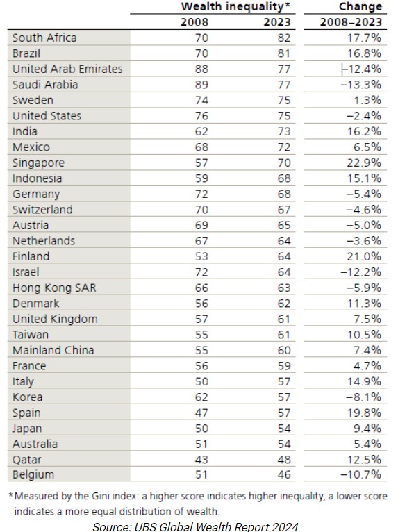
Wealth inequality

The great horizontal wealth transfer
How Australia’s high net worth individuals are faring

How the wealthy are investing their money

The narrative of a miserly, Scrooge-like figure hoarding his wealth for years instead of enjoying his retirement might seem unbelievable—but unfortunately, it isn’t relegated only to fiction. It’s a cold reality for many retirees.
Although most retirees’ stories aren’t as dramatic as Scrooge’s, it’s not uncommon for retirees to have more than enough to live comfortably for the rest of their lives but still think a vacation is out of the question. In fact, a number of retirees actually experience a sharp decrease in spending and increase in savings in retirement.
According to the Life Cycle Hypothesis, this shouldn’t need to happen. A retiree who is financially prepared for retirement should keep a consistent income in retirement, and her overall consumption should not change. So why does this conundrum—known as the retirement consumption puzzle—happen, and what can we do about it?
Who Is Struggling to Spend Their Retirement Income?
About 25% of retirees fall into the camp of people who decrease spending during retirement. So although this doesn’t impact a majority of retirees, it’s still a meaningful number, and it’s concerning to see so many people not enjoying the fruits of their labor.
Moreover, research suggests this problem may worsen. Researchers found that the issue was most pronounced with individuals who use their own savings for retirement income—whereas people with guaranteed sources of income, such as annuities, Social Security, and pensions, were more likely to spend their income.
Thus, as more retirees (in some cases unwillingly) use financial accounts for their retirement savings, the group of “decrease spenders” may grow.
Why Do People Have Trouble Shifting From a Saving to Spending Mindset?
The idea of a person hoarding their money in retirement is not new, but researchers still haven’t been able to pinpoint the exact cause. There are plenty of theories, though—some with more support than others.
One line of thinking posits that people simply don’t need to spend as much in retirement. For example, when people retire, they may experience a drop in work-related expenses. They may be able to spend more time doing things they had to pay for in the past—now making meals at home or mowing their own lawn—and searching for the best deals for their purchases. And they may pay off their mortgage, thus decreasing their expenses.
Another line of thought points to more psychological reasons behind a change in spending patterns.
Before retirement, a person may be more susceptible to present bias (the tendency to focus more on the present situation at the expense of long-term planning) because their future labour income is uncertain, and they don’t yet feel an ownership of that money. That uncertainty gives them the flexibility to think things like, “I’ll work more hours next month to make up for this trip,” or “My boss will cough up that bonus soon.”
However, after retirement, they are on a fixed income and the money they are spending is coming from their own pocket. This shift triggers loss aversion—that is, the desire to avoid losses outweighs the desire to experience gains. In retirement, we know that overspending today will result in a sure loss in future consumption. In a world where that future you is 85 years old and unable to work, that future loss looms much larger than an extra extravagance today.
This bias may be further aggravated by the fact that though your future retirement income is certain, your future expenses are uncertain. These stressors may push retirees to remedy preretirement overconsumption, thus prompting them to spend less.
How to Manage Retirement Spending Woes
Each of these theories has some merit, but none of them completely solve the retirement consumption puzzle. I believe that there is no one culprit behind the retirement consumption puzzle because no one retiree is the same.
For example, for Scrooge, the loss aversion theory may fit the bill. He became so preoccupied with the dollar amount he has that he ended up drastically underspending in retirement. But because every retiree is different, and different explanations may ring true based on their personal circumstances, retirees may benefit from taking stock of their retirement spending.
This exercise may help you understand if your spending is lining up with your retirement funds and needs. In some cases, that might mean that not spending all of your monthly retirement allocation is “OK.”
Step 0 is to gauge your financial affairs and have a clear understanding of how much you can spend. Assuming Step 0 is complete, here are three ways to diagnose if you have a retirement underspending problem:
- Refer back to your financial goals and life values (and if your financial goal was to retire on time, it’s time to set new ones). Consider: Are you meeting your financial goals given your current spending? Are you upholding your life values? If your life value is to experience new cultures, is your current spending allowing you to do that?
- Try tracking your spending using an online tool that breaks down spending by category. It’s ideal to do this before you retire, but not essential. On a quarterly basis, check your overall spending and take note of any categories where your spending patterns have changed. Do these changes align with your financial goals? Did your spending on eating out suddenly drop, even though you love trying new cuisines with friends?
- Take a moment to recognize your emotions when spending your retirement income. (Research finds that retirees who underspend are more likely to be worriers.) Are you constantly pinching pennies and afraid to spend?
The Pieces to the Retirement Income Puzzle
If you fall into the underspending camp, research suggests that people using guaranteed income sources are more willing to spend their income.
Although the causes of the relationship between annuitising and spending are still up in the air, there are a couple of theories.
For example, maybe people with an annuity feel they have more of a “license to spend” because they know they will always have money coming in. Or, maybe this phenomenon relates to how retirees think of their payments: If a payment comes from an annuity, it may feel like it’s someone else’s money they are spending (akin to labor income they earned before retirement). Since it’s not coming out of their own pocket, they may not be as prone to loss aversion and thus more at liberty to spend.
If you don’t want to take the leap to guaranteed income sources, try reframing your retirement income as a paycheck that someone else is paying you.
You can also try refocusing on your financial goals and life values. Put your goals and/or values on a Post-it note and stick it on your fridge, put them in your wallet, or add them to the notes app on your phone. Constant reminders of why you need to spend money—whether it’s to buy a condo near your grandchildren or to book that trip to Italy to taste authentic Italian cuisine—can be the nudge you need to make sure you make the most of your retirement.
Although not spending enough money in retirement may not be a universal problem, it does represent a huge, missed opportunity for the retirees in question. It’s important to remember that this is the money you’ve spent years toiling over and protecting. Now, during a long and happy retirement, is the time to put that money and free time to good use, funnelling both resources into your version of a life well-lived.
Key Takeaways
- In the second quarter of 2024, the global universe of sustainable open-ended and exchange-traded funds attracted an estimated USD 4.3 billion of net new money, compared with restated outflows of USD 2.9 billion in the first quarter.
- European sustainable funds garnered USD 11.8 billion, up from the restated USD 8.4 billion in the previous quarter.
- In the US, investors continued to pull money out of sustainable funds, but less than in the previous quarter. Redemptions in the second quarter amounted to USD 4.7 billion, about half of the USD 9 billion registered in the first quarter.
- There were reduced outflows in Japan too, while sustainable funds in Asia continued to attract net new money.
- Supported by stock price appreciation, global sustainable fund assets stood steady at USD 3.1 trillion at the end of June 2024.
- Product development continued a downward trajectory, with 77 new sustainable fund launches in the second quarter. While this number is likely to be revised upwards, it confirms the normalization of product development activity in this space.
New forecasts from the Australian Bureau of Statistics (ABS) highlight how quickly our population will age, and investors need to prepare now for the enormous changes that it will bring.
For a start, it will put huge pressure on Government budgets as spending on health and welfare skyrockets. To pay for this, Governments will need to increase taxes, borrow and print more money, or cut spending on other things. A combination of all three options is possible. Further changes to superannuation and the Age Pension seems inevitable in this context.
The ageing population will lead to slowing growth in our working age population, or even an eventual decline. Fewer workers may mean a tighter labor market. Could that result in structurally higher inflation?
It will also affect valuations of stocks and sectors on the ASX. There should be long-term tailwinds for companies catering for our ageing population including private health insurance, retirement villages, hearing aids, annuities, and pharmaceuticals/biotechnology. Conversely, there will be headwinds for companies exposed to the young, including childcare, toys, and teenage fashion.
New life expectancy estimates
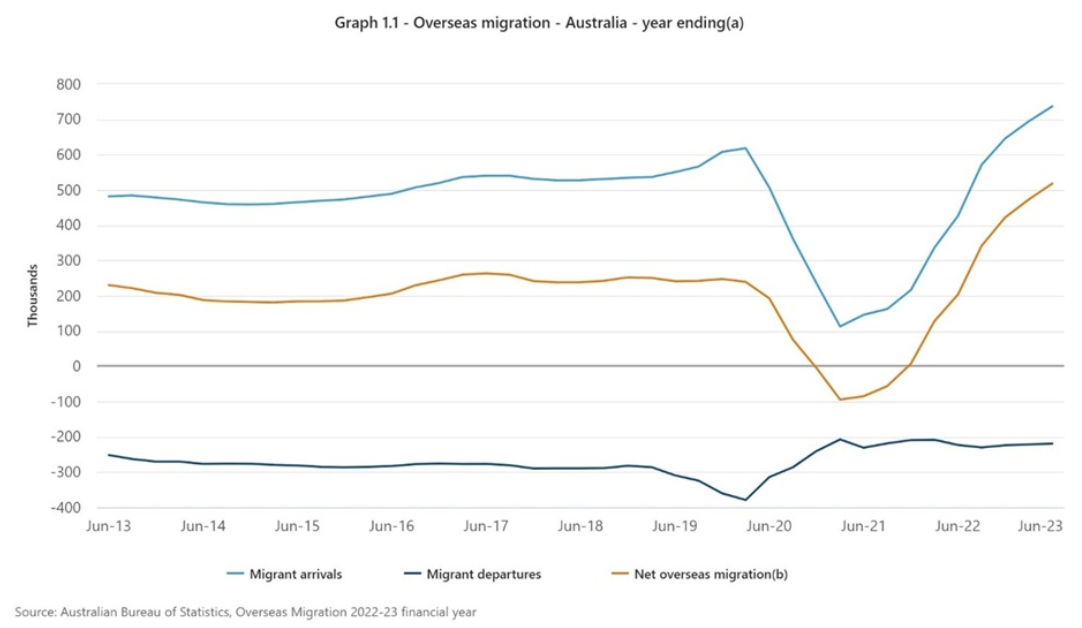
Recent population statistics from the ABS made front-page news. The data showed that Australia’s population had increased to 26.6 million, rising 2.4% over the past year.
The headlines focused on the key driver for the increase in population: record high migration. In the year to June 2023, there were 737,200 migration arrivals and 219,100 departures, resulting in net overseas migration of 518,100. That figure was dramatically up from pre-Covid levels though it’s at least partially a catchup from Covid when numbers dipped sharply.
What didn’t grab headlines was data from the ABS on population projections and life expectancy. The ABS now forecasts that Australia’s population will rise from the current 26.6 million to between 34.3 and 45.9 million by 2071. That’s a large range and is based on the current 10-year average annual population growth rate of 1.4% falling to 0.2-0.9%.
The ABS forecasts the median age of 38.5 years will increase to 43.8-47.6 years. Taking the mid-range of that projection of 45.7 years means that the ABS is expecting a 20% increase in median age by 2071.
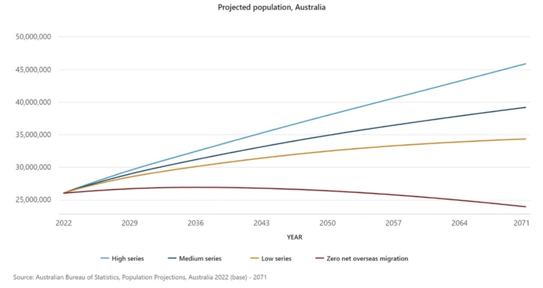
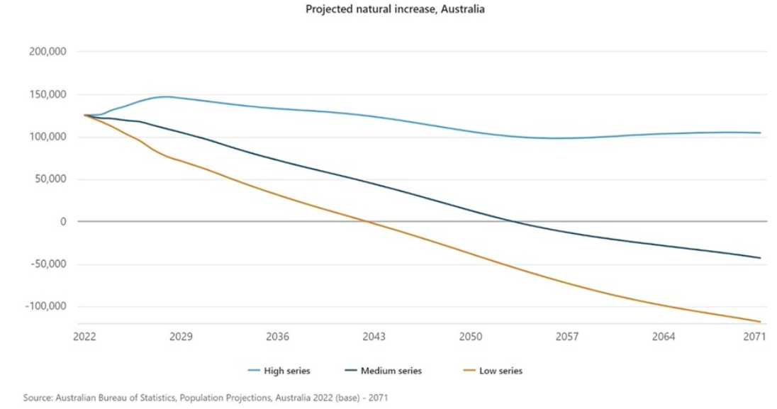
The ABS predicts that the natural increase in population could turn negative by as early as 2043. That means more Australians will be dying versus being born by then. That’s in the ABS’ so-called ‘low series’ scenario. Under its ‘medium series’ scenario, it’ll be 2054 when that happens, and under the high series, it won’t happen at all over the next 47 years.
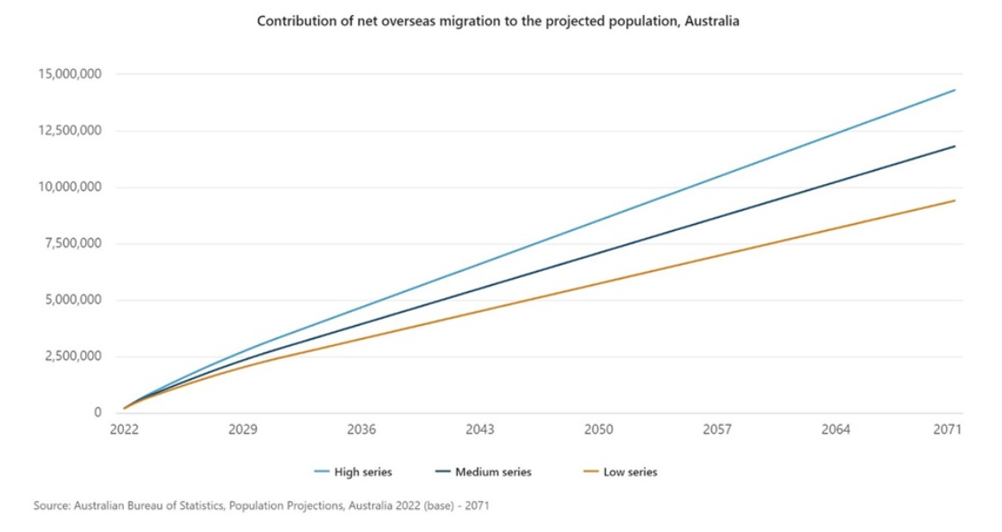
A big variable in the forecast is migration. The ABS forecasts that overseas migration will contribute 9.2-15.3 million people between now and 2071. The ‘medium series’ forecast of 11.8 million averages an annual intake of 246,000 overseas migrants.
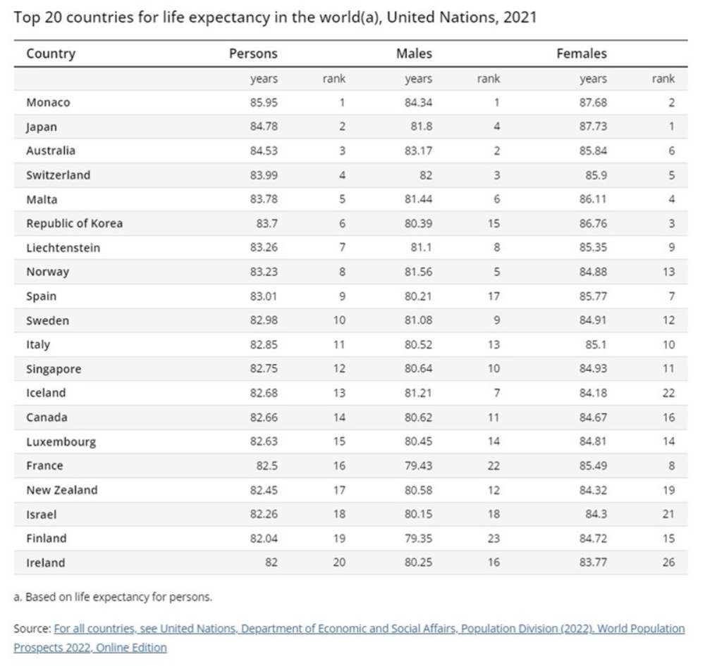
In other data, the ABS revealed that life expectancy at birth was 81.2 for men and 85.3 for women from 2020-2022. 30 years ago, those figures were 74.5 for men and 80.4 for women. In other words, men are living 6.7 years longer and women are living 4.9 years longer than they were in 1992.
Australia’s life expectancy now ranks third in the world behind Monaco and Japan.
The predictions for our ageing population aren’t new as the ABS, along with the various Intergenerational Reports, have continually updated their forecasts. As a rule, they’ve consistently underestimated life expectancy increases. This is understandable given that medical advances that extend life are impossible to predict. Yet it is also a fair bet that current estimates will prove too low as well.
A faster-than expected ageing of Australia’s population may mean we’re dealing with its effects far sooner than most think.
The great demographic reversal
A fascinating book called The Great Demographic Reversal outlines the potential impact from a rapidly ageing population on our economy. Written by Charles Goodhart, a Professor at the London Stock Exchange and former Chief Advisor to the Bank of England, and Manoj Pradhan, a macroeconomics consultant, in 2020, the book became well-known in economic circles for suggesting that higher global inflation was imminent. Back then, no one was suggesting that. The prediction turned out to be correct, albeit perhaps not entirely for the reasons that they put forward.
In the book, Goodhart and Pradhan argue that economic growth in the developed world is bound to fall because the tailwinds of the past three decades are now reversing.
Economic growth is a function of growth in working age population plus productivity growth. Goodhart and Pradhan suggest the days of a growing working age population are behind us and productivity improvements won’t be enough to offset this.
They say the rise of China as an economic superpower has been the dominant story of the past 30 years. It led to a global influx of hundreds of millions of workers. These cheap workers help fuel the rise in supply of goods for companies around the world. Along with favourable demographics, it resulted in increased economic output and lower inflation growth across developed market economies.
The authors think China’s largest contribution to global growth is now past as its working age population is shrinking, as its people grow old. And the West is witnessing sharp declines in fertility rates, continued increases in life expectancy, and falls in growth rates of working age populations. This means the ageing of populations everywhere, barring Africa.
Also, the dependency ratio – the ratio of those who need support because they do not earn income relative to workers – is worsening. The populations of most countries will go on rising for the next 25 years because the number of old will offset the number of young. But between 2045 and 2050, the global population will begin to decline.
The authors say this decline will lead to labor shortages and upwards pressure on wage rates, which will be reinforced if taxes on workers increase to pay for welfare for the ageing. That will fuel structurally higher inflation and higher nominal interest rates (but not necessarily real rates).
It will lead to employers increasing investment because labor will become more expensive. That will improve worker productivity, but it won’t be enough to counter the declines in the working age population.
The book doesn’t consider technology as a major factor in declining inflation rates in previous decades and they play down its potential role in future. To critics that mention Japan as an example for ageing populations not leading to inflation, Goodhart and Pradhan argue that Japan’ situation happened against the backdrop of China’s rise and that rise explains much of the low inflation that Japan has experienced since.
They also mention that immigration can help offset ageing populations in some countries. They say the issue of immigration is partly to blame for the rise of populist parties in recent years. The authors believe it’s also divisive because it pits mainstream economists, who largely welcome immigration, against the public, which wants it restricted.
Impact on super and the Age Pension
As Australians live longer, it will also put enormous pressure on welfare budgets. Governments will need to raise money to pay the bills. And they’ll pick politically easy targets to achieve this.
For example, negative gearing is political dynamite, and the Federal Government will avoid tinkering with it unless forced too.
On the other hand, super and the pension are easier targets. This year, we saw the introduction of a new tax on super balances over $3 million. Given future pressure on budgets, further changes to super seem inevitable.
That isn’t to say that super isn’t a good vehicle to build wealth. It currently is. Though whether it remains the case is an open question. Making sure that you have diverse investments outside of super to fund your retirement would seem prudent.
As for the pension, it used to be seen as a ‘right’ but is now perceived as welfare. In recent years, the Government has tightened criteria for the pension. More tightening seems a given. In future, a generous pension is far from guaranteed.
All of this suggests that people need to think carefully about how to they best accumulate wealth to fund their retirements.
In last week’s overview, we dissected S&P/ASX 200’s performance for the June-quarter and summarised our near-term projections for all the major sectors of the index. If you haven’t seen it, you should—if only to see the photos of our equity analysts, most of them bearing little resemblance to what we currently look like.
From two weeks’ time, we will get to see if actual company earnings justify equity market’s remarkable resilience, and whether corporate Australia’s outlook statements can further propel the index from current near record highs.
That is because the reporting season will kick off on July 29. Report cards for ASX-listed companies for the six-months ended June 2024 will flood the market. Hyperventilating headlines will light up the financial press and digital airwaves. Snap judgements and investment recommendations will compete with “how to lose weight while eating 2 burritos a day” tips on social media. And stock prices will gyrate in response.
Having been through over 50 earnings seasons, here are three ways I recommend long-term investors to cut through the noise and make the most of this bi-annual bedlam.
Happiness = Results − Expectations
Ever wondered why a seemingly strong earnings result is sometimes met with a shocking stock price drop? Or you hear a company guiding to a 25% slump in profit next year, but its stock price is up 15% in response?
It is all to do with consensus earnings expectations heading into the result. In a world of relativities, people want a reference point against which a result or a profit guidance can be judged. In stock investing, that reference point usually comes in the form of: (1) management guidance, or (2) the majority view of the analysts assiduously following that company (aka consensus).
There is whole industry that deals with consensus, in terms of its gathering, packaging and managing. In fact, there is an army of investor relations professionals out there, nudging analyst expectations one way or another, depending on how earnings are tracking—just so that their company stock prices don’t behave like a two-dollar yo-yo come the day of the result.
As an investor, it is useful to be aware of these market expectations during earnings season. Not only does it put some sense into stock price behaviour post results announcement and outlook, but it serves other critical purposes. In the case of judging a result by reference to company guidance, it sheds light on how good management is in assessing and predicting operating conditions, how well it has its arms around the business and factors within its control, and how it deals with uncertainties.
In the case of consensus estimates, knowing them allows investors to take advantage of short-term mismatches between market expectations and sustainable earnings delivery. A company that has consistently delivered 10%-plus EPS growth over a long period may report 5% growth one year and suffer the wrath of a market that has been conditioned otherwise. But that stock price correction could be an opportunity for long-term investors, especially if the reason for subpar growth was to reinvest to solidify the company’s competitive position and prolong its earnings growth trajectory.
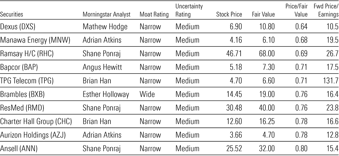
In Exhibit 1, we highlight ten most overvalued (as measured by their premiums to our fair value estimates), no moat-rated companies under our coverage with the highest fair value uncertainties. We see their high stock prices as perhaps reflective of hyper consensus expectations and, therefore, susceptible to a correction.
Exhibit 1: Ten most overvalued, no-moat, high-uncertainty rated stocks under our coverage
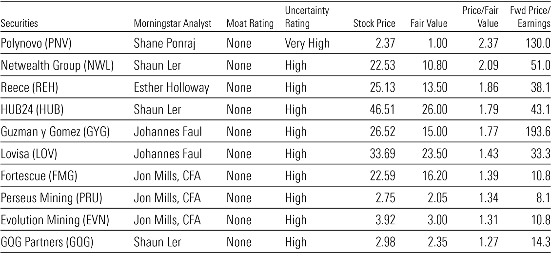
Source: Pitchbook, closing prices on July 16, 2024.
Conversely, in Exhibit 2, we highlight some high-quality, moat-rated companies whose stock prices show very low market expectations relative their midcycle earnings potential. And when expectations are low, happiness is more easily achieved.
Exhibit 2: Ten most undervalued, moat, medium-uncertainty rated stocks under our coverage
Source: Pitchbook, closing prices on July 16, 2024.
Quality over quantity
Westpac Banking Corporation’s fiscal 2024 interim financial report was 141 pages. Fair enough. It’s a big bank with many units and moving parts. But the results presentation and Investor Discussion Packs slides—meant to summarise the key drivers of operating and financial performances—also ran to 121 pages! The fetish for figures and slides is not confined to large companies. Coast Entertainment, a $220m market cap company that operates just a theme park and an observation deck on the Gold Coast, produced a 31-page presentation deck to supplement its last interim financial report, as well as a 3-page media release as an accompaniment.
Such information dumps may be a godsend to anal analysts and fussy fund managers who love getting into the weeds and adding to their formidable 5,000-line, 20-tab financial models. But for investors who don’t want to lose the sight of the forest for the trees, there are some quality-checks you can do on the results day, while you wait for the experts to generate the detailed research in due course.
One, go straight to the Statement of Cash Flow in the financial report, find “receipts from customers and recurring sources” and subtract “payments to suppliers, employees and others”. Compare the result to reported EBITDA. If the calculated cash inflow is materially lower, zero-in on the reasons why. In the process, you’ll likely be met with many different versions of EBITDA (adjusted, normalised, underlying, before-the-dog-ate-it). It’s not exactly straight forward, but have fun delving into them. See if the reasons for the discrepancy between operating profit and operating cash flow are reasonable (usual working capital changes) or suspect (unusual revenue/expense recognition).
Two, you can follow this cash flow thread further and see how much the company spent on capital expenditures, compared to the previous period (for example, in terms of capex/sales). If there is a big change, again, delve into it. You don’t want a company skimping on capex to compromise future earnings power. But you also don’t want any unnecessary gold-plating. Then keep going—see how management allocated the resulting net cash flow (after capex). How much of it was spent on acquisitions, dividends, debt retirement or share buybacks? What have all these allocation decisions done to the company’s indebtedness, shareholder returns, and future operating and financial sustainability?
Three, compare the REPORTED net profit in the financial statement to the creatively labelled “adjusted”, “normalised”, “underlying” net profit littered throughout the unaudited presentation slides (see Exhibit 3 as an example).
Exhibit 3: A real-life example of a company with different versions of earnings (company identity and figures removed)
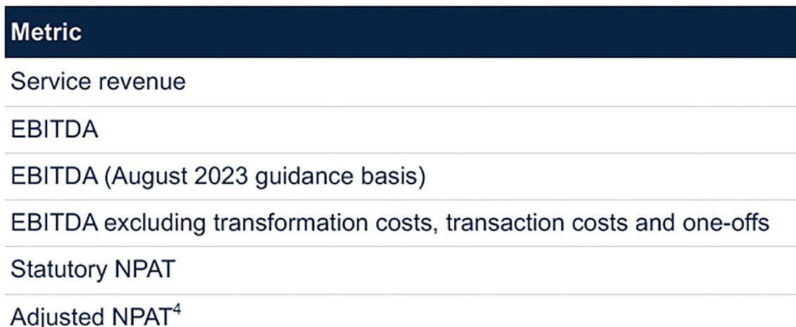
Source: Company presentation
Invariably, the reconstituted net profit will be higher than the reported net profit. In the process of investigating it, you’re likely to be bombarded with the terms “abnormal” or “one-off”. Delve into these reasons and see if these abnormals and one-offs are anything but, by looking at the company’s financial history.
Treat this as an exercise to gauge the quality of a result, and as a starting point to “proactively look” for information in presentation slides, rather being bamboozled by them in accordance with management’s agenda.
Assume bad intentions
One of the more entertaining, yet futile, aspects of earnings seasons are the conference calls that companies host to discuss their results.
Entertaining because nothing is funnier than analysts who profusely congratulate management on a good result, and proceed to ask questions which sound more like: (1) a dissertation of his knowledge and experience and/or (2) a demonstration of his close bond with management.
Futile because, in many instances, management spends 50% to 75% of the conference reading out what’s already written on the slides, dictating what it wants to communicate and restricting what investors want to know. Worse still, there are many companies that release prepared speeches to the ASX prior the conference calls, and their senior executives then proceed to read them verbatim during the call for 30 minutes to one hour! We kid you not!
As such, do away with at least the first half of any earnings call—we don’t need management to treat us like we’re in kindy. Instead, focus on the subsequent Q&A section. Pay attention to how management answers questions. Not Dorothy Dixer questions analysts ask so they can hear their own voice, let the management know they support the company and let their fund manager clients know they’re working. But questions real investors ask because they are genuinely interested in the company’s earnings drivers, cash flow movements, capital allocation and operating strategy.
Perhaps you may even want to ask a question yourself for fun, for example, “Thank you for the opportunity to ask a question. My question is: why are your one-offs and abnormal items always negative? And have you ever classified exceptionally good weather as a one-off positive item to be excluded from underlying EBITDA?”
Earnings seasons are chock full of noise. And companies make matters even more overwhelming by massaging their messages and figures, bedazzling audiences with fancy jargon and MBA-speak. It is the job of professional analysts and fund managers to wade through this information jungle and pinpoint what’s important to determine the intrinsic value of companies.
However, ordinary long-term investors can also actively participate in earnings seasons, without getting lost in the weeds. Focus on a few key areas and let your curiosity dictate how you navigate the mountains of information provided, rather than letting companies distract you with theatrics and minutiae.
The Demographia International Housing Affordability report is a widely respected annual survey of residential property across eight countries. This year’s 20th edition of the report has tonnes of great data, much of which doesn’t make for nice reading for Australia. That said, previous editions haven’t been too kind either.
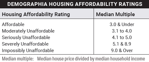
The report measures housing affordability on a median price-to-income ratio, or ‘median multiple’. Then it breaks housing markets down into categories, from affordable, down to impossibly unaffordable. A median multiple of 3x or under is deemed affordable, while 9x or over is considered impossibly unaffordable.
The report only introduced the category of ‘impossibly unaffordable’ this year to describe cities where housing purchases are extremely expensive relative to incomes, topping its previous highest category of ‘severely unaffordable’.
Source: Demographia International Housing Affordability 2024 edition
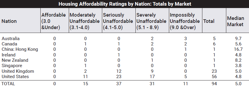
Here’s how Australia stacks up against seven other developed countries.
Source: Demographia International Housing Affordability 2024 edition
Australia’s five major capital cities, excluding Darwin, Canberra, and Hobart, are considered either severely unaffordable, with price-to-income ratios between 5.1x and 8.9x, or impossibly unaffordable, with median multiples of 9x or more. The median price-to-income multiple across the five cities is 9.7x.
The chart shows that Australia’s median multiple is more than 2x the US market of 4.8x or almost 2x the UK market of 5x. The US has five ‘impossibly unaffordable’ markets compared to Australia’s three, which shouldn’t surprise given the US has a population almost 13x greater than here. China, Hong Kong more specifically, is the only market that’s more expensive than Australia.
The other thing to note is there isn’t one city in any country which has a property market deemed affordable. Singapore is the most affordable market, though 78% of the population lives in public housing.
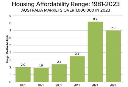
The next chart shows how house prices have exploded across all the countries over the past few decades.
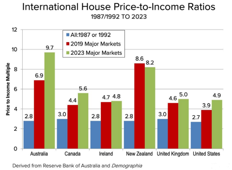
The jump in the median multiple of Australia is something to behold. In 1987, the price-to-income ratio here was just 2.8x. Even in recent years, the multiple has also seen a tremendous uplift, from 6.9x in 2019 to 9.7x now.
The chart shows that back in 1987, every country’s housing was considered affordable, under a 3x median multiple.
Other nations have seen an increase in their median multiple over the past four decades, yet Australia’s uplift has been the greatest by far. The report suggests that it isn’t just one city that’s making Australia unaffordable. Even our most affordable market is still well above other countries.
Source: Demographia International Housing Affordability 2024 edition
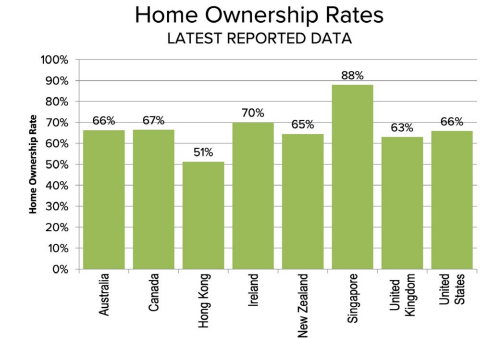
Home ownership rates don’t explain why Australia prices are so much higher than most. Our home ownership rate of 66% is about average across the different countries.
Source: Demographia International Housing Affordability 2024 edition
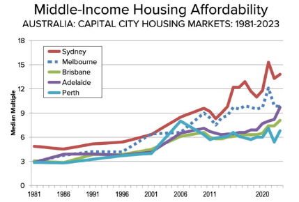
Drilling down into Australia
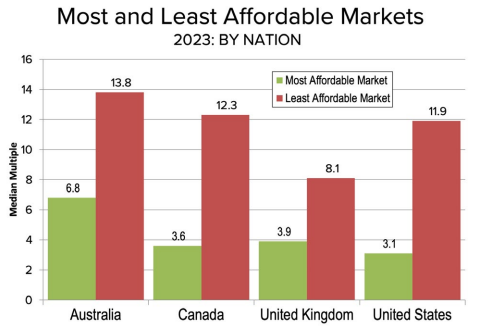
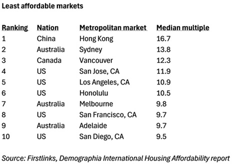
Sydney is the least affordable market in Australia, with a median price-to-income ratio of 13.8x. That multiple also makes it the world’s second least affordable city, behind Hong Kong. It’s not unusual for Sydney to be considered expensive on a global basis, as it’s been in the top three least affordable cities in 15 of the last 16 years, according to the report.
Source: Demographia International Housing Affordability 2024 edition
Melbourne is the second most expensive city in Australia, with a median multiple of 9.8x. Adelaide rounds out the list of Australia’s ‘impossibly unaffordable’ cities, with a median multiple of 9.7x.
Brisbane and Perth are less expensive, though still considered ‘severely unaffordable’, with price-to-income multiples of 8.1x and 6.8x respectively.
The report also notes that the gap in affordability between Australian cities has widened in recent decades. In 1981, the gap between the least affordable city and the most affordable was just 2 median multiple points, whereas today it’s 7.
Source: Demographia International Housing Affordability 2024 edition
Australia has three of the least affordable cities in the top 10.
Explaining the global rise in house prices
The report doesn’t hold back on the housing affordability crisis across the developed world. First, it suggests current struggles with high costs are rooted in high prices for housing:
“Middle-income households face rapidly escalating housing costs, which is the primary cause of the present cost-of-living crisis. For decades, home prices generally rose at about the same rate as income, and homeownership became more widespread. But affordability is disappearing in high-income nations as housing costs now far outpace income growth.”
As to a cause for higher house prices, the report is pointed:
“The crisis stems principally from land use policies that artificially restrict housing supply, driving up land prices and making homeownership unattainable for many.”
It says the solution to the crisis lays in increasing land supply:
“Urban containment policies (greenbelts urban growth boundaries, densification) are designed to limit sprawl and increase density. While well-intentioned, these policies severely constrict the land available for housing. In constrained markets, higher land values translate to dramatically higher housing prices…
The housing crisis demands prioritizing [sic] the well-being of people over abstract planning ideals. The planning orthodoxy, while aimed at improving cities, has worsened affordability. This undermines the economic opportunity essential for thriving middle-and lower-income households.”
The New Zealand experiment to making housing affordable
The report lauds New Zealand for its efforts to try to address housing affordability issues:
“New Zealand provides a hopeful path forward. Recognising the crisis is rooted in high land values, new policies are proposed to open up sufficient land to accommodate demand.”
The report’s applause for New Zealand’s policies is somewhat odd given these policies have primarily promoted greater medium-density housing – something that Demographia doesn’t favour to address housing shortages.
In 2016, Auckland upzoned about three-quarters of its residential land area under the Auckland Unitary Plan. In this case, upzoning meant abolishing single-family zoning to allow for multi-unit housing. It also involved changing zoning laws to allow high density housing around transit corridors.
The encouraging signs from the Auckland moves has resulted in New Zealand rolling out sweeping legislation to allow medium-density housing across all the country’s major cities.
So, how successful have the Auckland reforms been? It’s undoubtedly led to a large increase in new dwelling starts, most of which have been multi-unit dwellings. Academic studies show that the housing stock was 4% more than it would have been without the policies from 2016 to 2020.
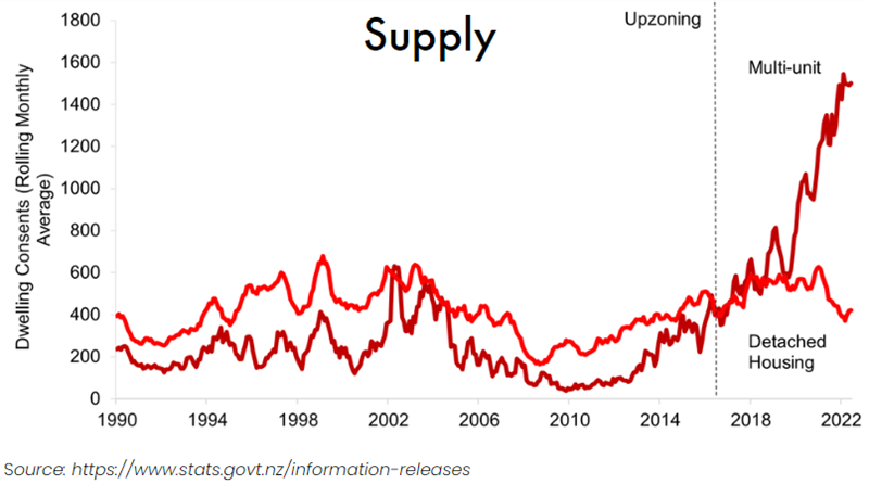
The location and composition of builds has also changed. In 2015, two out of three housing permits were issued in the inner suburban areas. Five years later, the figure was 6 out of 7.
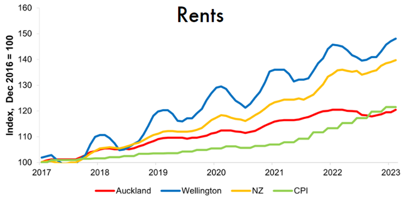
Interestingly, upzoned properties have increased in value in Auckland more than non-upzoned houses. That shows the market has ‘rewarded’ the upzoning option by ascribing it greater value.
Meanwhile, rents in Auckland have declined in real terms since 2016. They trailed the rental growth of other major New Zealand cities by some way.
Source: https://www.tenancy.govt.nz/about-tenancy-services/data-and-statistics/rental-bond-data/
House prices in Auckland have fallen sharply since peaking at NZ$1.3 million in November 2021. However, the fall came after a tremendous increase during the pandemic.
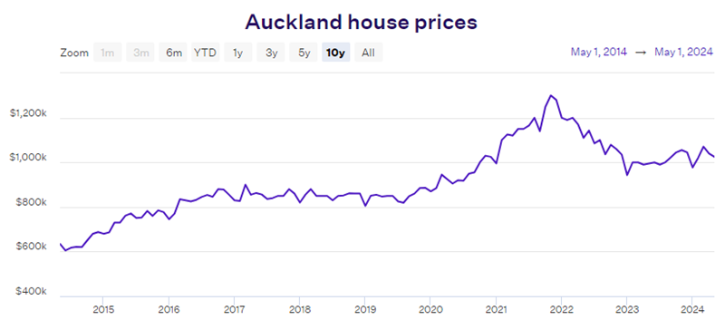
Source: Opes Partners
The jury is still out on the success or otherwise of Auckland’s reforms. They’ve certainly increased supply and seem to have stabilised rents. Whether they’ve impacted house prices is open to debate. The pullback in Auckland’s house prices since 2021 has coincided with a large rise in interest rates, so it may not just be increased supply that’s caused these price falls.
A fuller picture will emerge in coming years as the zoning changes take effect across other cities.
We can survive longer without food than without sleep. The US Centre for Disease Control and Prevention says most people will show adverse signs of sleep deprivation within 24 hours.
Three days without sleep has a profound impact on mood and cognition, and chronic sleep deprivation increases the risk of disease, obesity, and diabetes. Health is more important than wealth, and anyone who regularly loses sleep or wakes in a sweat worrying about the stockmarket must reassess their priorities. And asset allocations.
The dilemma is that over time, equity markets deliver the best returns of any major asset class. With the recent rise in interest rates, anyone who cannot tolerate even a small loss of capital can generate safe nominal returns of around 4%, but for most investors, some equity allocation is needed to achieve long-term goals.
What’s the right level? It’s personal. I have known someone for 40 years who is always 100% invested in equities and only cares about the income generated (and author Peter Thornhill makes the same arguments). But I know an older person with 95% allocated to term deposits and property and no tolerance for sharemarket volatility. Over many years, she has missed out on significant gains but she sleeps easy.
Why invest in equities?
Investors who can tolerate the volatility of share prices are eventually rewarded with a recovery of their capital as well as better returns. The All Ords Total Return Index (which includes dividends) has not experienced a period of negative returns over any eight-year rolling average on record in nominal terms. The average annual return over the last 100 years is 11%.
It’s a compelling result in the context not only of regular scary headlines about inflation, recession, and earnings downgrades, but genuine crises hitting the world such as wars and pandemics, as shown in this chart of the MSCI All Country World Index. While the long-term evidence favours equities (and in Australia, residential property), it requires an ability to think like Warren Buffett, who said:
“Charlie and I spend no time thinking or talking about what the stock market is going to do, because we don’t know. We are not operating on the basis of any kind of macro forecast about stocks. There’s always a list of reasons why the country will have problems tomorrow.”
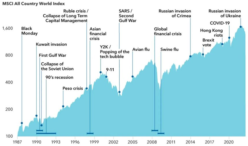
Source: @QCompounding
The maximum loss (drawdown) for the All Ords Total Return Index during this period was in November 2007, and the 48.3% would have frightened the hardiest of investors. And yet it had recovered to its previous high within 56 months, or less than five years, although the more volatile small company index took much longer.
Maximum drawdown for Australian broad market indexes
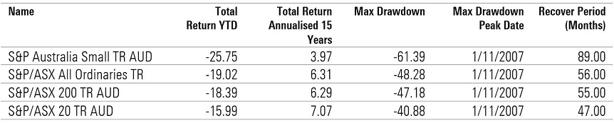
Period analysed: 01/01/2000 – 1/06/2023. Source: Morningstar Direct
Herein lies the challenge. Equities will deliver negative returns in about three years out of every 10, often by 20% or more. Investors should expect a 50% loss once every 25 years, which is the time horizon of 65-year-olds with a life expectancy until 90. For most, a 100% equity portfolio is simply too volatile, while a move to say 70% equities/30% cash would deliver 70% of the market volatility. Australian equity returns are also understated as indexes do not include the value of franking credits.
(This article focusses on investible assets, not the family home which comes with special tax and social security advantages and the pleasure of owning the place where you live).
Why not invest 100% in equities?
Benjamin Graham taught and mentored Warren Buffett in the principles of fundamental value investing, and he has influenced generations of stock analysts through his two seminal books, Security Analysis and The Intelligent Investor. The following quotations are taken from the 2009 reprint which reproduces sections of the 1973 edition.
Graham describes most people as ‘defensive’ who:
“… will place his chief emphasis on the avoidance of serious mistakes or losses. His second aim will be freedom from effort, annoyance, and the need for making frequent decisions.”
On this basis of avoiding large losses, Graham recommends an equal balance of 50% bonds and 50% stocks. He is open to allocations between 25%/75% and 75%/25% based on whether an investor perceives stocks are cheap (leaning towards 75% in equities) or expensive (moving back to 25%).
This is not very helpful, however, as he admits that investors attempting so-called Tactical Asset Allocation will struggle, because the usual human tendency is to buy when markets are riding high and sell when depressed and low:
“There is an implication here that the standard division should be an equal one, or 50–50, between the two major investment mediums. According to tradition, the sound reason for increasing the percentage in common stocks would be the appearance of the ‘bargain price’ levels created in a protracted bear market. Conversely, sound procedure would call for reducing the common-stock component below 50% when in the judgment of the investor the market level has become dangerously high. These copybook maxims have always been easy to enunciate and always difficult to follow, because they go against that very human nature which produces the excesses of bull and bear markets.”
He is unable to provide a reliable rule which applies to everyone, except that very few people should place more than 75% of their assets in stocks. But he is willing to identify the characteristics of “a tiny minority of investors” for whom holding a near-100% stock portfolio (with some cash) may make sense:
- Enough cash to support your family for at least one year
- Investing steadily for at least 20 years to come
- Did not sell stocks during the most recent bear market
- Bought more stocks during the most recent bear market
- Implement a formal plan to control your own investing behaviour.
He says:
“Unless you can honestly pass all these tests, you have no business putting all your money in stocks. Anyone who panicked in the last bear market is going to panic in the next one – and will regret having no cushion of cash and bonds.”
Here are the losses that anyone invested 100% in the US S&P500 would have experienced since World War II. The average bear market decline is 33% but there have been three falls of close to 50% in the last 50 years. The drops have taken as little as one month or up to 21 months of grinding down. It requires fortitude to watch losses accumulate for nearly two years.
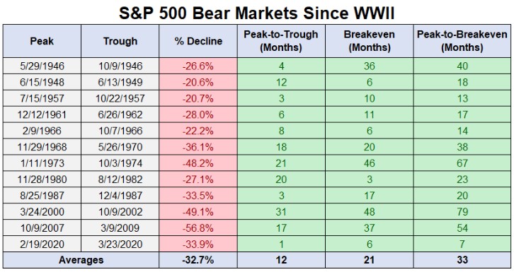
Source: A Wealth of Common Sense
Market conditions are less favourable
It is easy to list the threats in the current market, and they are higher than normal with the Ukraine war, withdrawal of monetary stimulus and inflation as serious dangers. Nobody holds up a red flag to signal a market top, although plenty of leading names in investing are issuing warnings. For example, Warren Buffett is also a great fan of Oaktree Capital’s Howard Marks, and Marks wrote in his client memo on 13 December 2022:
“In my 53 years in the investment world, I’ve seen a number of economic cycles, pendulum swings, manias and panics, bubbles and crashes, but I remember only two real sea changes. I think we may be in the midst of a third one today … What are the factors that gave rise to investors’ success over the last 40 years? We saw major contributions from (a) the economic growth and pre-eminence of the U.S.; (b) the incredible performance of our greatest companies; (c) gains in technology, productivity and management techniques; and (d) the benefits of globalization. However, I’d be surprised if 40 years of declining interest rates didn’t play the greatest role of all.” (his bolding)
Marks included this table showing how almost everything is worse for investing than it was in the period 2009 to 2021, which he looks back on as a golden age of favourable conditions driven by ever-falling rates.
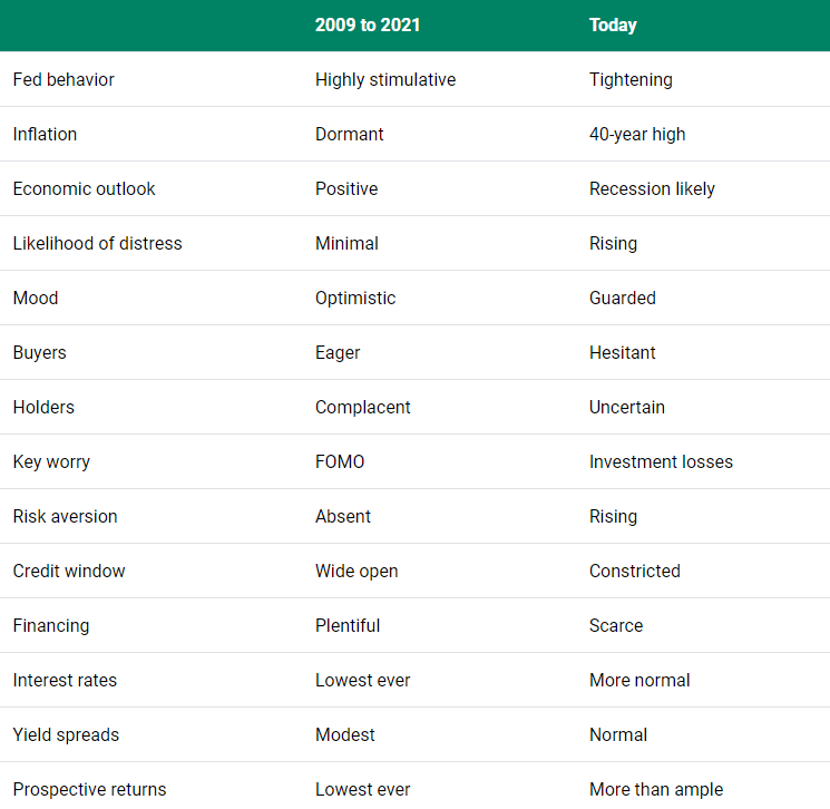
So the risks are real, and it is legitimate for someone in retirement to prefer to protect their capital rather than make a bit more money when they already have enough to meet their goals. Future earnings from paid work will be limited, and there is less time to recover from a major stockmarket fall. Where a comfortable way of life may be compromised, the risk may be too great.
Retirees should not feel embarrassed by reducing equity exposure to a point which reduces anxiety, to the sleeping point. The personal big picture of age, assets and risk tolerance are all relevant.
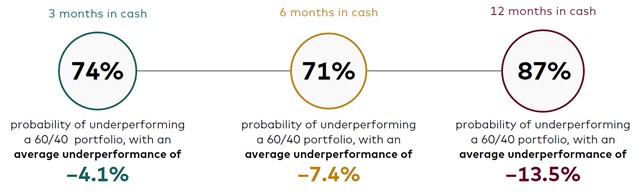
Cost of staying out of the market
Notwithstanding these heightened risks, caution often comes at a cost. Using US data, Vanguard studied each 3-month period in which equities declined 10% or more from 1 January 1980 through to 31 December 2022. These are times when investors are tempted to move to cash. They then checked returns in the following periods of 3 months, 6 months and 12 months. For example, there was an 87% chance of underperforming a 60/40 portfolio by spending a year stuck in cash, with an average underperformance of a hefty 13.5%.
Determining your sleeping point
So what are the questions that retirees or people near retirement should ask themselves in deciding the maximum equity allocation?
A useful check is whether the value of a share portfolio dominates your mind when going to sleep or waking up. Checking the market and worrying whether you can finance a future lifestyle is no way to start each day. A good question is:
What is the equity exposure where you are indifferent whether the market rises or falls?
You want some skin in the game to enjoy the rewards from equity investment, but you are not worried if the market falls because it gives an opportunity to buy equities at a lower price. Another check of the absolute dollars:
How much money are you prepared to lose without worrying about it?
If you have $1 million invested with 70% in equities and the market falls 30%, are you fine ‘losing’ over $200,000 in a short period?
Stay committed in a heavy market fall
Benjamin Graham says that with all the planning in the world, you still need to control your investing behaviour. There is no point going all-in equities because you know the rewards are the greatest, and then dumping in a sell off.
Some investors believe they can catch a falling knife, but it doesn’t work like that. If the market falls 10% and that’s a trigger price to sell, it’s just as likely to recover quickly as it is to fall further. The worst outcome is to continuously switch as markets swing around.
Although the daily market noise commands attention, there is much to support a portfolio that invests in a broad index and is left untouched for decades. And allows the investor to sleep easy.
The narrative of a miserly, Scrooge-like figure hoarding his wealth for years instead of enjoying his retirement might seem unbelievable—but unfortunately, it isn’t relegated only to fiction. It’s a cold reality for many retirees.
Although most retirees’ stories aren’t as dramatic as Scrooge’s, it’s not uncommon for retirees to have more than enough to live comfortably for the rest of their lives but still think a vacation is out of the question. In fact, a number of retirees actually experience a sharp decrease in spending and increase in savings in retirement.
According to the Life Cycle Hypothesis, this shouldn’t need to happen. A retiree who is financially prepared for retirement should keep a consistent income in retirement, and overall consumption should not change. So why does this conundrum—known as the retirement consumption puzzle—happen, and what can we do about it?
Who is struggling to spend their retirement income?
About 25% of retirees fall into the camp of people who decrease spending during retirement. So although this doesn’t impact a majority of retirees, it’s still a meaningful number, and it’s concerning to see so many people not enjoying the fruits of their labour.
Moreover, research suggests this problem may worsen. Researchers found that the issue was most pronounced with individuals who use their own savings for retirement income—whereas people with guaranteed sources of income, such as annuities or the age pension, were more likely to spend their income.
Thus, as more retirees (in some cases unwillingly) use super for their retirement savings, the group of ‘decrease spenders’ may grow.
Why do people have trouble shifting from a saving to spending mindset?
The idea of a person hoarding their money in retirement is not new, but researchers still haven’t been able to pinpoint the exact cause. There are plenty of theories, though—some with more support than others.
One line of thinking posits that people simply don’t need to spend as much in retirement. For example, when people retire, they may experience a drop in work-related expenses. They may be able to spend more time doing things they had to pay for in the past—now making meals at home or mowing their own lawn—and searching for the best deals for their purchases. And they may pay off their mortgage, thus decreasing their expenses.
Another line of thought points to more psychological reasons behind a change in spending patterns.
Before retirement, a person may be more susceptible to present bias (the tendency to focus more on the present situation at the expense of long-term planning) because their future labour income is uncertain, and they don’t yet feel an ownership of that money. That uncertainty gives them the flexibility to think things like, “I’ll work more hours next month to make up for this trip,” or “My boss will cough up that bonus soon.”
However, after retirement, they are on a fixed income and the money they are spending is coming from their own pocket. This shift triggers loss aversion—that is, the desire to avoid losses outweighs the desire to experience gains. In retirement, we know that overspending today will result in a sure loss in future consumption. In a world where that future you is 85 years old and unable to work, that future loss looms much larger than an extra extravagance today.
This bias may be further aggravated by the fact that though your future retirement income is certain, your future expenses are uncertain. These stressors may push retirees to remedy preretirement overconsumption, thus prompting them to spend less.
How to manage retirement spending woes
Each of these theories has some merit, but none of them completely solve the retirement consumption puzzle. I believe that there is no one culprit behind the retirement consumption puzzle because no one retiree is the same.
For example, for Scrooge, the loss aversion theory may fit the bill. He became so preoccupied with the dollar amount he has that he ended up drastically underspending in retirement. But because every retiree is different, and different explanations may ring true based on their personal circumstances, retirees may benefit from taking stock of their retirement spending.
This exercise may help you understand if your spending is lining up with your retirement funds and needs. In some cases, that might mean that not spending all of your monthly retirement allocation is ‘OK’.
Step 0 is to gauge your financial affairs and have a clear understanding of how much you can spend. Assuming Step 0 is complete, here are three ways to diagnose if you have a retirement underspending problem:
- Refer back to your financial goals and life values (and if your financial goal was to retire, it’s time to set new ones). Consider: Are you meeting your financial goals given your current spending? Are you upholding your life values? If your life value is to experience new cultures, is your current spending allowing you to do that?
- Try tracking your spending using an online tool that breaks down spending by category. It’s ideal to do this before you retire, but not essential. On a quarterly basis, check your overall spending and take note of any categories where your spending patterns have changed. Do these changes align with your financial goals? Did your spending on eating out suddenly drop, even though you love trying new cuisines with friends?
- Take a moment to recognize your emotions when spending your retirement income. (Research finds that retirees who underspend are more likely to be worriers.) Are you constantly pinching pennies and afraid to spend?
The pieces to the retirement income puzzle
If you fall into the underspending camp, research suggests that people using guaranteed income sources are more willing to spend their income.
Although the causes of the relationship between annuitizing and spending are still up in the air, there are a couple of theories.
For example, maybe people with an annuity feel they have more of a “license to spend” because they know they will always have money coming in. Or, maybe this phenomenon relates to how retirees think of their payments: If a payment comes from an annuity, it may feel like it’s someone else’s money they are spending (akin to labour income they earned before retirement). Since it’s not coming out of their own pocket, they may not be as prone to loss aversion and thus more at liberty to spend.
If you don’t want to take the leap to guaranteed income sources, try reframing your retirement income as a paycheck that someone else is paying you.
You can also try refocusing on your financial goals and life values. Put your goals and/or values on a Post-it note and stick it on your fridge, put them in your wallet, or add them to the notes app on your phone. Constant reminders of why you need to spend money—whether it’s to buy a condo near your grandchildren or to book that trip to Italy to taste authentic Italian cuisine—can be the nudge you need to make sure you make the most of your retirement.
Although not spending enough money in retirement may not be a universal problem, it does represent a huge, missed opportunity for the retirees in question. It’s important to remember that this is the money you’ve spent years toiling over and protecting. Now, during a long and happy retirement, is the time to put that money and free time to good use, funnelling both resources into your version of a life well-lived.
Building a mental map for investing involves both qualitative and quantitative analysis—the story and the numbers. In my past overviews, I’ve talked about focusing on the important and knowable factors when evaluating stocks, clues to look for to identify diamonds and what to do to create your own financial misery; that is, what to avoid.
But often, ideas and business investment opportunities present themselves as numbers. Can starting with financial statements and financial data be a way to find ideas?
Well, I think it can.
I have a pretty simple and fast process when looking at financials. It allows me to home in on where to look and where to question when it comes to investment analysis. Using this approach, I look clues as to what the business model might be. Is it a revenue growth story? Is it a margin story? Is it cyclical? Is it capital intensive? What kind of returns on invested capital can it generate and how have those been trending? These questions help to build a mental model from financials first, rather than the business.
The profit and loss
First, I look at the profit and loss, or P&L, statement. I mainly look at revenue growth and margins. For revenue growth, I want to understand if this business is growing quickly. Is it high single digits or more, moderately at mid-single digits, slowly at low single digits or in decline. Revenue growth is an important valuation driver. Depending on what kind of growth rate the business has, it begs the question, where is growth coming from? Is it acquisitions, product rollouts, market growth, market share, etc. Understanding the qualitative source of growth can be an important factor to determine if it can continue or not. Does it come from acquisitions, or organically, or a mixture of both? And, if the business has had a setback, this can be an opportunity. Sometimes structural growth stories have a hiccup, so it depends on what drives growth.
As for margins, I want to understand if it’s a high or low margin business. High margins can be associated with software businesses for example, which are highly scalable, or luxury brands where price and exclusivity become important drivers of demand. If I observe low margins, say mid to low single digits NPAT margin, then I become very interested in the capital efficiency of the business. That is the level of sales relative to total assets. You may need asset turnover of two times or more to make the economics work. Or in the case of banks for example, a lot of financial leverage.
DuPont analysis very simply breaks down the return on equity of a business. It breaks the after-tax return for every dollar of equity invested in a business into three key components: net profit margin (NPAT/sales revenue); asset turnover (sales revenue/total assets); and leverage (total assets/shareholders equity). The return on equity is the product of the three factors. The upshot is if net profit margins are low, then asset turnover needs to be high to generate high returns on equity. All else equal, we want high returns on equity because it means for every dollar of equity in the business, it generates an attractive return.
The cash flow statement
Second, I usually look at the cash flow statement. Firstly, operating cash flow. I want to see if the reported profit translates into operating cash flows, or just a mountain of assets on the balance sheet. Some capital-intensive businesses simply grow their asset bases in a boom, plowing everything they earn in profit back into more stuff. Mining equipment hire company Emeco has fit this bill before, spending money to grow when the market is rising. They are capital intensive, cyclical and their capital does not scale—i.e., to get bigger, they need more equipment.
Seeing how much capital is going out the door helps me assess if the company is investing rapidly and if it is translating into commensurate profit growth. What I generally dislike is a combination of no free cash flow, and declining returns on invested capital. Large investments ahead of some future payoff can be an exception, but good businesses invest as they grow, and superior businesses require little capital to grow. In the hypothetical good business, you may see stable but attractive returns on invested capital as the business grows. For a superior business, you may get rising returns as the business grows.
The balance sheet and other metrics
When comparing return on equity, one factor to look for is financial leverage. A business may earn slim margins, and slimmer margins than peers, but earn an attractive ROE because of excessive financial leverage. Here, those returns can evaporate quickly. It’s important to consider the likely variability of revenues and earnings in such cases, and if financial leverage can trigger value destruction if a downturn occurs. We don’t know when a downturn may strike, but we can have a decent go at understanding the consequences if it does.
There are a couple of ratios to look at to get an idea of financial leverage. I usually look at net debt / EBITDA, and if elevated—say above two, I might then also look at EBIT / net interest—to see how much coverage the business has, particularly if the business is cyclical. While the large global miners have generally been well run since the last downturn in 2015/16, some had to raise capital in that downturn, such as Glencore. And in the GFC, Rio Tinto had a large, discounted equity raise. When profits contract quickly, what looks like a reasonable amount of leverage can become risky.
Some types of leverage can be good though, such as free float. Berkshire Hathaway, while running a conservative balance sheet, has compounded returns in part thanks to free float from the insurance premiums. This is when policy premiums are paid by consumers to insurance companies in advance of claims, leaving a ball of money for the insurer to invest. Importantly, this free float grows as the business grows, meaning a growing ball of money to invest and growing earnings from it. Insurance brokers, such as AUB, also benefit from free float as premiums are collected before they are paid to the insurers. Interest can be earned in the meantime.
Putting it all together
Exhibit 1 below shows the return on equity assuming no financial leverage is dependent on asset turnover and net profit margin. I’ll make two observations. Firstly, the greater the asset turnover i.e., the less capital intensive the business is, the higher the returns on equity. Secondly, the higher the net profit margins, the higher the returns. A highly capital-intensive business needs high margins to make attractive profits and returns. While a capital efficient business can earn low margins and still make decent returns.
Hypothetical unlevered returns on equity
Exhibit 1: Asset turnover (revenue/assets)
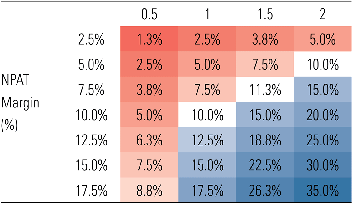
Source: Morningstar
To apply the data, the Exhibit 2 below shows our year one forecasts for the components of the return on equity for our best ideas. We can see returns for Resmed, ASX and Santos are driven by high margins, so here, our comfort around the ability for high margins to continue is critical. For A2 Milk and Ventia, capital efficiency, shown by asset turnover above two, is the key driver of attractive returns. AUB is an interesting case, benefiting from financial leverage despite having net cash. It shows the benefit of good leverage from free float.
Exhibit 2: Components of return on equity for our Best Ideas
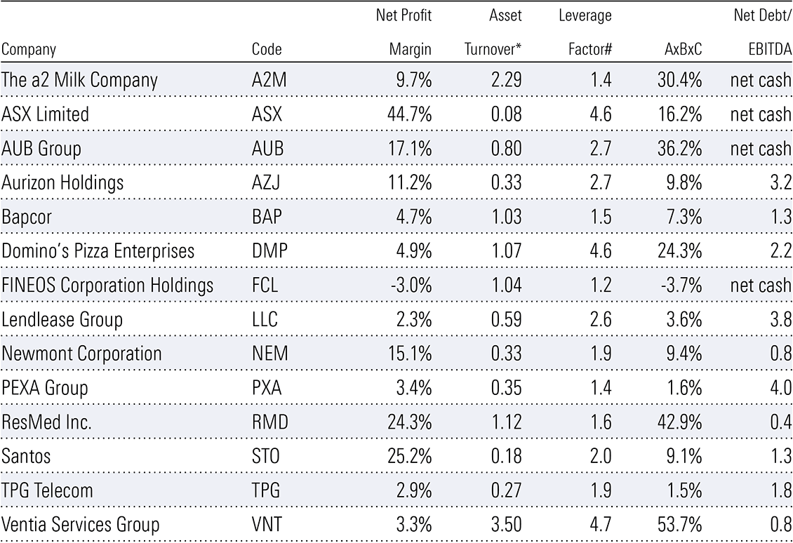
Source: Morningstar. * Excludes goodwill, cash and investments. # Total assets/shareholder equity.
Aurizon stands out with low asset turnover but generates solid returns on equity through leverage from debt. In this case, financial leverage is reasonable given the reliable underlying contracted revenues. Some businesses, such as TPG and Fineos, are underearning now. The product of net profit margins and asset turnover looks poor. But for these two we expect revenue growth and fixed cost leverage to expand margins and profits.
Inflation is trending lower, and central banks seem eager to cut interest rates. The stock market moves quickly, and interest rate-sensitive stocks like REITs, financials, and consumer cyclicals have rallied strongly in the past six months. This trend could continue for a while, and we still see plenty of value in good-quality stocks in these sectors. However, there is a significant risk that inflation will pick up again as it has in prior decades. While higher interest rates associated with the post-covid-19 burst of inflation were the leading cause of the 2023 stock market correction, stocks can do well in inflationary periods, particularly companies with strong pricing power and reasonable financial leverage.
Plenty of factors are at play that could lift prices for goods and services. Lower interest rates, or even hopes of lower interest rates, will likely spur pent-up consumer demand here and abroad. Western companies are shifting their manufacturing away from China towards friendlier nations, incurring additional costs. Container freight rates are rising again as demand recovery meets limited idle ship capacity, combined with geopolitical risks in certain areas. According to Trading Economics, the Containerized Freight Index, which tracks the cost of shipping containers on major routes, has increased 160% in the past year.
Immigration to Australia is forecast to remain high, which is a nightmare for renters, given residential vacancy rates are already very low. The immense investment needed from the private sector and the government for the renewable energy transition, highlighted again by the recent Federal Budget, will likely keep upward pressure on skilled labour and components. Base metal prices, which are useful in the global renewables transition, like copper, nickel, zinc, and manganese, are rising strongly. Government spending on social programs like the National Disability Insurance Scheme shows no sign of abating. And sadly, global conflict is rising, which can be highly inflationary as resources and people are used for destructive purposes.
However, a return of high inflation wouldn’t necessarily be bad for stocks. If we look at the 1970s (using United States data because of difficulty sourcing reliable Australian data), the initial wave of inflation caused the stock market to fall sharply in 1974. The market recovered a year later as inflation waned, dipping briefly when the second wave of inflation started before generally moving higher for the rest of the decade despite ongoing inflation (Exhibit 1). The stock market rally continued until the early 1980s, when high interest rates eventually triggered a recession.
Exhibit 1: Stocks fared relatively well in the second wave of inflation in the 1970s
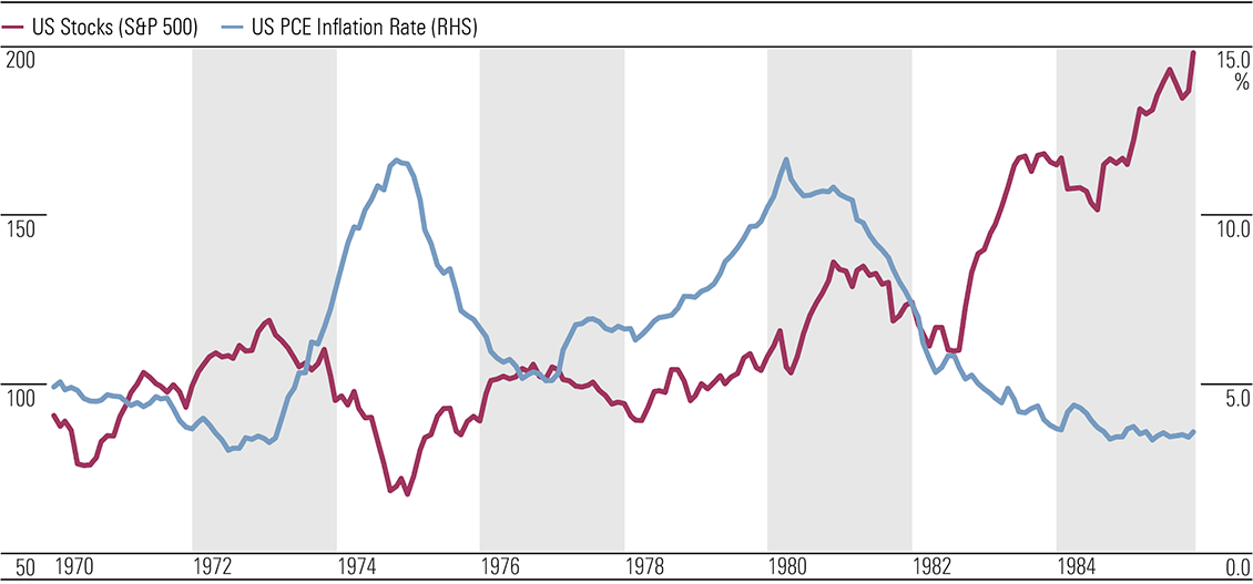
Source: Bureau of Economic Analysis, Standard & Poor’s, Haver Analytics.
If we experience a re-emergence of high inflation, the best-performing stocks would likely be those with economic moats, whose profits are more likely to keep up with inflation, and those with manageable debt levels that won’t be crushed if interest rates rise materially. Commodity producers, including precious and base metal miners and energy companies, could also do well.
Bonds, on the other hand, performed poorly throughout most of the 1970s. Exhibit 2 shows bond yields, which move inversely to prices, rising in the first wave of inflation and spiking higher in the second. A similar outcome is possible if a second wave of inflation hits this decade, with long-dated fixed-rate debt most at risk.
Exhibit 2: Bonds underperformed in the 1970s (rising bond yields means falling bond prices) (%)
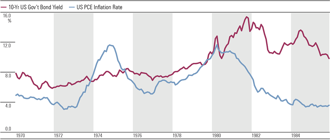
Source: Bureau of Economic Analysis, US Treasury, Haver Analytics.
It’s not just inflation that could undermine bond values. Demand and supply could also play a part. Elevated government spending and refinancing existing heavy debt loads across most of the Western world should keep the bond supply high. At the same time, demand from some buyers appears to have disappeared. The US seized about USD 300 billion in Russian foreign assets (state and private property held in the West) when it invaded Ukraine in early 2022. Regardless of whether the confiscation of assets was morally justified, the unintended consequence is that nations that are not fully aligned with the US, like Russia and China, are likely now reluctant to buy Western assets. This is particularly true for government bonds, which can be easily confiscated and help fund a potential military adversary. China’s ownership share of US Treasury Securities has fallen sharply since early 2022 (Exhibit 3), with friendlier nations, including the United Kingdom and Canada, making up the difference for now. China’s central bank and those in Russia, Turkey, and India, among others, are increasing exposure to gold bullion and other assets instead.
Exhibit 3: China steadily reduces exposure to us government bonds (treasury holdings as a percentage of total) (%)
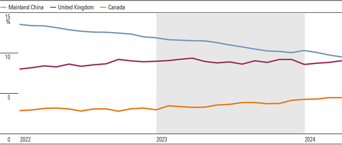
Source: US Treasury. Data as of April 30, 2024.
Currently, developed market central banks are draining the liquidity they pumped into the financial system in 2020 with quantitative easing (printing money to buy government bonds). With governments unlikely to cut spending materially and reduced appetite for bonds from China et al, central banks may be forced to resort to quantitative easing again, with potentially positive implications for stock markets and inflation. (Exhibit 4)
Exhibit 4: US Federal Reserve balance sheet shrinking for now
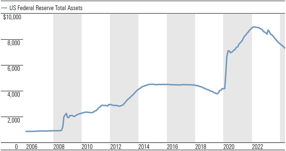
Source: Federal Reserve Bank of St. Louis. Data as of May 15, 2024.
The often-missed case for direct equities to hedge tail risks
In poker, strong players typically target the weakest at the table to build up their war chests before taking on more skilled opponents. Thus, the old poker proverb “If you’ve been at the table for 10 minutes and don’t know who the patsy is, it’s you.” The best strategy in this position is probably to quit before losses mount. To paraphrase, if you don’t know who will bail out the financial system in the next global financial crisis, it’s probably you.
After governments were forced to bail out the financial system during the 2009 global financial crisis, the Bank for International Settlements guided Western world governments to pass the onus of saving banks onto their unsecured creditors, including certain lenders, depositors, and other customers. This is known as a bail-in, rather than a bail-out, where the government rescues banks with taxpayer money. Provisions for bail-ins were introduced in the Dodd-Frank Act in the US in 2010 and were mirrored in Canada, Europe, the UK, Australia, and New Zealand, among others. In Australia, bail-ins were introduced in the 2017 Crisis Resolution bill.
With strong domestic banks and a government guarantee on deposits less than AUD 250,000 (the guarantee must be activated at the government’s discretion to apply), we can feel reasonably comfortable with our savings.
However, you may have more exposure to bail-ins than you think. The assets of pretty much every exchange-traded fund and managed fund are held by custodians, which are typically subsidiaries of US and European investment banks. In other words, the investment banks have legal ownership of the underlying shares and other assets of these funds, and in bankruptcy of the investment bank, the assets will likely be seized and divvied up between all creditors, starting with the most senior. It’s impossible to quantify likely losses for investors as there have been limited examples since bail-in laws were introduced, and each case will be different. However, customers in the Bank of Cyprus lost nearly half their uninsured deposits when it got into financial difficulty in 2013.
Some funds try to sidestep this counterparty risk with segregated accounts that are not supposed to be available to creditors in the event of the custodian’s insolvency. But it’s unclear if these will work in practice, given that bankruptcies are messy, desperate management may co-mingle funds, and these segregated accounts contravene the government’s bail-in plans, leaving them on the hook once more.
In the 2009 global financial crisis, governments allowed a few of the riskiest investment banks to go bust, then stepped in to stop contagion caused by immense derivative exposures between the banks. Without the same level of government support, the next banking crisis could be more widespread, having severe ramifications for deposits, ETFs, and managed funds. That doesn’t mean buying ETFs and managed funds is a bad idea. All investments carry risks. But it’s best not to have too much exposure to one risk type—in this case, counterparty risk.
If you don’t want the risk of having your investments taken to recapitalize global investment banks, direct equities are a better bet. In contrast to ETFs and managed funds, you are the legal owner of CHESS-sponsored and issuer-sponsored shares (but not broker-sponsored shares, where the stockbroker has legal ownership). Legal ownership, without a margin loan, should ensure your shares remain yours. We think a diversified portfolio of good-quality, lower-risk, Australian CHESS or issuer-sponsored shares is one of the better ways to protect and increase your wealth over the long term.
The Australian government’s medium-term economic outlook is muted and becoming more cautious. Forecast gross domestic product growth of 2.0% in fiscal 2025 is below the previous forecast of 2.25%. Although still an improvement on fiscal 2024 at 1.75%, it sits firmly below trend. In this environment, we anticipate equities with exposure to the Australian economy will experience modest revenue growth, on average. Against this backdrop, valuations of some sectors look stretched; others appear reasonably priced. For instance, we view the Australian discretionary retailing sector as overvalued on average. Moderate sales growth, while an improvement on fiscal 2024, will likely be offset by wage hikes and discounting. Much better value can be found in consumer staples. Wide-moat Endeavour is trading at an attractive discount to our fair value estimate. (Exhibit 1)
Exhibit 1: GDP forecast revisions point to slightly less revenue growth potential
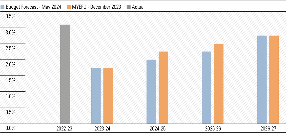
Source: The Commonwealth of Australia
Notes: MYEFO: Mid-Year Economic and Fiscal Outlook. Real GDP growth on preceding year.
Household consumption is the key swing factor for GDP growth
Higher saving rates are a potential headwind to economic growth. Weak consumer sentiment could entice households to save a larger share of the substantial lift in disposable incomes coming our way in fiscal 2025 (Exhibit 3). Australia’s savings rate is unusually low compared with the average in the lead-up to the pandemic, at around 3% compared with 7%, respectively. Every percentage point increase in the savings rate detracts a percentage point from household consumption and would shave over half a percentage point from GDP growth, according to our estimates. Given the significant difference between current and past savings rates, more frugal households could significantly dampen GDP growth.
However, a slower economy could trigger a more aggressive loosening of monetary policy. Presently, money markets only price 0.4% of rate cuts by July 2025, having tapered their more dovish stance on a run of stronger economic data. However, this leaves some upsides if rates come down faster than expected, increasing disposable incomes, and boosting consumer sentiment.
The surprise handout isn’t going to stoke inflation
The Budget flags inflation as a substantial risk: “Inflation could also be more persistent, which would further weigh on household budgets.” However, the government has only modestly revised its inflation forecasts over the three years to fiscal 2027 (Exhibit 2). And it’s still expecting inflation to return within the Reserve Bank of Australia’s target of 2%-3% by the June quarter of 2025.
Exhibit 2: Inflation a little stickier midterm
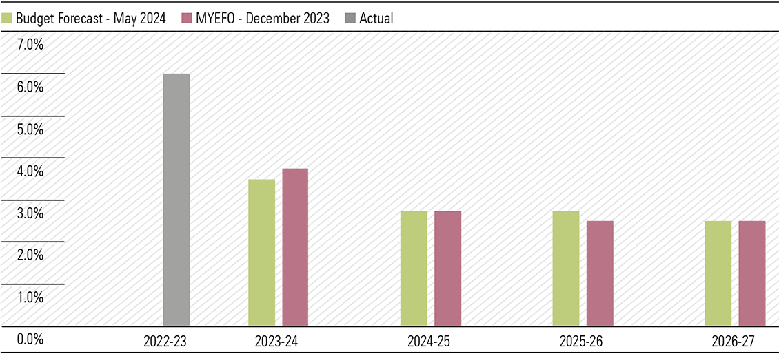
Source: The Commonwealth of Australia
Notes: MYEFO: Mid-Year Economic and Fiscal Outlook. The Consumer Price Index is through-the-year growth to the June quarter.
While we don’t consider the Budget inflationary, we wouldn’t call it “inflation-fighting” either. We anticipate subsidies for energy bills and rents will free up money for other purchases, increasing the demand for goods elsewhere and, hence, the prices of those goods.
Most policies in the Budget were already announced before Budget night. Still, we were genuinely surprised by the AUD 3.5 billion “cash splash” to all Australian households in fiscal 2025 and fiscal 2026 in the form of a AUD 300 energy bill rebate. This is a significant figure indeed. But in the context of AUD 1.4 trillion in annual household consumption, an incremental 0.2% is a minor driver of next year’s spending—and assumes the entire subsidy is spent. The far more significant measure is the long-coming income tax cuts, lifting collective incomes by 1.7%. (Exhibit 3)
Exhibit 3: Wages are the main driver of consumption growth
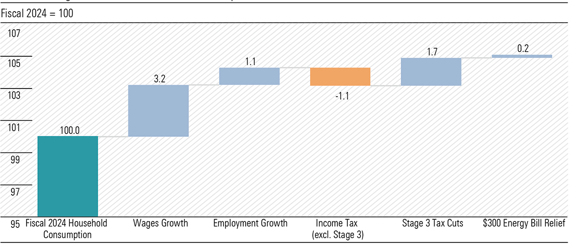
Source: Australian Bureau of Statistics, Reserve Bank of Australia, The Commonwealth of Australia, Morningstar. *Based on Reserve Bank of Australia Forecasts
Budget implications for healthcare stocks
Key Budget announcements affecting our healthcare coverage pertain to diagnostic providers: Sonic Healthcare, Healius, Australian Clinical Labs, and Integral Diagnostics. Overall, the Budget affirms our outlook for the industry. Increased government funding in pathology will help support practices to offset inflationary pressures. Our special report, “Pathology Providers Are Down but Not Out,” published on May 13, 2024, delves deeper into this undervalued industry.
About 50% of the pathology schedule by revenue is resuming indexation from July 1, 2025. While we had assumed a 50% likelihood of indexation resuming for the entire pathology schedule, the net outcome is very similar, and we maintain our earnings estimates. These items, including haematology, immunology, tissue pathology, cytopathology, and infertility and pregnancy tests, have not been indexed for over 24 years, which means significant relief in providing labour-intensive pathology services. Importantly, the only pathology items that will remain frozen are in chemical, microbiology, and genetics, which are generally higher-margin and benefit more from automation and economies of scale or essentially consist of newer services and technologies, whose costs are decreasing over time.
The future for gas in Australia
The pandemic exposed the fragility of global supply chains and revealed Australia’s dependence on imported goods. This Budget attempts to rebuild Australia’s industrial base, taking out an insurance policy against another shock to global trade.
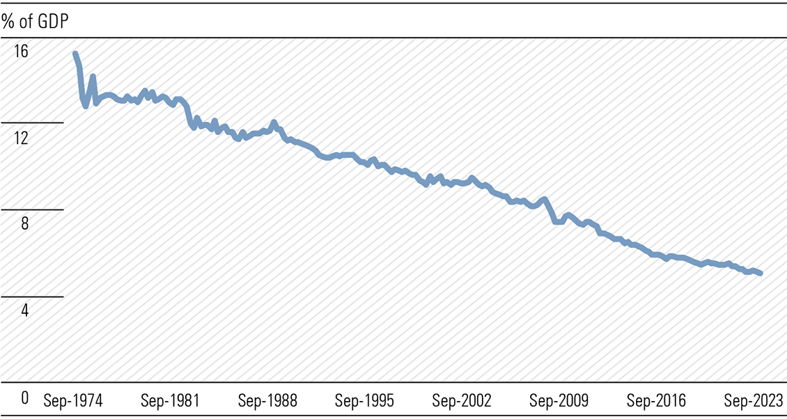
However, Australia needs to be cost-competitive to reverse the secular decline in domestic manufacturing (Exhibit 4) and build an industry capable of sustaining itself without government support.
Exhibit 4: Turning around the manufacturing decline will be a big task
Source: Australian Bureau of Statistics, Morningstar.
One cost that has been a thorn in the side of manufacturers for decades is the cost of gas. Data from the Australian Bureau of Statistics shows that while prices received for wholesale manufactured goods have doubled since 2000, the price manufacturers pay for natural gas has tripled (Exhibit 5). Much of this can be attributed to the launch of the East Coast LNG export market in 2015, which brought export parity. Before this, wholesale gas was much more affordable.
Exhibit 5: Affordable energy is key to competitive manufacturing (Mar 2000 = 100)
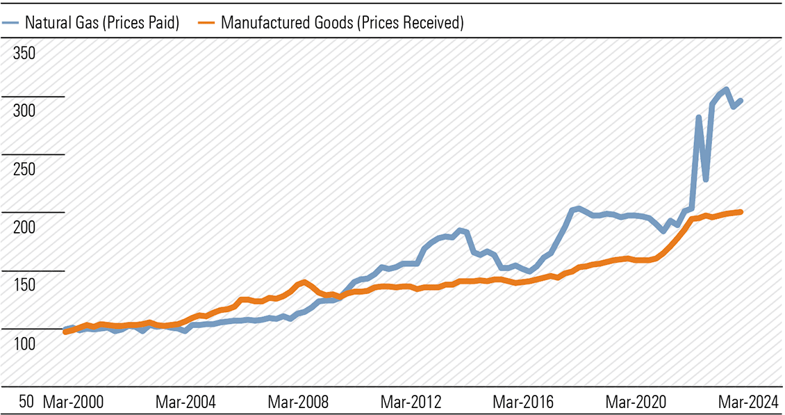
Source: Australian Bureau of Statistics, Morningstar
The Future Gas Strategy, published in the lead-up to the Budget, aims to encourage new gas supply and ensure it remains affordable during the energy transition. The strategy embeds gas in Australia’s energy mix until at least 2050. While any 30-year roadmap should be assessed with a degree of caution, this makes the government’s position on gas a little clearer, reducing some of the political uncertainty surrounding the future of the industry.
For investors looking for exposure to this theme, Santos and Woodside are the cheapest energy names in our coverage.
Support for critical minerals
The government will spend around AUD 9 billion over the next decade on Australia’s critical minerals sector. This includes grants and loans, and certain downstream producers of critical minerals will be eligible for a 10% tax credit on production costs, valued at around AUD 7 billion. While the dollar value of the stimulus is meaningful, we think the true value of the package lies in its symbolism—this government is committing to the future of Australia’s critical minerals industry. (Exhibit 6)
Exhibit 6: Government expects critical minerals will become an increasingly important export (quarterly export values, AUD billions)
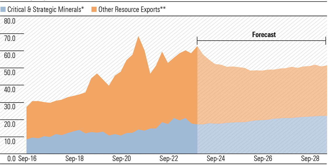
Source: Department of Industry, Science and Resources, Morningstar.
*includes aluminium, copper, nickel, lithium, zinc. **excluding energy and coal
No-moat Illuka Resources, trading at an attractive discount to our fair value estimate, will likely qualify for the production tax credit when its proposed Eneabba rare earths refinery is up and running. Outside of rare earths, Iluka also produces zircon and titanium dioxide. We see significant supply challenges for zircon and high-grade titanium dioxide feedstocks in the long term, given declining grades at existing mines and a general lack of investment in new mines. This bodes well for Iluka when demand recovers, as we think it will in the future. Its strong balance sheet—net cash was about AUD 230 million at the end of December 2023—gives us confidence it can ride out the cyclical downturn.
Imagine a multi-asset fund manager listed on the ASX. It’s been successful for decades by mostly investing in Australian equities, bonds and listed property/infrastructure, and that success had resulted in it gathering a large amount of funds under management. They start to gradually diversify into other assets such as overseas and unlisted investments. Then, they announce that they’re going to move much more aggressively into these newer areas. They say it will not only help with diversification but also prospective returns.
What would happen to the share price of this fund manager? As a best guess, the market would look sceptically at the announcement, and analysts would ask hard questions about the move to diversify beyond the manager’s core competencies. There’d also be queries about the risks involved given the poor track record of Australian companies which have ventured overseas.
While the above example is simplistic, the strategy of this fictional multi-asset manager is analogous to that of many of our large super funds. Yet, there’s been barely any questions asked about how the size of the super funds is essentially forcing them to diversify further into alternative and international assets, and the risks that this entails.
To infinity, and beyond
First, let’s put the size of our super funds into perspective.
New figures from APRA this week show that superannuation assets will soon hit $4 trillion. In the year to March, total super assets increased 11% from $3.46 trillion to $3.85 trillion. Over the past decade, super assets have approximately doubled.
The industry superannuation funds’ share of assets continues to grow, reaching 35% at end-March, with corporate funds being the main losers and SMSFs holding steady.
Australia’s pension assets are the fourth largest in the world. Super assets are now 145% of total GDP, compared to 108% a decade ago – the fastest growth versus GDP of any country.
Residential property is still the largest asset in Australia by far, at more than $10 trillion, or 2.6x the size of super funds.
However, Deloitte projects that super assets will grow to about $11 trillion by 2043, or close to 200% of Australia’s GDP.
Total superannuation assets
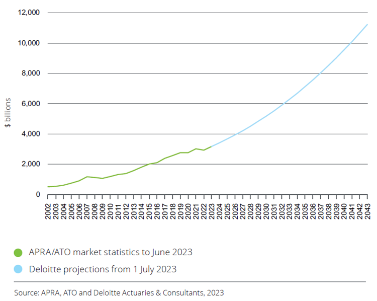
Superannuation assets as a proportion of nominal GDP
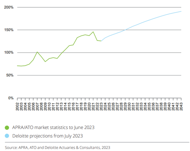
A recent KPMG report suggests that super funds are about to be hit by a wave of Baby Boomer outflows, yet this is likely a significant overreaction. It’s true that some of the large retail super funds are experiencing net outflows as their clients withdraw money. However, industry super giants are still growing strong. Net-net, super assets are expected to still increase significantly in coming decades.
Size is already creating challenges for super funds. These funds have always had a lot of equities exposure – initially primarily in Australia, though now more internationally.
Super fund allocation to equities
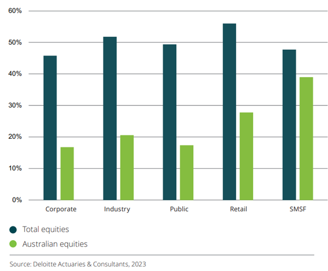
The reason for having greater holdings in international stocks is not only to get exposure to sectors and returns that Australia may not offer, but also because the super funds are simply getting too big for the Australian share market.
Deloitte estimates that investments by super funds were 34% of the total market capitalization of the ASX. And it expects that share will grow to almost 50% by 2043.
Proportion of ASX market capitalization represented by super funds
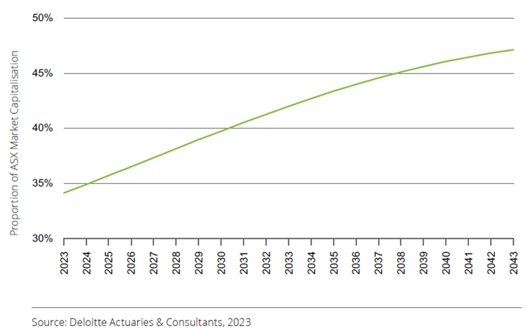
Super funds’ diversification beyond Australia has accelerated of late. NAB’s Super Insights Report suggests that allocations to offshore investments by funds rose to 47.8% in 2023, up from 46.8% in 2021, and 41% in 2019.
The funds have also been diversifying into unlisted assets, which now account for about 20% of total industry allocations.
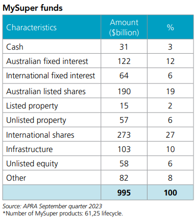
Maintaining domestic allocations “not practical”
Australian Retirement Trust’s Head of Investment Strategy, Andrew Fisher, had some fascinating things to say about the challenges faced by mega funds at the Morningstar Investor Conference in Sydney last week. He said it’s “not going to be practical” for the larger funds to continue to maintain the current level of domestic allocations.
“I’d be lying if I said $280 billion of assets to invest is not a challenging task at times”, he said.
“It is a lot of money and we’re forecast to go to $500 billion by the end of the decade, those are the internal numbers we’re dealing with.
“Realistically, it’s not going to be practical for us to continue to maintain the level of domestic allocations, particularly listed market equity allocations that we have.”
It’s not just an equities issue. With Australia being one of the first countries to privatise infrastructure, locating opportunities in the domestic market has become more challenging, according to Fisher.
“The market is finding new and innovative ways to create infrastructure – digital infrastructure is quite popular now – but realistically, there’s some underdeveloped markets offshore where we’re likely to see better opportunities,” he said.
Fisher suggested that the fund still holds a “strong preference” for domestic investment where possible.
“Our members are Australians, their liabilities are linked to Australian inflation, and the best protection against that is investments in the domestic economy.
“We certainly will be strongly committed to investing domestically, but there is an inevitability with scale that we’re going to have to increasingly move offshore, and also an inevitability with being one of the first mover countries in the infrastructure space – there’s only so much infrastructure that can be sold,” he remarked.
It explains why Australian Retirement Trust opened its first overseas office in London in mid-March.
On the same panel as Fisher at the Morningstar conference, UniSuper’s Head of Private Markets, Sandra Lee, said her fund had taken a different tack to investing internationally. Rather than launching an office overseas, UniSuper has chosen to partner with “high quality managers” operating globally.
Lee pointed to the “complexity in going overseas”, including currency hedging and finding a common language with a different team of co-investors.
Sizeable issues
There are two key challenges that size brings to Big Super. First, concerns returns. Consider Australian Retirement Trust mentioned above. It manages $280 billion. To get a 7% return, it needs to make $20 billion a year. If its funds increase to $500 billion by 2030 as they project, then they’ll need to make $35 billion. Earning that sort of money is far from easy.
Warren Buffett once said that “it’s a huge structural advantage not to have a lot of money.”
“Anyone who says that size does not hurt investment performance is selling. The highest rates of return I’ve ever achieved were in the 1950s. I killed the Dow. You ought to see the numbers,” he said.
Buffett isn’t lying. While he spoke of his hedge fund above, even the numbers from his listed company, Berkshire Hathaway, show that his outperformance has dwindled as Berkshire has become larger.
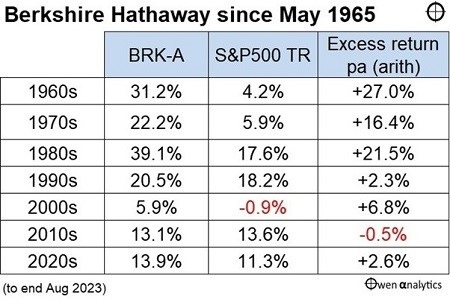
The other risk that size can bring is if diversification becomes ‘diworsification’. The core expertise of super funds has traditionally been in Australian listed stocks, bonds, and real estate. Deeper moves into international equities make sense though require a broader skillset.
The funds’ increasing exposure to unlisted assets also brings opportunities and risks. Yes, private assets are currently offering higher returns than stocks and bonds. The trade-off is that they’re illiquid and offer much less transparency.
You don’t have to look far to see the risks with unlisted assets. Whether it be current wrangling over Healthscope’s debt, the yo-yo valuations of Australian tech startup Canva as revealed by Franklin Templeton (though not by Australian super fund holders), and redemptions being frozen at several large private equity funds.
There’s plenty that the large super funds must deal with, and getting the rewards versus risks right will be a big task in the years ahead.
Graham Hand’s update last week, five months on from his cancer diagnosis, understandably struck a chord with readers. It wasn’t just his battle with brain cancer. It was also his revelations of struggling with not being able to work, and in some ways, of losing his personal identity.
It brought home that in debates about retirement or semi-retirement, there’s a lot of focus on the financial aspects: income, tax, estates, wills, superannuation, and the like. Less attention is paid to the psychological challenges of retirement, which can be even more demanding.
In response to Graham’s article, one subscriber helpfully pointed to a book addressing some of these challenges called, ‘The Four Phases of Retirement: What to Expect When You’re Retiring’ by Dr. Riley Moynes.
What are the four phases of retirement?
Moynes, a former educator and financial adviser, wrote the short book after his own struggles in retirement and subsequent interviews with other retirees.
He believes that there’s a predictable and identifiable pattern to retirement, and it involves four phases:
Phase one: vacation time
Moynes is Canadian so you’ll have to forgive his use of ‘vacation’ instead of holiday. Phase one, in the initial months and years of retirement, is like a holiday. You get to do the things that you wouldn’t normally do. You get to fulfill bucket list wishes, such as extended travel to places that you’ve always wanted to visit, like the south of France or Tuscany, or buying a new toy that you’ve always wanted, like a Porsche or boat.
At first, this phase is exciting. The unstructured time, being your own boss, and freedom. Yet, after a while, it can get boring and a little egocentric. Put simply, you overextend your holiday.
Moynes says you know when you’re in phase one when:
- You feel a sense of relief, exhilaration, and accomplishment about your just completed working career.
- You appreciate having no set routine for the moment.
- You are regularly making travel plans.
- You are serious about improving your golf/tennis/bowling game.
- You’re considering a ‘trophy’ purchase such as a sports car, sailboat, yacht, or a holiday property.
- You look forward to spending more time with your spouse.
- You look forward to spending more time at the holiday house or puttering around home.
Phase two: feeling loss and feeling lost
The move from phase one to phase two involves the stark realization that the life that you knew for decades no longer exists. Most people work for +40 years, climbing their way up the corporate/career ladder. They may achieve a certain level of success, responsibility, and even prestige. They may even have people report to them.
When retiring, by choice or circumstance, all of that suddenly disappears. The influence or power that you have at work, part of your identity, is gone. Moynes calls this the “plunge into the abyss of insignificance”.
Retirement not only impacts your identity but your routines and structures. Work imposes a routine and structure. Without it, you lose that, and the friendships that accompany work. It can make you feel alone and vulnerable.
And you must spend much more time at home with your spouse, which can have its challenges. I’ve noted in a previous article how research has revealed that the happiest retirees are women who get divorced between the ages of 60 and 65. On this, retirement researcher, Dr. Michael Finke, says:
“I think that relates to a problem that very often happens in a relationship when people retire. And that is that men tend to have a more limited social network and oftentimes that social network revolves around their work. And women tend to do a better job of investing in relationships that they can then draw from in retirement outside of the workplace. And so, what that means is that women oftentimes want to be able to maintain those relationships in retirement. Men all of a sudden become far more – in an opposite sex couple, they become far more reliant on their relationship with their wife. And the wife is often struggling to be able to manage her existing relationships and this perceived obligation that she has to her husband. And oftentimes they may not have developed the capabilities to spend all day with each other. They get married, and they see each other for breakfast and dinner, but not necessarily for lunch.”
In phase two, Moynes says you suffer five unavoidable losses:
- Structure
- Identity
- Relationships
- A sense of purpose
- A sense of power
Phase two can led to bouts of depression, alcoholism, family breakdown, anxiety, and other stressors.
Moynes notes there is a group of people (10-15%) where phase two is less of a problem. These people have created structure and meaning outside of work, and the transition to retirement is more seamless.
However, for most, suffering the five unavoidable losses can be traumatic. And you can either go into your shell or push forward.
Phase three: trial and error
This phase is about finding new meaning and purpose, and it often involves trialling different things to see what works.
Moynes recalls his own efforts, from considering going to law school, to undertaking courses in mediation, and helping his son out with his magazine business.
He says that you know when you’re in phase three when:
- You begin to ask yourself, “How can I still contribute?”
- You explore options that will allow you to make contributions and feel good about them.
- You commit to a specific venture.
- You are prepared to go back to the drawing board when your venture of choice doesn’t work out.
Phase four: reinvent and repurpose
Moynes says that not everyone reaches phase four. Some people stay in phase one where they are happy to satisfy their own needs – the ‘it’s about me’ phase – and there’s nothing wrong with that. Others don’t get through the struggles of phase two. Others reach phase three, yet when trialling different things doesn’t work out, they step back to phases two or one.
Moynes believes that it’s important for you to be able to identify which phase of retirement you’re in. And that when you reach phase three, it’s crucial to ask questions about what you want to get out of the next phase of life and what you want to become.
In Moynes’ experience, for those who are most successful in breaking through to phase four, it almost always involves some level of service to others. That can be via a volunteer role or offering services for a fee.
Moynes thinks that you need to look at your unique skills and experiences, and how they might be best used to help others. That can provide renewed purpose and a ‘sweet spot’ for retirement.
That conclusion might not come as a revelation. It’s the type of advice that you get during your working career. Yet things change, especially as you get older, and it may be worth following Moynes’ guidelines to make the most of your retirement.