
In his 2022 Berkshire Hathaway shareholder letter, Warren Buffett discussed the ‘secret sauce’ to investing, highlighting growing dividends at two of his long-term holdings: Coca-Cola (NYSE:KO) and American Express (NYSE:AXP).
Berkshire bought shares of Coke for a total cost of US$1.3 billion in 1994. The cash dividend that Berkshire received from Coke in that year was $75 million. By 2022, the Coke dividend paid to Berkshire was US$704 million.
Of this, Buffett said: “Growth occurred every year, just as certain as birthdays. All [business partner Charlie Munger] and I were required to do was cash Coke’s quarterly dividend checks. We expect that those checks are highly likely to grow.”
American Express has been a similar story. Berkshire completed the purchase of the company’s shares in 1995, also for US$1.3 billion. Annual dividends from Amex grew from US$41 million then to US$302 million in 2022.
The dividend growth from these companies has been incredible for both Berkshire and Buffett. The dividend from Coke grew 9.4x over the 28 years to 2022, at a compound annual growth rate (CAGR) of 8.3% per annum (p.a.).
The 2022 dividend from Coke represented an annual yield of 54% on Buffett’s original purchase price (it’s now 60%). In other words, for every dollar that Buffett invested in the company, he’s now getting 60 cents in annual dividends. In total, he’s received US$10.72 billion in dividend income, against a cost of US1.3 billion, and he’s used that dividend money to buy stakes in other businesses and shares through the years.
Likewise, American Express grew dividends by 7.4x over 27 years, at a CAGR of 7.7%. Buffett is now getting an annual dividend yield of 23% on his original purchase price.
The wrong conclusion to draw from this is that Buffett bought these companies for their dividends. He didn’t. Amazingly, Coke did offer close to a 6% yield in 1994 because Buffett bought it on the cheap. By contrast, his purchase of America Express was when the stock was on a yield of about 3.2%.
But Buffett purchased Coke and American Express because of their ability to grow earnings over the long term. The dividends were merely a by-product of the earnings growth. Without the earnings power of the companies, dividends wouldn’t have been able to increase at the clip they did.
Earnings drive dividends
An example can illustrate the point. Let’s take a stock called ‘Good Dividend Yield Corp’. The business has $100 dollars in equity, and it makes a reasonable return on that equity of 10%, resulting in $10 worth of profit. Of that profit, it pays out 50% as a dividend, equivalent to $5. It retains the remaining $5 in earnings for reinvestment in the business.
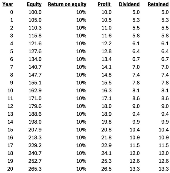
Figure 1: Growth of profits and dividends in ‘Good Dividend Corp’. Source: Author
I buy this stock for $100. That equates to a price-to-earnings (PE) ratio of 10x and a dividend yield of 5%.
By year 20, the company has increased profits to $26.50 from $10. Dividends are up from $5 to $13.30, at a CAGR of 5%. By year 20, the annual dividend yield at cost for the business is 13.3%.
If the shares trade at a similar PE ratio of 10x, they would be worth $265.50 in year 20. That would equate to a share price return of 5% p.a. ex-dividends. Not too bad.
Let’s now look at another company called ‘Faster Growing Corp’. This business has $100 in shareholders equity but earns a better return on equity of 18%, resulting in net profit of $18. Of that profit, it pays out 50% as dividends, equating to $9. It retains the remaining $9 in earnings for reinvestment in the business.
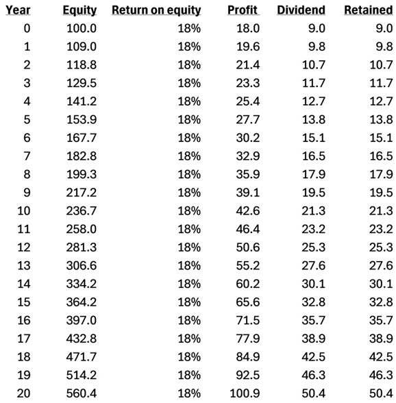
Figure 2: Growth of profits and dividends in ‘Faster Growing Corp’. Source: Author
I buy this stock for $350. That puts it on a PE ratio of 19.4x – not cheap but probably fair given the growth in the company. The dividend yield is 2.6%, lower than I’d like.
By the end of year 20, ‘Faster Growing Corp’ has increased profits to $101 from $18, up 5.6x, at a CAGR of 9%. Dividends have followed suit, growing from $9 to $50.40 over the same period, also a 9% CAGR.
By year 20, the annual dividend yield at cost for the business is 14.4%. In other words, though ‘Faster Growing Corp’ had a dividend yield about half that of ‘Good Dividend Yield Corp’ in year 0, the yield at cost for the former had risen to more than latter by year 20.
That’s not the full story, though. If we assume the same PE ratio for ‘Company B’ of 19.4x at year 20, the stock price would be $1,941, up from $350 at initial purchase, equivalent to a return of 9% p.a. ex-dividends.
By the end of year 20, ‘Company B’ has a higher dividend yield at cost, a faster growing dividend, all the while having achieved a higher total return over the preceding period.
The lesson is that earnings drive dividends. You want to own businesses that can grow earnings over the long term and pay out a portion of those growing earnings as dividends over time. By doing this, you stand a chance of being in the enviable position that Buffett is with Coke and American Express.
Another way to maximise dividend income
The other overlooked aspect of dividend investing is the importance of reinvesting dividends.
Now, the great Warren Buffett doesn’t reinvest the dividends from his stock holdings. That’s because he takes that money to invest in other businesses which he thinks can offer even better returns.
I’d suggest that you don’t follow Buffett’s example here. Buffett is an exceptional investor and that’s why he does what he does.
For mere mortals, if you find a good company that can sustainably grow earnings and dividends over time, it’s best to reinvest the dividends. That way, you get to fully enjoy the fruits of compounding returns from the business.
Of course, it’s not always possible to reinvest all cash dividends. Some investors are on high tax rates that can cut into dividends. Others must take dividends out for everyday expenses.
Like everything, much depends on your personal circumstances. As a general rule, though, reinvesting dividends in a great business is a sound long-term strategy.
We’re almost halfway through February 2025 reporting season. We cover almost 180 stocks set to report this month, and 73 results are out at the time of writing. There’s still a way to go, but we’re beginning to get a handle on how Australia’s biggest companies—and by extension, the broader economy—fared in the latter part of 2024. Let’s dive into the big results and key themes that caught our eye.
The numbers
As of Wednesday 19th, we’ve upgraded our fair value estimate for 29 companies, or 40% of those that have reported thus far. The average upgrade has been 5%. We’ve left our fair value estimate unchanged for 41 companies and made only three fair value downgrades.
What does this tell us? Well, for context, our fair value estimate is a long-term valuation for a business, based on our discounted cash flow model. Our analysts make assumptions about a company and its industry to forecast future cash flows. Recognising that a dollar today is worth more than a dollar tomorrow—the ‘time value of money’—we discount these cash flows to the present and add them together. This gives us a fair value estimate. If we increase our fair value estimate, the sum of all cash flows we expect the business to generate in the future, discounted to today, is greater now than before.
An average upgrade of 5%, across 40% of companies that have reported so far, is a touch stronger than recent reporting seasons (in August 2024, February 2024, and August 2023, we upgraded roughly a third of companies). Keep in mind, however, this doesn’t necessarily mean the absolute level of earnings was higher than previous reporting periods— it just means things are tracking better relative to our expectations.
I’d call this a positive start, but with the caveat that half our coverage is yet to report. Our take is at odds with the market reaction—the benchmark ASX 200 is off around 2% since the start of Feb—but perhaps this reflects extended market valuations coming into reporting season.
With that, onto the big themes.
The big themes
Office property stabilising
The dawn of ‘work from home’ hit office property hard and stock prices across the sector remain well below pre-pandemic peaks. But, as outlined in the last issue of Your Money Weekly, we expect conditions to stabilise. Now that the three major office landlords we cover—Dexus (ASX:DXS), Mirvac (ASX:MGR), and GPT Group (ASX:GPT)—have reported, what did we learn?
Firstly, capitalisation rates, used by appraisers to discount rental cash flows, are rising at a much slower pace. Cap rates have an inverse relationship with valuations, so this slowdown suggests the worst of the devaluation losses are behind us. Dexus, a bellwether for the industry, saw its office cap rate lift a mere 12 basis points between June and December 2024, to 6.17%. That compares to a 52-basis point increase in the six months ending June 2024.
Leasing incentives, which jumped during covid as landlords attempted to attract and retain tenants, are also moderating. Dexus is now offering an average incentive equal to 26% of gross rents, down from 28% six months ago. And pleasingly, occupancy is holding up. While we think there is downside risk in the second half of the fiscal year, we forecast improving conditions from fiscal 2026 as the trend of ‘flight to quality, and flight to better locations and amenities’ continues to play out.
While the market reaction to the landlords’ results was broadly positive, shares still look undervalued. You can find our full analysis for Dexus on page 23, for Mirvac on page 37, and for GPT on page 27.
Cracks appear, but bank shares still defy gravity
Accounting for a fifth of the benchmark ASX 200 index, major bank results are rightly of interest to investors. Commonwealth Bank (ASX:CBA) was the first cab off the rank. As discussed last week, the result was a touch better than we expected, due to stronger revenue growth and lower bad debt expenses, albeit partially offset by higher costs.
There’s a lot baked into CBA shares, which trade on a forward P/E ratio above 25, dividend yield of 3%, and price/book of above 3.5 times. It’s hard to square this against a modest outlook for earnings—a five-year CAGR of 6%, on our forecasts. A premium to peers is warranted given the strength of its moat—lower cost of funding and better operating efficiency—but the gap is extreme. Still, last week’s result wasn’t enough to unsettle investors, who’ve pushed CBA’s share price almost 60% above fair value.
Westpac (ASX:WBC) didn’t fare so well in the eye of the market. We thought the bank posted a reasonable first-quarter 2025 result, with a modestly lower net interest margin offset by robust loan growth. We upgraded our full year profit forecast by 3%, but the market was clearly expecting more. Westpac shares sold off roughly 5% on the day, though continue to screen as overvalued.
National Australia Bank (ASX:NAB) was also punished, its first quarter 2025 result met with an 8% sell down. We didn’t find too many surprises: rising loan impairments, which may have contributed to the correction, are not alarming from such a low base. It was a bit higher than the other majors, so perhaps the market is questioning the bank’s loan quality relative to peers. But loan impairments can be volatile from quarter to quarter, so we’re not reading too much into it. The 2% slip in profit compared with last year leaves the bank on track to hit our 4% full-year growth forecast, and we left our fair value intact.
The sell-down isn’t a calamity for NAB and Westpac investors, who sit on 12-month share price gains of 9% and 28% respectively. But it reveals a chink in the armor of major bank valuations, which, aside from ANZ Group (ASX:ANZ), have defied gravity for some time. It also reminds us of the danger of lofty expectations: not much needs to go wrong to suffer the market’s reprisal.
The consumer is bouncing back
On the topic of lofty expectations, we turn to JB Hi-Fi (ASX:JBH), another market darling up almost 50% in 12 months. With shares more than twice our fair value estimate, it’s the second most expensive Australian retailer we cover, behind high-flying Guzman y Gomez (ASX:GYG).
We were impressed with JB Hi-Fi’s first-half fiscal 2025 result. So much so that we upgraded our fair value estimate by 7%. Sales growth of 7% across its Australia segment is nothing to be sniffed at, especially when the electronic goods retailing industry grew only 3% over the period, according to the Australian Bureau of Statistics. The retailer is taking share, some of which likely comes from its biggest competitor, Harvey Norman (ASX:HVN) (reporting 28 February). But again, it wasn’t enough to satisfy the market, with shares down 5% on the day.
Results day may have been disappointing for JB Hi-Fi investors, but zooming out, we see a bigger message here. Look at the trajectory of JB Hi-Fi’s Australian sales growth: 0.8% in 1H24, 1.0% in 2H24 and now 7.2% in 1H25. It’s accelerating, and this suggests the consumer is bouncing back.
JB Hi-Fi isn’t the only retailer posting a rebound. Online pure plays Kogan (ASX:KGN) and Temple & Webster (ASX:TPW) both saw double-digit sales growth in the final half of 2024, as did youth-focussed apparel retailer Universal Store (ASX:UNI). Improving turnover bodes well not only for ASX-listed retailers, but for the broader economy, as household consumption accounts for roughly half of Australia’s GDP. Several big retailers are yet to report, but early signs are encouraging.
Keep in mind, though, we’re not expecting anything like the post-pandemic retail boom. That was fuelled by emergency monetary and fiscal policy settings, which are highly unlikely to repeat this time [Exhibit 1]. Nonetheless, we still expect above-average retailing growth in the next few years, providing long-awaited relief for a sector battling cost pressure from many sides: rent, utilities, and most significantly, labour. The RBA’s first rate cut on Tuesday, widely anticipated by the market, offers another pillar of support for this outlook.
Exhibit 1: We see green shoots across the Retail industry
Annual retail sales growth (historicals and Morningstar forecast)
Source: Australian Bureau of Statistics, Morningstar.
As 2025 unfolds, small-cap stocks are positioned to potentially add significant value to investors’ portfolios. Here are five compelling reasons why small caps can steal the spotlight this year.
Benefits from rate cuts
Small-cap companies often have a capital structure that is more sensitive to short-term interest-rate movements. After central banks cut rates, the debt servicing costs for these companies become less burdensome, potentially leading to better performance within the small-cap segment.
Exhibit 1: Domestic interest rates (%) versus Australian small-cap market returns
Source: Maple-Brown Abbott, Data as of Jan. 28, 2025.
The co-portfolio managers of the Maple-Brown Abbott Australian Small Fund rated Silver by our research team, Phillip Hudak and Matt Griffin, are saying “Historically, interest-rate cuts have resulted in subsequent positive performance at the smaller end of the domestic equity market.
Last year, the RBA was uncoordinated with other central banks, remaining more hawkish, given stickier domestic inflation, although have recently recast a more dovish tone with interest-rate cuts expected to commence in the first half of the 2025 calendar year with the market factoring in close to 0.75% reduction by year-end. This setup is expected to be supportive and renew investor interest for Australian small caps”.
Attractive valuations
Currently, small caps are trading at a substantial discount compared with their large-cap counterparts. Historically, such a discount has been a precursor to a significant price appreciation for small caps, especially if market sentiment changes positively.
Ned Bell, portfolio manager of the Bell Global Emerging Companies, rated Gold by our research team, said about the global small- and mid-cap companies “SMID Cap equities trade at a Price/Earning (P/E) of 16.4x versus 19.2x for the MSCI World Index. Over the last 10 years, SMID Cap equities have traded at a 5% premium to the broader market. In other words, if SMID cap valuations were to re-rate to historical norms, they would be trading on a P/E of 20.2x.”
Exceptional growth prospects
Projections indicate that small caps are set to experience significantly higher earnings growth than large caps in 2025. Faster growth means that these companies might offer more robust returns for investors chasing growth opportunities.
In the domestic market, “stocks like Hansen Technologies (ASX:HSN) might benefit from a favorable outlook at the smaller end of the market relative to large cap,” states Phillip Hudak. HSN offers critical billing and customer care solutions, with a strong recurring revenue base and high margins, benefiting from the energy transition and recent acquisition synergies. HSN generates strong cash flow, has a solid balance sheet for acquisitions, and trades at an unjustified discount to peers despite its defensive characteristics and growth prospects.
In the US, stocks like Clean Harbors (NYS:CLH) and Core & Main (NYS:CNM) have attracted the eyes of Ned Bell as “the opportunity set in the hazardous waste industry is attractive and growing as the number of incinerators declines and opportunities in PFAS* materialize, there is real scope for the company grow earnings by +50% over the next 2–3 years” and ” the largest standalone waterworks / fire protection distributor in the U.S. is expected to benefit from increases in water infrastructure and we can see scope for the earnings to grow by 15% p.a. for the next 3 years.”
Reshoring boost
In a shift of global trade dynamics, many large multinational corporations are now bringing their supply chains back to domestic shores. This “reshoring” trend is expected to benefit small caps predominantly operating in local markets. Additionally, this shift could spur mergers and acquisitions, or M&A, activities, with larger firms looking to acquire smaller businesses to capitalize on the benefits of reshoring.
Codan, or CDA, has been identified by Matt Griffin from Maple-Brown Abbott “Given ongoing heightened geopolitical tensions, de-globalisation, and onshoring of defence production and supply chains, we see increasing global defence spending as being a structural growth thematic. Codan Limited (ASX:CDA) is positively exposed to this theme via their expansion of communication services for military and emergency response. The company has a strong track record of innovation with sustained levels of engineering investment and has focused on expanding the product suite to grow the total addressable market, via widening the range of customers and industry verticals. In addition, the company is building more predictable and recurring revenue streams with the strategy being enhanced by aligned acquisitions, which offer enhanced scale, core business expansion, increased penetration in adjacent markets, and complement existing technology and market exposures.”
Advantages of market concentration
History has shown that following periods of heightened market concentration, small caps generally outperform. Given the current market climate, this trend could very well continue, rewarding those who invest in the smaller yet nimble players in the market.
In sum, 2025 could very well be the year small caps shine, offering opportunities for investors willing to embrace a bit of risk for potentially rewarding returns.
* Per- and polyfluoroalkyl substances are a group of synthetic chemicals that are resistant to heat, water, grease, and oil. They are also known as “forever chemicals” because they are difficult to break down.
Articulating your value proposition as an adviser is harder than ever due to changes in the industry that have advisers both racing to increase their breadth of services and compete against new technology. To stand out from the crowd, some advisers are exploring alternative fee and niche services structures, but others are taking a different approach and leaning more on unpacking clients’ life values.
What does a holistic “Know Your Client” approach look like? Below, we illustrate this style and why it works through research and firsthand testimonials.
How Does Values-Based Planning Help Advisers Differentiate Themselves?
Traditionally, advisers may ask clients if a plan reflects what’s important to them without first defining what this means for clients. This approach is problematic because most people don’t know what’s important to them. Therefore, advisers who have these conversations with clients may be helping them explore something they haven’t even addressed with their closest family members. As Todd Fithian of think-legacy.com puts it, “It’s an entirely different way to open relationships and help them build a vision of the future.” This difference means advisers who focus on life values can distinguish their service from others by getting to know their clients in a way other advisers don’t and building plans that reflect this insight.
What Do Values Bring to Financial Planning?
Our core (or life) values motivate us, guide our behaviors, and help us recognize what’s important. To illustrate, let’s turn to social psychologist Shalom H. Schwartz’s theory of 10 basic values—a framework designed to document values universally held by humans. One value is self-direction, which is being able to act independently and develop original ideas and opinions. A self-directed person may be motivated to pursue a freelancing role with the freedom to work autonomously.
Uncovering values takes time because we tend to take shortcuts when faced with big, demanding questions, so a structured process can help clients dig deeper into their values. Something like the PERMA + V framework, where clients are asked to reflect on six elements of well-being, can help clients uncover values they may initially miss. Though it might seem daunting to raise such personal topics, Jim Boyd of CANE Financial Group points out it can be fun and engaging for clients because “at the core, most humans want to learn more about themselves, and fundamentally we all want to be loved.”
Advisers add further value by helping clients craft goals that honor their values. There are no hard and fast rules for how goals should reflect values. For some, there is a direct connection to the goal—like relocating to a neighborhood with more outdoor space because health is valued. The relationship between other values and goals may be less apparent. For example, a client who values integrity might find themselves working at a company that doesn’t reflect their morals; therefore, they might develop the goal of starting a personal business that better reflects what they believe in.
Clients find value in working with an adviser who can bring their financial decisions and values in line with each other, as this isn’t something easy to do on their own. We are all familiar with that guilt we feel when we don’t exercise even when we want to. This stems from a disconnect between our behavior and our values—a psychological phenomenon known as cognitive dissonance. Clients may be uncomfortable with how their finances don’t align with their values, but without guidance, it can be difficult to resolve this disconnect. An adviser can help clients overcome this problem just as a personal trainer can help us stay committed to our exercise goals. Becky Gustafson of Eternal Wealth Partners finds centering values can take away the guilt in decision-making and give her clients peace of mind. For example, she says, “We have business owners who want to take care of people and leave a legacy beyond wealth, so they prioritize compensation and benefit planning and take a hit to the bottom line.” Furthermore, clients may be better able to stick to a financial plan that reflects their values when the going gets tough because there isn’t additional friction between their plan and their values.
Values-based goals also tend to be more stable because our values don’t often change. Even major events like the global financial crisis and the recent pandemic only had small effects on peoples’ values. To illustrate, US clients of advisers who used Legacy’s tool designed to help them identify their values showed no major changes in their overall top 10 values before and during the pandemic. “This is consistent with our experience—we didn’t see a lot of change in people’s values, but some values became more crystalized,” commented Fithian. Furthermore, refocusing clients on their values and goals can keep clients on track and avoid reacting to current noise.
Top 10 Investor Values During and Prior to the Pandemic
Top 10 values for US clients based on the percentage of clients who identify with that value from May 2018 to December 2022. Source: The Legacy Companies Qualitate(TM) application.
However, values-based planning does come with its own set of difficulties. Some clients may be overly focused on the technical side of planning and not understand the value such an approach brings. These clients might not be the right fit for a values-based adviser. Even receptive clients might push back on in-depth discussion. Gustafson tells such clients to focus on the long-term gain, stating, “We’re embarking on a possible 20- to 30-year relationship … the time spent now will pay off in years to come.”
Advisers Who Lead With Values Will Have an Advantage
Incorporating value discussions into your engagement process requires more upfront investment. It’s hard, personal, and makes people feel vulnerable, but the payoff is the loyalty of a client for life and an opportunity to form real connections. It also gives advisers a clear human advantage over technology and advisers who just provide nuts-and-bolts financial advice.
Last week, we compared stock valuations in Australia to the rest of the world. The upshot? The local market is one of the most richly priced across Morningstar’s global coverage list, even eclipsing the overvalued US equity market.
This is not a call to sell all Aussie stocks. The ‘culprits’ skewing valuations are a handful of big, expensive companies. Think the major banks (excluding ANZ) and market darlings like Wesfarmers (ASX:WES) and Goodman Group (ASX:GMG) . We still see many opportunities across our Australian coverage, some of which we will explore below.
Nonetheless, when the market departs meaningfully from our estimate of fair value, it’s worth asking questions. This week, I’ll tackle two. First, how does today’s premium compare to valuations in the past? And second, what might it tell us about future returns?
Today’s market in context
Our equity research database holds roughly fifteen years of ratings for ASX-listed stocks. During this time, we’ve seen all sorts of markets: a mining boom and bust, the rise of Trump, the US-China trade war, a war in Europe, a pandemic, an inflation surge, and so on. In short, we’ve got a reasonable sample against which to benchmark today’s market.
But first, how can we value the Australian stock market? There are many approaches an investor can take. For us, it starts with our individual stock ratings. Take Commonwealth Bank (ASX:CBA), for example. On Jan. 22, 2025, CBA closed at $158. Our fair value estimate for CBA, derived from our discounted cash flow model, is $95. Dividing the market price by the fair value gives us a price/fair value ratio of 1.66. Expressed another way, CBA trades at a 66% premium to fair value.
By market capitalisation, CBA is the largest company on the ASX, accounting for roughly 10% of the ASX 200 index. By multiplying CBA’s price/fair value with its index weighting, we can calculate CBA’s contribution to the total market valuation. If we repeat this for all the Australian stocks we cover (nearly 200) and sum these together, we get an aggregate price/fair value ratio for the Australian market.
I’ve plotted the aggregate price/fair value ratio for the ASX 200 index over the last ten years [Exhibit 1]. This is only a subsample of our total Australian equity coverage (we also cover stocks outside the ASX 200), but it should be fairly representative. As suspected, the chart suggests we are in unusual territory for Australian equities. Though today’s market isn’t completely unprecedented—we saw similar valuation during the frothy post-pandemic period.
Exhibit 1: Unusual territory for Australian equities
Market Cap Weighted Price/Fair Value, ASX 200 Index
Note: If a stock is not covered by a Morningstar analyst, the Morningstar Quantitative Equity Research Rating is used.
Source: Morningstar.
What do valuations suggest about future returns?
Howard Marks, co-founder of Oaktree Capital Management, recently published a fantastic memo. Marks is famous for, amongst other things, warning of bubble-like behaviour during the dot-com boom—right before it dramatically burst in the early 2000s. I won’t rehash the article here but highly encourage subscribers to take a look. It’s accessible on Oaktree’s website.
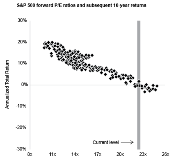
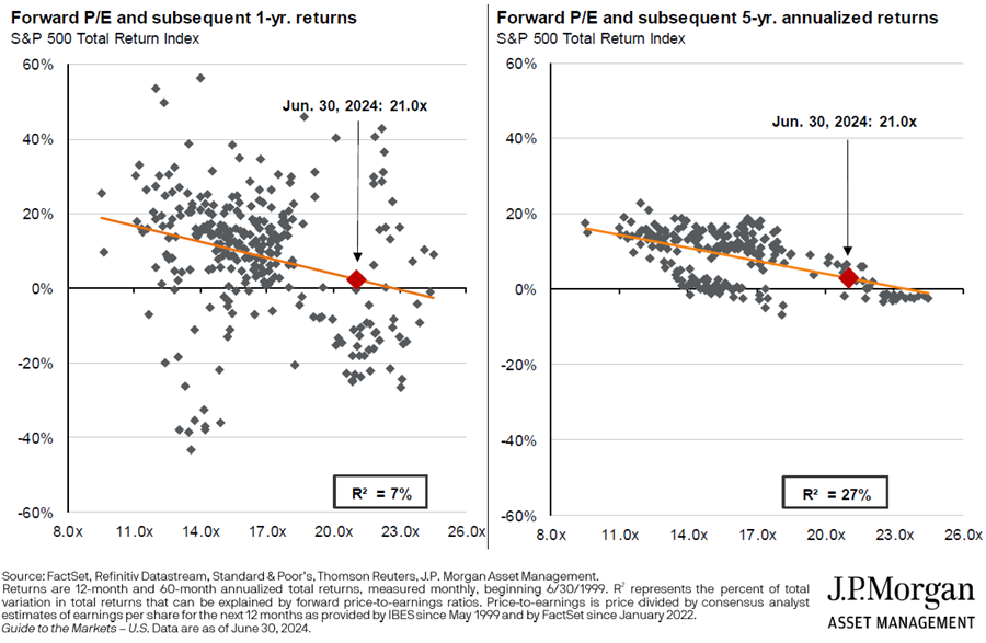
There are many gold nuggets in Marks’ note. But let’s home in on a particular chart from J.P. Morgan Asset Management [Exhibit 2]. On the vertical axis, we have the price/earnings ratio of the S&P 500 each month from 1988 to 2014. And on the horizontal axis, the annualised return of the S&P 500 in the ten years that followed. The relationship is remarkably consistent: the higher the price/earnings ratio, the lower the future returns. And, as the chart shows, US equities currently trade at an abnormally high multiple.
Exhibit 2: S&P 500 forward P/E ratios and subsequent 10-year returns
Source: JP Morgan Asset Management, as cited by Oaktree Capital Management.
Let’s run a similar experiment on the Australian market. But instead of price/earnings, we’ll use Morningstar’s proprietary price/fair value ratios. Because we have a shorter history of Morningstar ratings, I’ll plot valuations against three-year forward returns, rather than ten. [Exhibit 3]
Exhibit 3: ASX 200 price/fair value ratio and 3-year forward returns
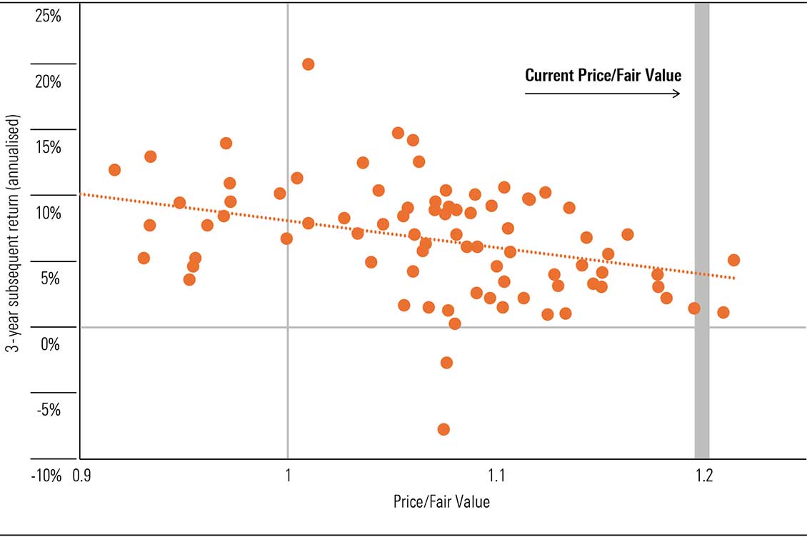
Source: Morningstar
What does the chart show? First, like the J.P. Morgan chart, it indicates a negative relationship between valuations and forward returns, at least during the last decade. To make it easier to see, I’ve drawn a line of best fit. Using this, we find today’s price/fair value ratio has historically been associated with returns of around 4% per year.
But this should not be interpreted as a forecast. For starters, the range of historical outcomes is vast. If we take the handful of examples when the market has traded at a similar level to today, we’ve seen annual returns above 5% and as low as 1%. Making any sort of forecast with such volatile data would be fraught. We also had a pandemic in the middle which created a big distortion.
But the chart suggests our ratings have historically provided a useful signal for stock returns. And if the next three years perfectly replicated the average outcome over the last decade (a heroic assumption), we could be in for returns of 4% per year. That’s below the historical average for the ASX, but whether it’s a fair return for taking on equity risk is up to the investor.
Where we see value amongst the large caps
While expensive large caps are the biggest contributor to our market’s overvaluation, this doesn’t mean we don’t see opportunities. In fact, five of the largest 20 stocks on the ASX trade below fair value: ANZ (ASX:ANZ), CSL Ltd (ASX:CSL), Santos (ASX:STO), Telstra (ASX:TLS), and Woodside (ASX:WDS). We’ll briefly touch on the last three. Subscribers can find further information on these stocks on morningstar.com.au.
Telstra
- Price/Fair Value: 0.88
- Star Rating: ★★★★
- Moat Rating: Narrow
- Uncertainty Rating: Medium
- Capital Allocation: Standard
Telstra is the leading telecommunications services provider in Australia. It has dominant market share in each service category and customer segment, and enjoys cost advantages which underpin its narrow moat rating.
While competition is robust, Telstra’s mobile market share is likely to prove resilient. Telstra’s infrastructure provides the most comprehensive coverage for fixed-line, mobile, and broadband in Australia which drives reliable cash flow. While it is not the cheapest provider of telecommunications services, it is the lowest-cost provider, resulting in EBITDA margins of over 30%.
Shares trade some 12% below our fair value estimate. In our view, a new strategy to improve ROIC, not just by cost-cutting but by adequate pricing and monetisation of the immense capital deployed, would help close the stock price discount.
Woodside
- Price/Fair Value: 0.61
- Star Rating: ★★★★★
- Moat Rating: None
- Uncertainty Rating: Medium
- Capital Allocation: Standard
Santos
- Price/Fair Value: 0.71
- Star Rating: ★★★★
- Moat Rating: None
- Uncertainty Rating: High
- Capital Allocation: Standard
Santos shares have fallen roughly 5% since mid-2023, while Woodside is down some 30%. Both have greatly underperformed the broader market. But the outlook for cash flows remains robust. Even though some think the end of hydrocarbons is nigh, oil and gas demand is growing.
Investors should be wary of calls for near-term peaks in oil demand. Historically, similar calls were based on improbable assumptions and proved wrong. And naturally declining supply means significant hydrocarbon investment is required in most demand scenarios.
Both companies trade on a materially lower multiple than global peers. Within a decade, we see Woodside shares heading toward $50, and Santos toward $15, under conservative assumptions.
Australian equities are richly priced. Trading 8% above fair value, our market ranks amongst the most expensive across Morningstar’s global coverage [Exhibit 1]. In fairness, this premium isn’t extreme by historical standards—we’ve seen valuations at these levels roughly 40% of the time during the past ten years. And opportunities remain, including stocks on our January 2025 Best Ideas list (see page 4). But the market looks more expensive than usual, particularly across the large caps, and paying more today means lower future returns.
Exhibit 1: Australia ranks amongst the most-expensive markets we cover
Premium/Discount-to-Fair-Value by region
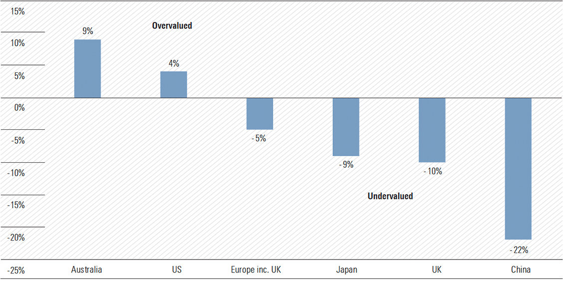
Source: Morningstar. Data as of 6 Jan. 2025. Europe inc. UK data as of 14 Jan. 2025.
Fortunately, investors are not constrained to our shores. The ASX is home to $121 billion of global equity exchange-traded products, roughly twice the size of domestic strategies. Despite this, Australian portfolios are still heavily skewed to the local market. State Street found domestic shares account for 44% of the average superannuation portfolio, even though Australia accounts for less than 2% of the global equity market. A familiarity with the local investing landscape, and the allure of franking credits, doubtless contributes to the home bias.
There’s no definitive answer on how much exposure an investor should have to the local market. But the average allocation seems high, and this comes into sharper focus when our market looks overpriced. So where might investors turn for diversification and better value?
The US
The world’s largest stock market is first to mind. Trading 4% above fair value, the premium is not as steep as Australia. But we’re in unusual territory for US equities. Since the end of 2010, the market has traded at a premium of 4% or more less than 10% of the time. The most recent example occurred in early 2021—right before the disruptive technology bubble popped. [Exhibit 2]
Exhibit 2: 2024 rally pushed the US stock market above fair value
Composite of Price/Fair-Value ratios for US stocks under Morningstar coverage.
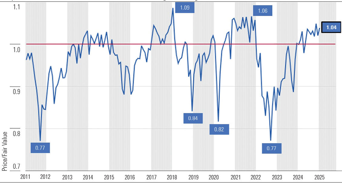
Source: Morningstar. Data as of Jan. 6, 2025.
That’s not to say devaluation is imminent. Markets can stay expensive for a while, and we might just be in for a period of lower returns until earnings catch up. But the tailwinds that propelled the market higher last year appear to be receding. Spending on artificial intelligence hardware is now increasing at a decreasing rate as opposed to increasing at an increasing rate. And as our US technology strategist points out, as the market comes to better understand the AI megatrend, the big, positive surprises like those of 2024 are less likely to repeat.
The US market trades at rich valuations despite significant macroeconomic and political uncertainty. Inflation is proving stubbornly persistent, the Fed has tempered the outlook for rate cuts, and while we’re not calling a recession, growth is slowing. We’re not so concerned about the upcoming fourth-quarter earnings season, as the US economy appears to have held up into year-end. But the management teams of companies we cover may lower the bar on expectations for earnings growth in 2025. This could unsettle markets, but bouts of volatility around earnings can create attractive entry points.
Trump is the big wild card. It remains to be seen how much of the tariff talk was just campaign trail rhetoric. We still don’t know when potential tariffs might be implemented, how big they might be, and what countries and products will be taxed. Our Chief US Economist thinks Trump’s two main tariff proposals—the 60% tariff on China, and the 10% universal tariff—are unlikely to come to pass, but the outlook is highly uncertain.
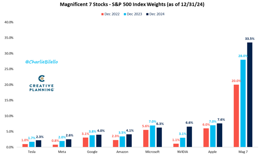
So where do we see value in US equities? Small and mid-cap stocks trade below fair value, while large caps generally look expensive. US growth stocks, particularly in the technology sector, have run hard. Ten stocks, including the Magnificent Seven, accounted for almost 60% of US equity market returns in 2024. But these stocks only account for 30% of US market capitalization. We think the outperformance is mostly behind us, and only two of the Magnificent 7—Alphabet, parent of Google, and Microsoft—screen as undervalued. But ‘value’ stocks—stable, mature businesses, with low debt levels and solid cash flows—remain attractively priced in general.
Asia
Value abounds across Asia’s equity markets, with stocks we cover at a discount of around 6%. China looks particularly undervalued, at a 22% discount, though this market has its challenges. Aging demographics, deleveraging, and weak consumer spending are core. Equity performance has been unimpressive in recent years, notwithstanding an ebullient reaction to stimulus measures announced in September 2024. Investors considering exposure to China should keep in mind the heightened regulatory, geopolitical, and economic risks.
Nonetheless, we are optimistic about the medium-term prospects for Chinese equities. We are encouraged by signs that the authorities are prioritizing policy support to shore up the economy and expect stimulus measures to continue evolving in the year ahead. A more benign regulatory backdrop compared with a few years ago is also constructive. As a cyclical recovery takes shape, we anticipate moderate earnings growth from Chinese companies—but it could take time.
Several Asia-focused ETFs on the ASX receive medalist ratings from our manager research team. Medalist ratings are on a scale of Gold, Silver, Bronze, Neutral, and Negative. Funds awarded Bronze ratings or above are expected to provide better risk-adjusted returns than their relevant indexes, after accounting for fees.
Key statistics for these funds, including the geographic weighting to China, are in Table 1. This list might serve as a starting point, but investors should consider their individual objectives.
Table 1: ASX-listed Asia & emerging markets exchange-traded funds (Bronze Rating or higher)
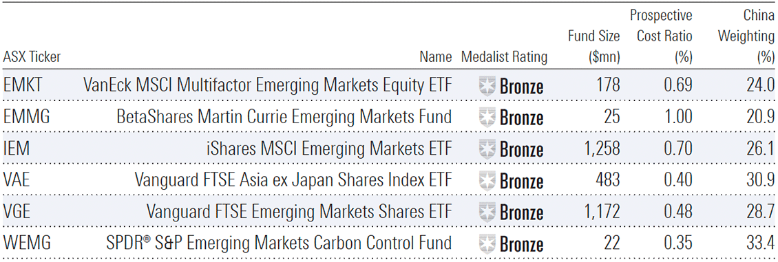
Source: Morningstar.
Europe
European equities trade at a 5% discount to fair value. This isn’t particularly cheap compared to the bargain territory of the past two years, but excluding Asia, it’s the most attractive region we cover. Value is particularly pronounced in the UK: at a 10% discount, it’s the cheapest developed market globally.
The macroeconomic environment is improving in Europe, which should support corporate profitability in the region. Inflation has cooled to roughly 2%, the ECB’s target level; GDP growth is picking up; and monetary easing has commenced. Two risks we see for early 2025 are (i) political disruption, with German elections planned for February and France still working to establish a stable government, and (ii) US trade policies. As the largest trade partner with the US, it’s unlikely Europe will escape unscathed.
But these risks look priced. Almost half the stocks we cover trade in 4- or 5-star territory, and across all categories, European stocks trade at a discount to US peers. For investors considering European exposure, there are a handful of dedicated ETFs on the ASX. Table 2 shows key statistics. The iShares Europe ETF is the only fund we cover and receives a Neutral medallist rating.
Table 2: ASX-listed Europe & UK exchange-traded funds
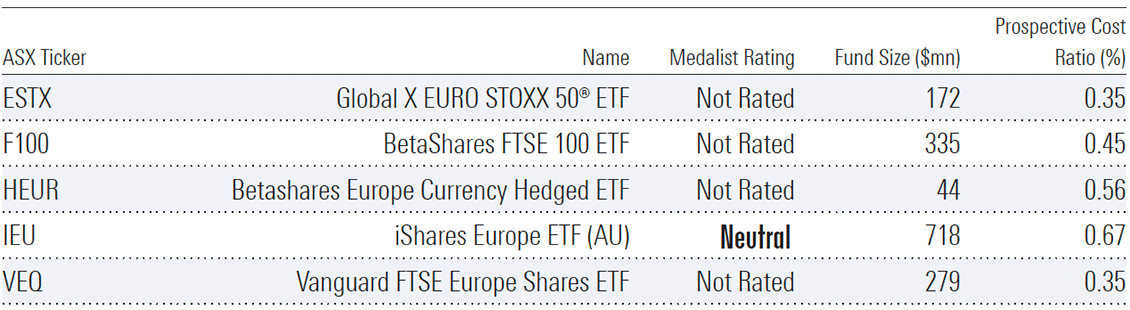
Source: Morningstar.
Let’s first review the performance of the major asset classes and sub-sectors in 2024.
Asset class returns
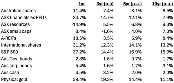
Note: All figures as at Dec 31, 2024. Aus shares = ASX 200, A-REITs = S&P/ASX 200 A-Reit Index, International shares = MSCI World ex-Aus in AUD, Aus Govt bonds = Bbg AusBond Treasury Index, Aus Corp bonds = Bbg Ausbond Credit 0+ index. Source: S&P Global, Bloomberg, Firstlinks
The winners in 2024
The asset with the highest return last year would surprise many: it was gold, which jumped 39% in Australian dollar terms. Other big winners were US shares, up 37%, and Australian financials, with a 34% return.
The gold price rose by 27% in US dollar terms, but higher in Australian dollars thanks to a fall the Aussie dollar against the greenback.
Why did gold go up so much? Historically, gold has tended to move inversely to the US currency – when the US dollar rises, gold often falls. But that wasn’t the case in 2024.
The World Gold Council’s John Reade explained to Firstlinks in late October that gold has benefited from two things: central bank buying and emerging market demand. Central banks have been purchasing gold as they seek diversification following the American confiscation of Russian US dollar assets after Putin’s invasion of Ukraine. Emerging markets have also been keen on the yellow metal, as the Chinese seek safety amid their economic downturn, and other countries such as India and Turkey increase their buying of jewelry and other gold-related products.
It’s intriguing that Australian investors, especially institutions, generally shun gold, in spite of its recent strong performance.
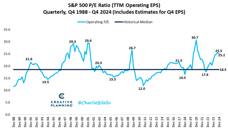
US shares grabbed far more headlines than gold with its barnstorming 2024. The S&P 500 rose more than 20% for a second year in a row, driven by earnings and an increase in the valuations attached to those earnings. S&P 500 operating earnings rose 9% during the year to new record highs.
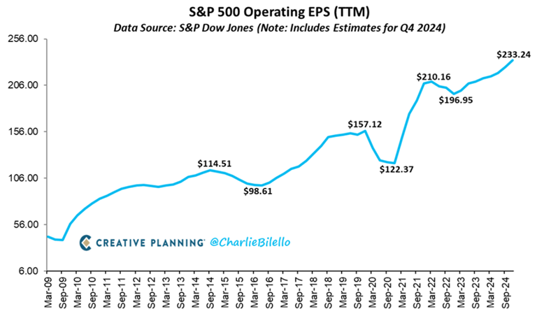
The market rise was aided by the S&P 500’s price to earnings (P/E) ratio moving up to 25.2x at year-end from 22.3x at the start of the year.
The ‘Magnificent Seven’ technology stocks helped the S&P 500 to new highs. They went up an average 61% in US dollar terms, compared to a 25% rise in the index (+37% in AUD terms).
Nvidia led the charge, up a stunning 171%, as expectations for AI demand soared. Following Nvidia was Meta, rising 66%, and Tesla, 63% higher. Microsoft was the laggard of the bunch.
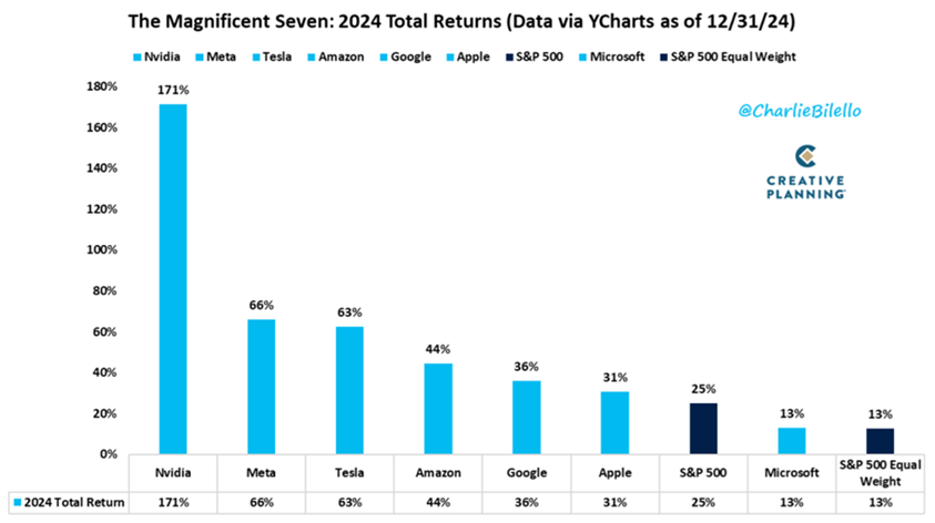
The Magnificent Seven now accounts for 34% of the S&P 500, up from 20% just two years ago.
The other big winner from 2024 was the Aussie banks. The ASX financials sector ex-REITs leaped 34%, surprising many investors. Westpac was best, up 41%, followed by heavyweight, CBA, 37% to the better.
The amazing thing about the banks’ performance was that their earnings last year went backwards, so their share price performance was entirely driven by multiple expansion. For instance, CBA is now the most expensive bank in the developed world, trading at 27x trailing earnings. That compares to America’s largest bank, Bank of America, which has a price to-earnings (P/E) ratio of 16x.
The Australian banks were obviously helped by a rotation out of the miners, which suffered from China’s economic slowdown. That rotation has slightly turned in 2025, with miners starting to find some love.
The other strong performer was the REITs. That may be a headscratcher for some, given the plight of the office and retail property sectors last year. However, Goodman Group accounts for almost 40% of the ASX 200 REITs index, and it rose 75% in 2024, thanks to excitement over its growing data centre portfolio.
Meanwhile, the ASX 200 increased 7% last year, and 11% including dividends. It was a decent enough year, albeit badly lagging the likes of the US. The main reason for being a laggard is that earnings barely grew in 2024 as the economy stalled.
The losers in 2024
The Australian miners were the biggest losers last year, dropping 15%. It didn’t help that the price of our biggest mining export, iron ore, fell 28%. That resulted in resource majors, BHP and Rio Tinto, declining by 22% and 18% respectively.
Some of the biggest losses were in the lithium sector, as the lithium price went down a further 22% in 2024. That led to IGO, Pilbara Minerals, and Mineral Resources, sinking 43%, 45%, and 51%, respectively.
The other loser from last year was Australian Government bonds. The bonds went up 2.3% though lost money in real terms as they trailed the rate of inflation. Bonds are entering their 5th year of a bear market, with 2025 delivering more bad news so far.
The best over a decade
One year is just one year, and it’s often best to zoom out to get a better picture of asset class returns.
Over the past 10 years, the standout performers have been US and international shares. The S&P 500 has returned 16% per annum in Australian dollar terms. America has had an amazing run since the financial crisis, with the index up 8.8x, and almost 10x including dividends, since bottoming in March 2009 at 666. Almost a 10-bagger over 15 years!
The US has helped international shares ex-Australia return 13% p.a. over the past decade. America now accounts for 75% of the MSCI World Index – it’s now a case of where the US goes, the world goes.
Australia has trailed US and international shares badly over the past 10 years, rising 8.5% p.a. That’s well below its long-run return of close to 10%. The banks have dragged on the index, despite a better 2024, due to tepid earnings growth.
Surprisingly, at least to me, is that miners have beaten the ASX 200 since 2015. That’s because the resource companies had a sharp downturn from 2012 to 2014 as commodity prices swooned, but they’ve since somewhat recovered.
Bonds and cash over the decade have been poor investments, largely due to the low interest rates that prevailed up to 2022.
Meanwhile, gold has not only been a solid short-term performer, but a longer term one too. It’s returned 11% p.a. during the past decade. That’s better than Australian shares over the period.
What do past returns tell us about the future?
Unfortunately, the asset class returns of the past year and decade don’t tell us a lot about what will happen during the next 10 years. They can give little clues, though.
US shares have clearly had an extraordinary run and look expensive, at 1-2 standard deviations above historical norms on most valuation metrics.
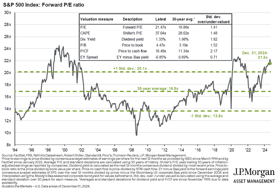
Current valuations for American don’t augur well for future returns.
Source: JP Morgan
Unfortunately, most other developed markets, including Australia, also trade at higher than average multiples. It would surprise if banks didn’t pull back from recent highs, unless they can generate some decent earnings growth. If the Big Four don’t perform, it will be up to the resource companies to pick up the slack. And that will depend on commodity prices, whose future is always difficult to predict.
Bonds are offering greater competition to equities, with 10-year yields approaching 5%. Those yields should result in better returns for bonds over the next decade than the paltry ones delivered in recent years.
Gold has had a great run, though given its history of boom and bust, it seems unlikely to repeat that performance over the next 10 years.
What about alternative assets? Private equity and private debt have become increasingly important in the portfolios of super funds and other institutional investors. And of late, they have delivered commendable performance. Yet, they haven’t been fully tested in times of steeply rising bond yields and/or deteriorating credit quality. That said, listed and unlisted infrastructure looks more interesting.
I’m often asked about Bitcoin. I briefly wrote about it and copped some backlash from enthusiasts. None of them have rebutted my critique that Bitcoin is yet to prove useful for anything barring speculation. If it becomes useful in the real world, I might change my mind. Until then, I can’t advocate it for investor portfolios.
What should investors do with their portfolios?
Given this context, what should you do with your portfolio? Probably the worst thing that you can do is overreact to the past performance of assets and make wholesale changes to your portfolio. Tinkering perhaps, but radical surgery is usually unwise.
One of the best strategies to implement is re-balancing.
Say you’ve got a 60/40 equities/bonds portfolio, with a 70/30 split between international and Australian shares. Perhaps that split is now 75/25, given the recent outperformance of international stocks. Rebalancing back to 70/30 can make sense.
Research has shown that rebalancing every year or two, or when certain assets reach a certain percentage of a portfolio, improves investment performance in the long term. The reason for this is that rebalancing is essentially a value strategy: it switches out of outperforming, and possible expensive, assets into cheaper ones.
What if you’re worried about the future and expect a sharp downdrift in stocks? Again, overreacting can be a mistake. It’s handy to remember that Australian shares go up about four out of every five years on average. Therefore, if you’re a pessimist, the numbers are against you.
That doesn’t preclude buying some more defensive shares, if you’re that way inclined. Defensive ASX stocks such as Woolworths, Endeavour, and Lotteries Corp are offering better value than a lot of other Australian companies at present.
Cost is a key consideration for investors. Morningstar research and academic studies have repeatedly
demonstrated that fees are a reliable predictor of the future success of a fund. Indeed, we revamped our Morningstar Medalist Rating methodology in 2021 to gauge the rated share classes by their respective fees to better reflect the impact on their net-of-fees expected alpha.
This is not to say that investors should only look at fees when evaluating funds. Qualitative factors such as the investment team, investment process, and parent organization are also vital when determining a fund’s outperformance potential. Still, lower-cost funds generally have a greater chance of outperforming their more expensive peers. In this article, we provide evidence to show the predictive power of fees across most categories.
The Test
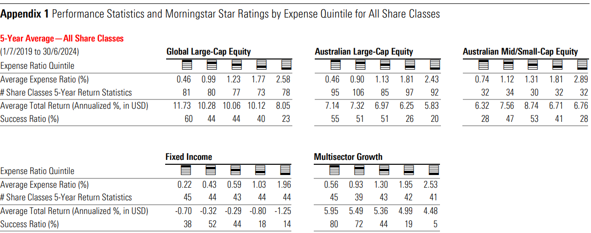
We examined a pool of funds that investors would have had access to at the beginning of a given historical period. That includes funds that no longer exist. This aims to mirror the experience of investors and the potential choices they would need to make, without requiring prior knowledge of subsequent fund closures. To ensure relevance to Australian-based investors, we included only share classes that are domiciled in Australia.
For our test, we began by grouping broad categories to build significantly sized categories, namely, combining style factors for equity funds and grouping Australian and global-bond categories. Then we split fund share classes into fee quintiles based on their relevant grouping. Here, we focused on core asset classes that Australian investors typically consider when building their portfolios, such as Australian largecap equity and fixed income. Then, we looked at the relationship between the average total returns and average fees across the quintiles of these categories for the five years ended June 2024. For each quintile, we further calculated a success ratio, which indicates the percentage of share classes that survived and outperformed their Morningstar Category peers. Only share classes that did both counted toward the success ratio, as it is hard to argue that funds that no longer exist or underperformed were successful. In other words, the success ratio factor in funds that were merged or liquidated over the ensuing time period, which investors may have invested in at the time.
We used “representative cost”, a Morningstar proprietary data point that indicates the reoccurring costs for the share class as levied by the management group, calculated using the fee measure most relevant to the local market. This measure does not include one-off costs nor costs levied by third parties such as investment advisors or platforms.
The Result
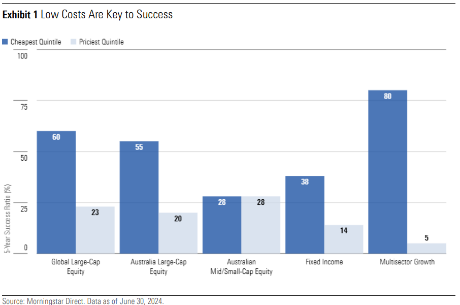
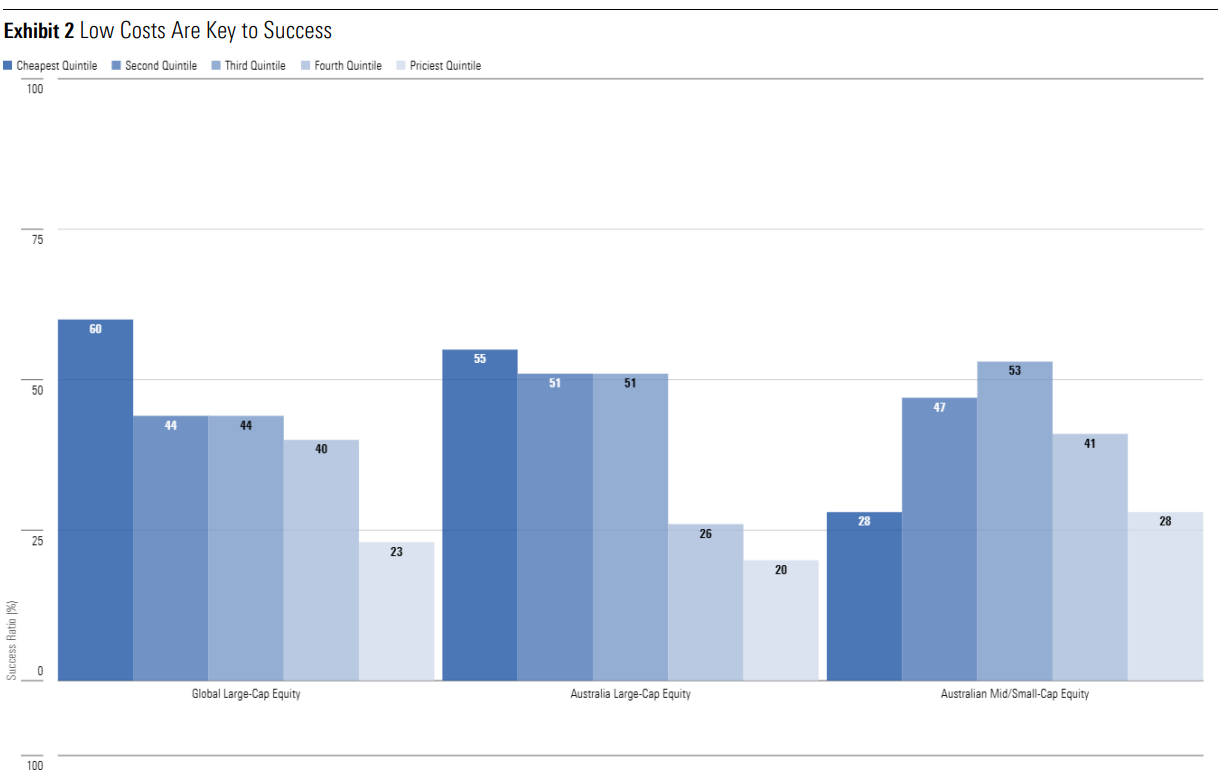
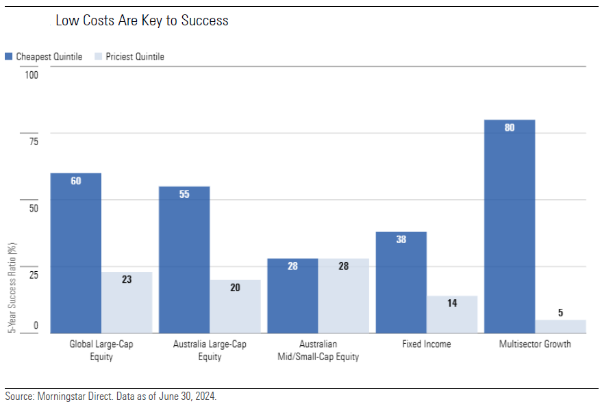
Across most categories that we examined as part of this study, the cheapest quintile achieved a higher
success ratio than the most expensive fee quintile, illustrating the power of fees. As an example, in the global large-cap equity group, the cheapest quintile recorded a success ratio of 60%, while the priciest option recorded 23%. A similar trend was seen in the Australian large-cap equity group (55% versus 20%).
The categories contained a significant number of passive funds in the cheapest quintile. Recent years have been a challenging time for active managers to beat their passive peers as returns have been dominated by a select few sectors. Globally, technology companies have had stellar performances, with sector exposure growing from 16% to 24% of the global index. The catalyst is the promising potential growth of artificial intelligence. Locally, large banks have been beneficiaries from the rising interest-rate regime. These factors did not help active equity managers who aim to produce returns above the benchmark through diversified portfolios.\
An outlier where the power of fees has shown no benefit is the Australian mid/small-cap equity group. The success ratio of the cheapest and priciest quintile is equal at 28%. The cheapest quintile’s low success ratio is attributed to consistent missteps in stock selection by active managers, as measured using the information ratio. In contrast, the most expensive quintile was hampered by higher fee share classes of existing funds provided by secondary distributors. Although the underlying funds were mostly successful, the higher fees posed too much of a drag to achieve success in these cases. Within this category, fees had no predictive power, and medium-term performance was dependent on a manager’s skill.
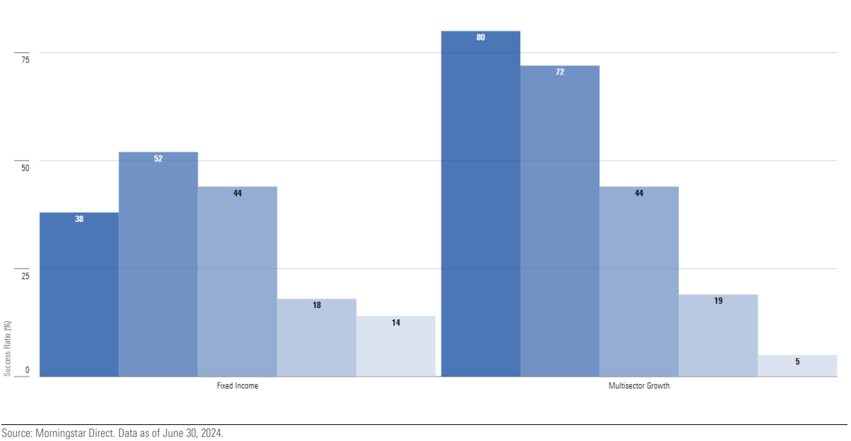
The dispersion was smaller within the fixed-income asset class; the cheapest quintile’s success ratio was 38%, and the most expensive quintile was 14%. Over the tested period, active managers have been able to capitalize on the rising interest-rate environment by shifting their portfolios to shorter-duration positions—a lever unavailable to passive funds. Similarly, they have been able to adjust their credit risk exposure, benefiting more from a tightening in credit spreads than their passive peers. Taking a longerterm view, active fixed-income managers can produce stronger returns over the economic cycle owing to a consistent overweight in corporate credit relative to the index. This is particularly evident within Australian fixed interest, where the conventional benchmark has a considerable skew—around 90%—to government and government-related issuance. Thus, active managers tend to underperform the index in risk-off conditions while outperforming in more sanguine markets. Being compensated for the additional risk with higher yields tends to bolster index-relative performance through the cycle.
Ultimately, our analysis suggests that although active fixed-income managers are often able to outperform the index gross of fees, the outperformance does not always compensate for the corresponding fees.
The disparity between the cheapest and priciest quintile was the most shocking in the multisector growth category, where the cheapest quintile logged a success ratio of 80% versus the most expensive quintile’s 5%. We have long acknowledged the ongoing difficulties for active managers to consistently add value through dynamic asset allocation, as the ability to predict market conditions continues to be a challenging endeavor. So, it was unsurprising to find that the cheapest, most successful quintile was heavily comprised of multisector funds that used passive components. That said, the poor result of the most expensive quintile has been exacerbated from the number of secondary distribution of funds that are burdened by inefficient legacy fee models.
Taking a step back from specific examples, we see the two metrics are negatively correlated, albeit with some exceptions. Notably, Australian mid/small-cap equity funds and fixed-income funds. The former being a unique case where fees had low predictive power, but skillful managers proved crucial in achieving success, as no simple rule described the distribution. While, as highlighted in our analysis of fixed income, active managers are able to outperform broad bond indexes through their available levers.
This is discernible from the higher success ratio in the second fee quintile—which was predominantly
comprised of active funds—when compared with the cheapest quintile (52% versus 38%). Investors can expect higher returns from active managers, at the cost of taking on additional risk. It is important for investors to be aware of this relationship and pick an option that suits their risk tolerance.
Overall, it is clear that fees play a key role in predicting a fund’s success, though the strength of the
correlation differs across categories.
Donald Trump has won the US presidential race, and the Republicans have reclaimed the Senate. As of Thursday afternoon, the House of Representatives remains up for grabs. The market reaction has been emphatic, with a broad-based rally pushing the US market to a record high. The biggest winners are those sectors which are ostensibly best positioned under Trump’s agenda: financials, energy, technology, and small caps.
Meanwhile, the bond market is under pressure. The 10-year US Treasury yield rose roughly 20 basis points as the election result became clear, to a touch under 4.5%. The market has concerns about the inflationary potential of Trump’s pro-growth, America-first agenda. This also has implications for the US fiscal position, which, for a period of relative peace and outside an economic crisis, looks overextended [Exhibit 1].
Exhibit 1: US debt burden at exceptional levels
Gross federal debt held by the public (% GDP)
Source: US Office of Management & Budget, Morningstar.
We may revise our base case macroeconomic forecasts as Trump’s policy priorities become clearer. But for now, we’re not factoring Trump’s two main trade proposals, the 10% blanket tariff and a 60% tariff hike on China, into our central case. Trade is one of the few areas in which a president can make sweeping changes without congressional approval, but at this stage, we think both proposals look more like pre-election bluster.
Nonetheless, it’s a formidable starting point for negotiation with trading partners, and Trump may be able to extract concessions by brandishing this threat. In a previous article, we called out a couple of stocks that could do better under a second Trump administration: Iluka Resources (ASX:ILU) and James Hardie (ASX:JHX). Both seem better positioned for a world of deglobalization and onshoring.
BlueScope (ASX:BSL), which had a good day as the election results rolled in, is another potential beneficiary. China accounts for around half of global steel production, and the US is one of the world’s largest importers of steel. European steel exporters, too, could also find themselves in the crosshairs, given the European Union runs a sizeable trade surplus against the US. The US previously imposed a 25% tariff on steel and 10% tariff on aluminum imports from the EU. And while these were subsequently suspended, this suspension only lasts until 2025, and these tariffs could be quickly reinstated. So further tariff hikes on Chinese or global steel imports would bode well for BlueScope’s North Star mill in Ohio. Under our base case scenario, we see BlueScope as modestly overvalued, but there’s upside potential here if Trump forges ahead with the tariff proposals.
The long view
Amidst all the noise, it’s important to remind ourselves of the power of compounding, and the rewards of staying invested. Starting with $1000 at the time of Eisenhower’s inauguration in 1953, you’d have $27,400 today if you’d owned the S&P 500 whenever a Republican was president, and otherwise stayed out of the market. If you’d run the same strategy while a Democrat was in the White House, you’d have $61,800. But if you’d stayed invested the whole time, ignoring politics entirely, you’d have accumulated $1,690,000—dwarfing the wealth of the two market timers. [Exhibit 2]
Exhibit 2: Returns since Eisenhower’s inauguration (1953)
$1000 invested in the S&P 500
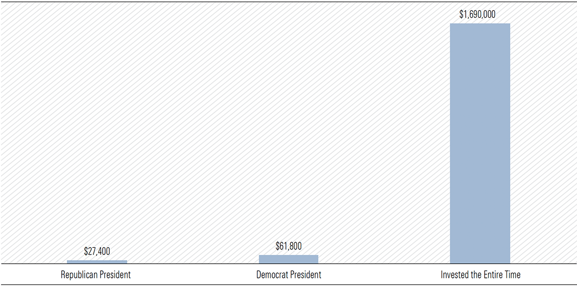
Source: Morningstar
Over the past 36 presidential terms, from James A. Garfield in 1881 through to Joe Biden, valuations are a much better predictor of returns than the party occupying the White House. Morningstar finds party affiliation accounts for less than 1% of the variability in US equity market returns across presidential terms. However, the starting valuation of the market explains almost 18% of the differences in returns across presidential cycles [Exhibit 3].
Exhibit 3: Starting valuations more important than party affiliation
% explained (R-squared)
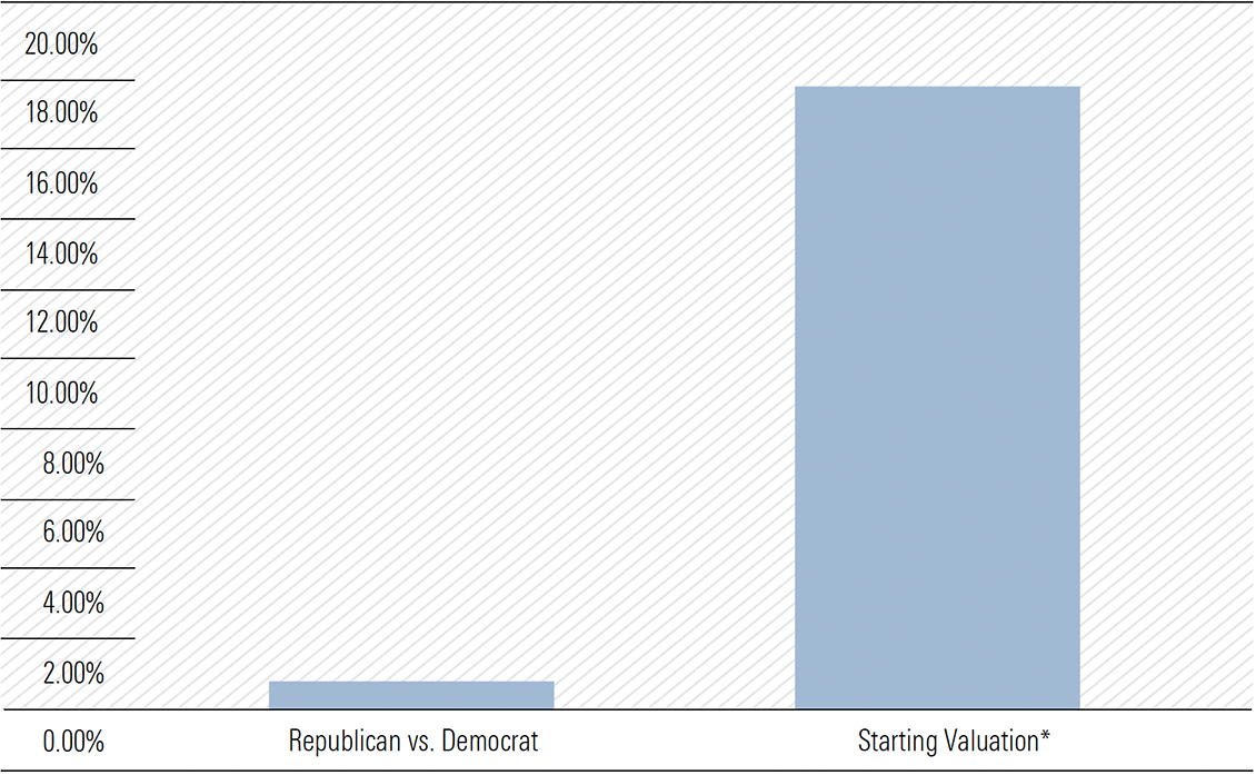
Note: Shiller’s Cyclically Adjusted Price-to-Earnings (CAPE) Ratio is used as the proxy for market valuation.
Source: Robert Shiller data library, Morningstar Wealth Analysis.
At present, both the US and Australian markets trade at modest premiums to fair value. A notable exception for our market is the energy sector, the cheapest under Morningstar’s Australia coverage. Woodside (ASX:WDS) and Santos (ASX:STO), at 48% and 47% discounts respectively, are a big part of this.
Few surprises from the RBA
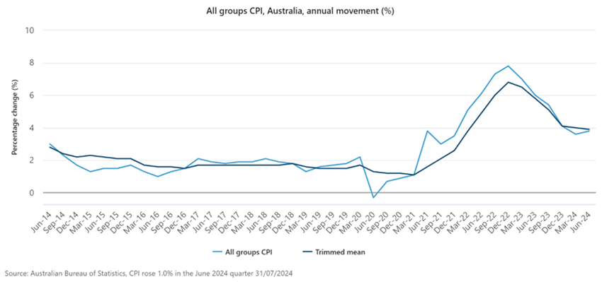
While overshadowed by events in the US, the RBA left the cash rate unchanged at its November meeting, as widely expected. The bank acknowledged headline inflation had fallen, in part due to cost-of-living subsidies, but made it clear that underlying inflation is what matters. Running at 3.5% annually as of the September quarter, this is still too high to justify rate cuts. In the absence of a material shock to the economy, we can essentially rule out a rate cut in December, the final RBA meeting of the year.
There were a few interesting takeaways from the bank’s latest set of economic forecasts, released alongside the rate decision. A subtle revision in the outlook for trimmed mean inflation, the RBA’s preferred measure of underlying inflation, caught my eye. The bank now expects trimmed mean to return to the top of the 2%–3% band by June 2025, from December 2025 previously.
The RBA knows how closely the market scrutinizes its forecasts, so I’d be surprised if this change wasn’t deliberate. While modest, it arguably opens the door for cuts a little earlier. It takes time for interest rates to work their way through the system—the ‘long and variable lags’ of monetary policy—meaning policymakers must be forward-looking. Accordingly, the RBA doesn’t need to wait until inflation returns to target to begin easing, it just needs to be confident it will get there. Bringing forward the timing in which the bank expects to achieve its target makes it easier to justify cuts in the first half of 2025, should the economy unfold as expected. Of course, these forecasts were finalized before Trump had cemented a second term. And at the time of writing, we still have a US Federal Reserve decision pending before we can close the book on a huge week for global markets.
In recent years, fund managers have received a lot of bad press for their performance versus benchmark indices.
In a Firstlinks editorial in October, I wrote of S&P Global’s new SPIVA report, which showed Australian fund managers performed better in the first half of the year, with most outperforming indices in local equities, small and mid-caps, and bonds. But their results were less impressive over longer periods.
Active vs passive
In a new report, Morningstar has measured fund managers’ success relative to the net-of-fee performance of comparable passive funds, rather than an index. And it turns out that active managers stack up pretty well.
The study spanned more than 800 open-ended fund strategies across nine different categories. It found that the top quartile performers in every category have generated positive excess returns over their passive counterparts in the trailing 10-year period.
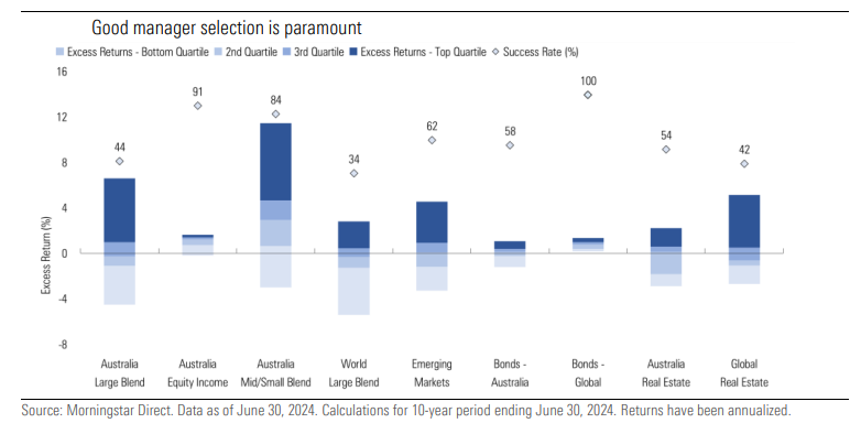
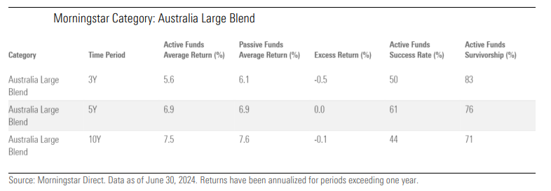
Some categories of fund managers did better than others. In the prominent ‘Australia Large Blend’ category, active funds performed worse over the past 10 years, better over five years, and were evenly split in the prior three years. Put simply, large cap managers have had periods of outperformance and underperformance.
Mid and small cap managers fared better. They performed in line with passive funds over three years, but significantly outperformed over longer periods. And, most of these managers beat passive across every timeframe.
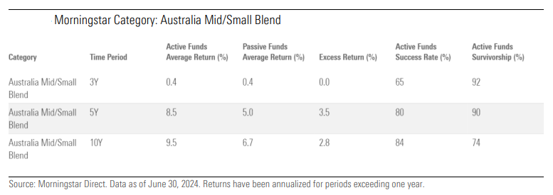
This would suggest that there’s value in managers who can find pricing discrepancies in relatively under-researched mid and small caps.
Similarly, Australian equity income has been a favourable area for active managers. They’ve had excess returns across all timeframes.
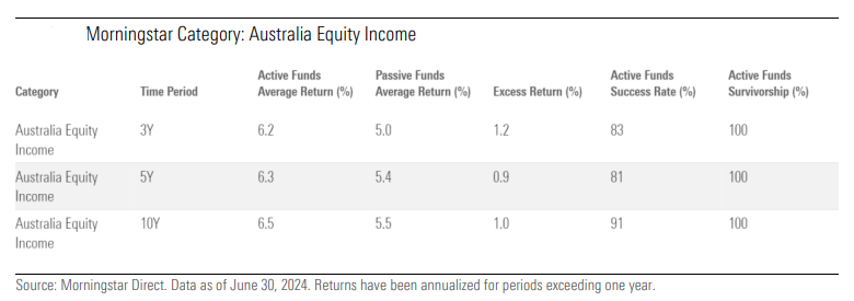
Most dividend-focused passive funds have strict rule-based mandates. It seems that active funds with more flexibility can generate significant outperformance in this space.
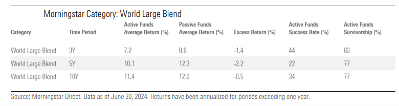
Investing overseas has been more of a problem for Australian equity managers. In the ‘World Large Blend’ equity category, passive dominates active funds. Undoubtedly, increasing market concentration, aka ‘The Magnificent Seven’, has made it more difficult for active managers to keep up with the performance of comparable passive funds.
In fixed income, fund managers have added value both in Australian and global bonds. In local bonds, most managers have beaten passive counterparts over three, five and 10 years. Excess returns have been more positive in recent years with the normalization of the yield curve.
Managed fund fees are a key predictor of future returns
In a separate report, Morningstar has updated previous work which showed that fees were a reliable predictor of the future success of a fund.
The report confirms that lower-cost funds in Australia have a greater chance of outperforming their more expensive peers, as the chart below indicates.
In four out of five categories, the cheapest quintile of funds, both managed and passive, produced better results than the priciest quintile over the trailing five years.
Breaking that down further, in Global Large-Cap Equity, 68% of the funds in the lower quintile of fees outperformed their category group. These funds had average expense ratios of 0.46%. And their average annualized total return was 11.73% in the five years to June 30, 2024.
That compares to funds in the highest quintile of fees, where only 23% beat the category group, with average annualised returns of 8.05%, and expense ratios of 2.58% being a key drag on performance.
In Australian mid and small cap equity, fees weren’t as big a factor in overall results. The success ratio of the cheapest and priciest quintile was equal at 28%. Perhaps this suggests cheaper isn’t better when it comes to selecting small cap managers, and it may be worth paying up for good ones.
Fees were a larger factor for fixed income managers. Yet the spread between the cheapest quintile’s success ratio and the most expensive was smaller than for other asset classes. The cheapest quintile’s success ratio of 38% compared to the 14% of the priciest quintile.
The report says that active managers in fixed income tend to underperform indices in risk-off conditions while outperforming in more sanguine markets. That’s because the managers tend to overweight corporate credit relative to the index, where conventional benchmarks have a considerable skew to government and government-related bond issuance.
The report goes on to suggest that “although active fixed income managers are often able to outperform the index gross of fees, the outperformance does not always compensate for the corresponding fees.”
The largest disparity between the cheapest and priciest quintile of fund managers was in the multisector growth category. Here, the cheapest quintile recorded a success ratio of 80% compared to the most expensive quintile’s 5%. The dispersion in fees was comparable to other asset classes with the cheapest charging an average 0.56% compared to the dearest’s 2.53%.
In sum, cost is a big predictor of managed fund returns and should be a key consideration for investors.
Periodically, I give an update on the valuations of key asset classes and how they compare. Here’s the latest chart on yields for the four major asset classes: cash, bonds, property, and stocks. I’ve included the inflation rate as a point of comparison.
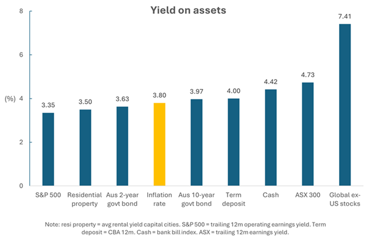
Sources: Firstlinks, CoreLogic, Robert Shiller, CBA, ASX, Morningstar
What stands out is that the yields on many asset classes are quite condensed. When I’d compiled this chart 10 months ago, inflation was much higher and there was a greater dispersion in yields. Most assets have performed well of late and that’s lowered the yields for them.
It seems to me that most of the assets are pricing in inflation coming down further. The reason is that when you buy an asset, you’re hoping to earn a yield above the inflation rate ie. a positive real return. Yet some asset classes are currently yielding below the inflation rate, and others are only marginally above. Note that in the above chart, I’ve used the quarterly inflation figure, which is widely considered more reliable than the monthly number.
The odds favour inflation declining further, though whether it goes lower and stays lower is the question. Australia has stickier inflation than many other developed countries after not raising rates as aggressively.
The overvalued: US stocks
Let’s first run through what I consider the overvalued asset classes. The S&P 500 looks expensive, and parts of it appear very expensive. On most valuation metrics, it’s 1-2 standard deviations overvalued compared to history.
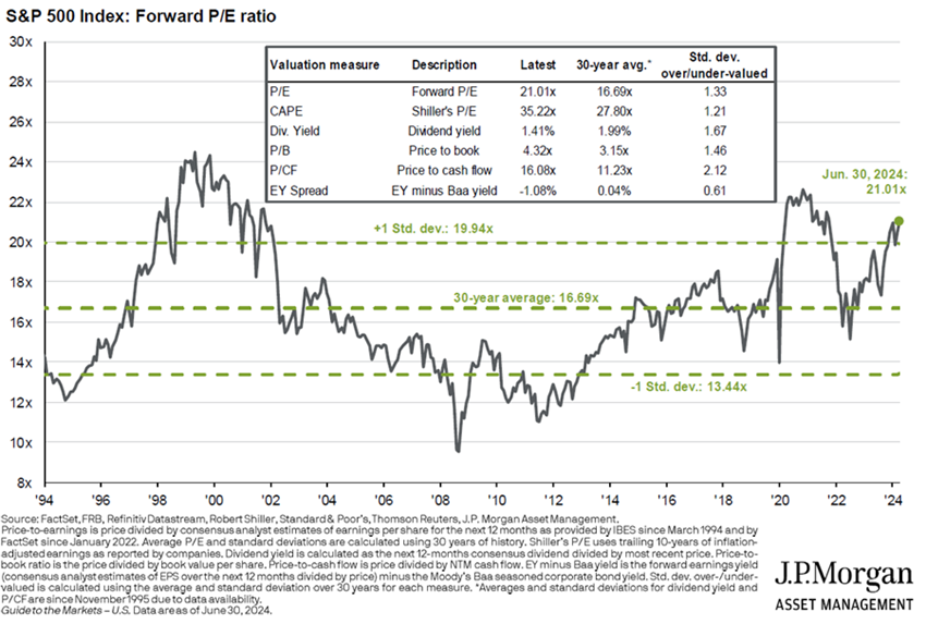
At a 21x forward price-to-earnings ratio (PER), the S&P 500 is well above its average PER of 16.7x. Through history, the higher the PER, the lower future returns have been.
The technology, consumer discretionary, and healthcare sectors in the US look most overvalued. For instance, US tech is trading at 30x forward P/E versus its 18x average of the past 20 years.
Much of the overvaluation resides among the largest companies in the US. Many are pricing in gains from AI and the consensus outlook for an economic soft landing in America. If either of these falters, earnings may disappoint, and valuations will come under pressure.
The overvalued: Australian housing
Residential real estate dwarfs every other asset in size in Australia. At almost $11 trillion dollars, it’s 3.5x larger than the market for publicly listed stocks, 2.8x bigger than the superannuation sector, and 2.5x total GDP.
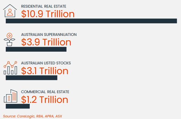
I’ve stated previously that residential property in Australia is possibly the most expensive asset anywhere in the world. And that it’s at least 40% overvalued, in my view. I stand by that view, and here’s why.
The gross rental yield on property is 3.5% in capital cities. That gross yield is essentially revenue for a landlord. Therefore, the yield essentially equates to a price to sales (P/S) ratio of 29x (ie. 100 divided by the gross yield).
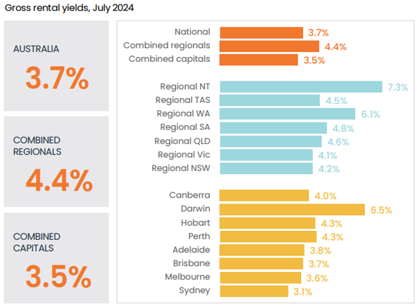
Source: CoreLogic
That P/S ratio is extraordinarily expensive. For instance, Nvidia – the world’s third largest company by market capitalization and regarded by most observers as expensive if not bubble-like – currently trades at a P/S ratio of 28x.
That’s not the fully story though. The gross yield on property comes before costs, including maintenance, interest, and taxes. Property experts I speak to suggest maintenance and other operating expenses would reduce that yield by at least 1%. In other words, the yield would be sub-2.5%, and that’s before taxes.
Let’s be generous and call it a 2.5% net yield for residential property. That equates to a price-to-earnings ratio of 40x. Again, compared to the pricey US tech sector, that P/E ratio also looks high. And remember, US tech company earnings are growing exponentially, while those of property aren’t.
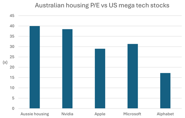
Note: tech stocks = forward P/E. Source: CoreLogic, Morningstar
Compared to other housing markets around the world, Australia also stands out. The price to income ratio is 9.7x, about double that of the US. The ratio has more than trebled over the past 40 years.
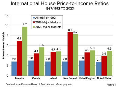
Australia has three cities in the top 10 least affordable metropolitan markets in the world, according to consultants, Demographia. Incredibly, the likes of Adelaide rank as less affordable than global destinations such as New York.
For price to income ratios to decline, either prices must drop or incomes need to rise. The outlook for incomes looks relatively muted. Meanwhile, supply constraints mean prices are unlikely to come down in the near term, though growth from here may prove more challenging.
In other words, Australian residential real estate may be one of the globe’s most expensive assets, but it’s likely to remain that way, at least in the short term.
The undervalued: international stocks
Outside of the US, stocks look reasonable value. International stocks have had mediocre returns over the past decade, badly lagging America’s.
Source: A Wealth of Commonsense
That’s led to favourable valuations for global stocks, especially compared to the US. The dividend yield on international shares of 3.2% is also much higher than the 1.4% of the US.
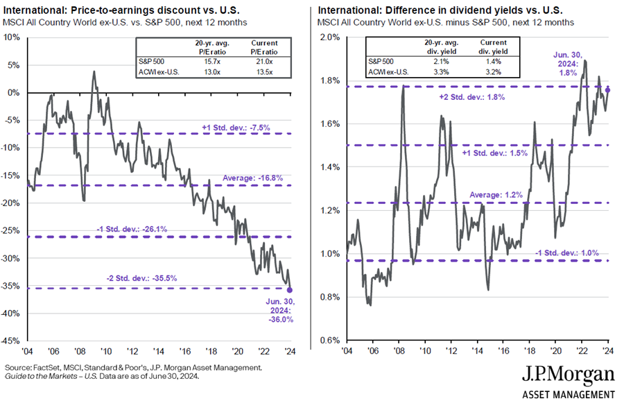
Of the different markets, Japan and Emerging Markets offer good value. China is cheap and due for a bounce back, though whether that proves sustainable will depend on fixing a broken political and economic model.
Source: JP Morgan
The undervalued: value stocks
Value stocks may also be an opportunity. Over the past 15 years, growth stocks have left value stocks for dead. Because of this, there are few true value-oriented fund managers left. It’s resulted in value being inexpensive.
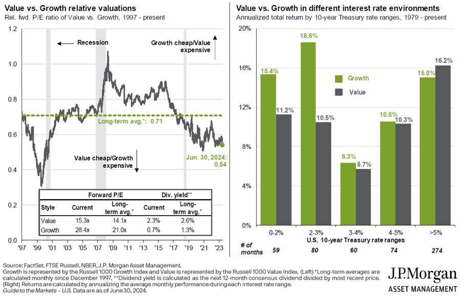
Interestingly, the chart on the right shows that value stocks perform especially well in higher interest rate environments. So, if you’re worried about high inflation and rates, owning value stocks makes sense.
The undervalued: small caps
Small caps may also be a contrarian play. They’ve significantly underperformed large caps in Australia and globally over the past decade, leaving them on undemanding valuations. Smaller companies are generally carrying larger debt loads, which means that they’re more sensitive to changes in interest rates. If rates are heading down, small caps may be a primary beneficiary.
The undervalued: cash
It seems odd to say that cash is undervalued, though I’d suggest it might be.
Investors poured money into term deposits last year, after stocks and bonds endured a poor 2022. That defensive stance has slowly switched. This year, the cash in term deposits has eked out into risk assets as investors get more comfortable with the outlook for the likes of equities.
The question is whether term deposits are still attractive in the current environment. With 12 month term deposits of up to 4.9% available at reputable banks, there still appears to be value here, especially with inflation at 3.8% and many risk assets offering inferior yields.
The fairly valued: Australian bonds
Bonds have performed reasonably well over the past 12 months, though most retail investors still seem to be gun shy given the poor performance of this asset class over the prior three years.
Source: Trading Economics
At this time last year, many investors were declaring that the 60/40 portfolio (60% equities, 40% bonds) was dead. That’s proven overblown.
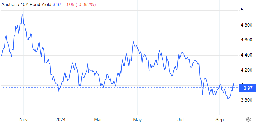
However, given the recent pickup in bond prices, the yields on bonds are less attractive now. With 2-year Australian bond yields at 3.63% and 10-year yields at 3.97%, they don’t offer the same value as they did 12-18 months ago. And the key risk for bonds is that inflation stays sticky in Australia.
How do bonds compare to cash? The two assets serve different purposes in a portfolio. Cash is more of a placeholder, until there’s a better place to allocate money. Bonds serve as a ballast in a portfolio, buffering it against the potential for sharp drawdowns in riskier assets. Bonds also gives investors protection against economic downturns, which is something that cash doesn’t do.
The fair valued: Australian stocks
The other asset that seems fair valued is Australian stocks. It’s deceptive, however, as the market is split between the haves and have nots. On the one hand, the prices for tech companies are extraordinary.
Banks have also been bid up. Possible reasons for this include ever-increasing superannuation and ETF flows into the sector and cash exiting the depressed mining sector and into banks.
It’s left financials sector valuations on par with the ASX 200. That’s unusual as banks traditionally trade at a discount to the index due to them being cyclical and selling highly commoditized products.
Note that the bank’s steep valuations can be primarily attributed to the otherworldly pricing attached to Commonwealth Bank (ASX: CBA). CBA is the most expensive retail bank in the developed world, and it’s not even close.
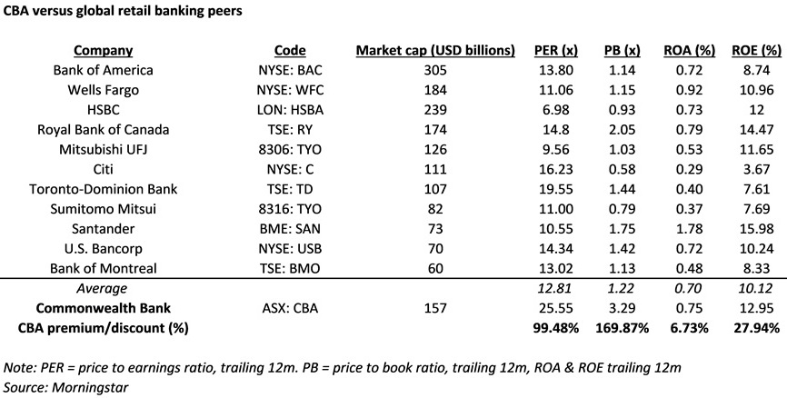
Meantime, the mining and energy sectors have been left behind. Yes, China is depressing demand in many commodities, with iron ore at the top of the least. However, supply remains constrained in several commodities, including copper, oil, and coal, and that augurs well for prices going forward.
While of these sectors, there are pockets of opportunity. Earlier this year, I wrote an article on 16 ASX stocks to buy and hold forever. It was a wish list – stocks to buy in future at the right price.
Of the stocks, there are four that currently offer value, albeit for different reasons:
- ASX Ltd (ASX: ASX) – problems now with replacing Chess but still a superb business with multiple ways to win.
- SkyCity (ASX: SKC) – casinos are hated, but therein lays the opportunity with this sound operator.
- The Lottery Corporation (ASX: TLC) – brilliant business, and valuations are starting to look ok.
- Washington H Soul Pattinson (ASX: SOL) – Its main businesses in New Hope, Brickworks and TPG should bounce back from cyclical issues.
The footy season is over Down Under, following the National Rugby League grand final on October 6 and the Australian Football League decider the Saturday prior. I am aware the A-League Soccer season is about to begin. However, in Australia, “footy” is more commonly thought of as a winter escapade, played with balls that are oval-shaped.
What am I going to do now on weekends? Bother my wife and the kids? Go to BBQs talking to people I don’t like? Wander around Bunnings spending money I don’t have? Visit restaurants paying for nouveau cuisine I don’t want?
To deal with footy withdrawal symptoms, I have instead assembled a rugby league dream team of stocks—a “Brian’s Equitable XI”, if you will. One where the key requirements of each position are matched with companies exhibiting similar attributes within an investment context.
Fullback and wingers
Flashy players occupy these positions, utilising blistering pace and high-flying acrobatics to bring in tries and keep the scoreboard ticking.
In investment parlance, these are the Growth Stocks. They have a track record of impressive earnings increases which, most importantly, is expected to continue into the future. Their invariably ritzy earnings multiples reflect the growth potential, and their typically high fair value uncertainty ratings testify to the high variance in potential outcome. Still, these are the stocks that could provide the juice for portfolio outperformance.
We have selected three stocks under our coverage to fill these positions, as can be seen in Exhibit 1, based on their strong forecast EBITDA growth outlook over the next five years.
Exhibit 1: Growth stocks as fullback and wingers (in AUD)
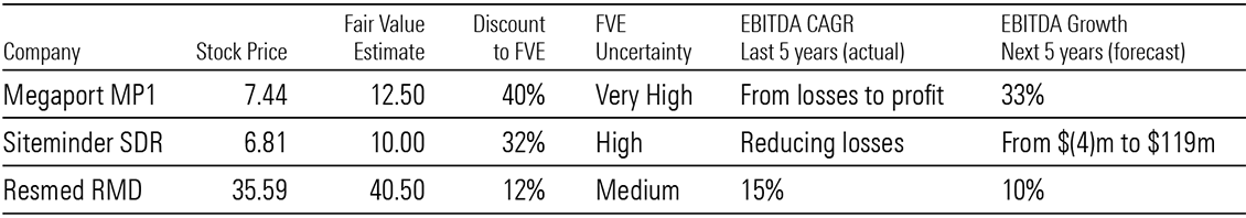
Source: Company reports and Morningstar estimates. Data as of October 16, 2024.
Unsurprisingly, fair value uncertainty ratings are Very High for data centre and cloud services provider Megaport, and High for hotel commerce platform Siteminder. However, the remarkable ascent of sleep apnea treatment company Resmed (which we still consider as showing value and have selected in the team) shows the evolution of a growth company and the remarkable contribution it can make to a portfolio.
Centres
All-rounders typically play these positions. They can attack with flair, defend with stout and play out of structure to inject some X-factor.
In an Australia/New Zealand portfolio, what could be more out-of-structure and X-factor-esque than International Stocks? I have been an ardent advocate of diversification via global investing to anyone who would listen, ever since discovering in my 30s there is a whole world out there beyond the ASX. With the subsequent advent of technology, proliferating trading platforms and falling commission rates, that world is open to anyone willing to shed their home bias.
Scouring our global coverage universe of around 1,600 stocks, we have selected two to fill these positions. (Exhibit 2)
Exhibit 2: International stocks as centres
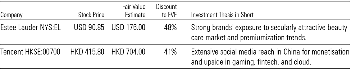
Source: Company reports and Morningstar estimates. Data as of October 16, 2024.
I could have nominated current tech-darlings such as Nvidia, Apple, Meta or whatever others that make up the ridiculous acronyms on NASDAQ (FANG, FAANG, MAMAA). Instead, I have gone with prestige beauty product maker The Estee Lauder Companies and Chinese Internet/social media giant Tencent, both trading at attractive discounts to our fair value estimates. The former because I see them lying around everywhere in our house, and the latter because my sons seem to be on some Tencent platform whenever they’re lying around the house.
Halves
These positions are almost always filled by marquee players, the playmaking lynchpins around whom whole teams are built.
They are akin to Blue-Chip Stocks in an investment portfolio. As the mainstays in the portfolio, they exhibit a combination of capital appreciation potential and dividend generating capability. Critically, they possess durable competitive advantages in the industries they operate in, or an “economic moat”, such that their excess returns over cost of capital can compound over the long term.
It just happens there are two stocks in our Australia and New Zealand Best Ideas list that fit these criteria: Australia’s dominant liquor retailer Endeavour Group and Australia’s homegrown Brambles which is now the world’s largest supplier of reusable wooden pallets. (Exhibit 3)
Exhibit 3: Blue-chip stocks as halves (in AUD)
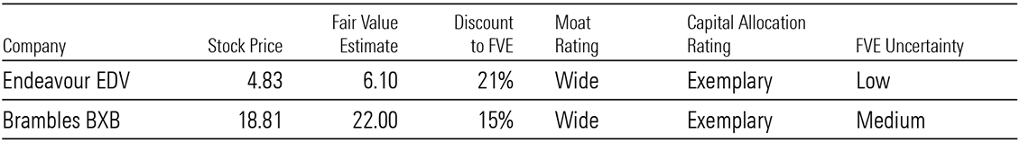
Source: Company reports and Morningstar estimates. Data as of October 16, 2024.
Both are high-quality, wide moat-rated companies whose shares are trading at decent discounts to our fair value estimates. Furthermore, their capital allocation ratings are Exemplary.
Middle forwards
This position is the bedrock of the team. They are filled by big, non-nonsense players who plough their heads into places I wouldn’t put my mother-in-law’s feet. And when the going gets tough, they can be relied upon to hold the fort defensively and make the hard yards offensively.
That sounds like big-cap, Defensive/Income Stocks in a portfolio. They may not be sexy. But with solid balance sheets and reliable cashflows by virtue of their defensive business traits, they can be counted on to provide portfolio stability and generate dividend income.
Telecom and infrastructure are the prototype industries to find such stocks, and we have selected integrated telcos Spark New Zealand and Telstra, as well as gas infrastructure company APA Group as the picks. (Exhibit 4)
Exhibit 4: Defensive/income stocks as middle forwards (in AUD)
Source: Company reports and Morningstar estimates. Data as of October 16, 2024.
We see their earnings and cashflows as relatively resilient. As such, we believe their current attractive dividends can be maintained, particularly given the comfortable interest cover ratios.
Edge forwards
Edge forwards in rugby league are similar to centres in terms of attacking flair and defensive prowess. When the momentum is on the team’s side, they can run riot, given their size, skills and athleticism. However, because they are so big, these edge forwards can also go MIA at times when the pace of the game is too frantic or when the team’s back is against the wall.
In other words, they sound like Cyclical Stocks. When the industry tailwinds are blowing and tides are rolling in, these stocks can do no wrong. But when the tides turn, the dry spell can be frustratingly long. And just when investors give up on them, as low earnings multiples coincide with bottom-of-cycle earnings and they are demonised as “value traps”, these cyclical stocks rise again as tides come back in.
Energy and discretionary retail are the classic cyclical sectors, and we have selected two stocks therein to fill this position. They are oil and gas producer Woodside and pizza outlets and franchise services provider Domino’s Pizza. (Exhibit 5)
Exhibit 5: Cyclical stocks as edge forwards (in AUD)
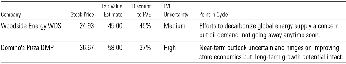
Source: Company reports and Morningstar estimates. Data as of October 16, 2024.
Both are trading at steep discounts to our fair value estimates, weighed down by excessive near-term concerns. However, our analysts are willing to look beyond them to focus on their long-term fundamentals. That is, producing oil and gas to sell at reasonable prices, and opening more stores to sell more pizzas at even more reasonable prices.
Hooker
Rugby league professionals who play this position are often underappreciated. They are the short, squat ones with cauliflower ears, busted noses and yappy mouths, tackling much bigger forwards and getting trampled on in doing so. For all that trouble, they are under-remunerated compared to the flashy types who get all the glory.
In the investment world, there is a name for these types—Value Stocks. They are called that because they are usually boring businesses, businesses in a turnaround or cyclical businesses at the wrong end of the cycle. Because of these reasons, they are also cheap, in terms of low earnings multiples and high dividend yields.
We have selected Nine Entertainment to fill this position from our Australia and New Zealand coverage. (Exhibit 6)
Exhibit 6: Value stock as hooker (in AUD)
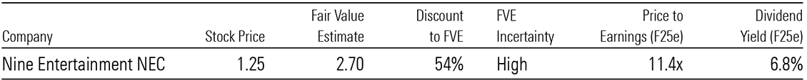
Source: Company reports and Morningstar estimates. Data as of October 16, 2024.
Shares in the diversified media company are trading at classic value-esque multiples and yield. The current advertising recession is hurting group earnings and investor concerns about structural headwinds are depressing earnings multiples. But the risks are more than reflected in the current bargain basement stock price, and we believe the sum of its various parts are significantly bigger than the current sub-$2bn market capitalisation value.
This rugby league dream team of stocks, “Brian’s Equitable XI”, is not intended to be an investment advice. I don’t need to bore you with a disclaimer that readers should consult their advisors and pay heed to their individual financial circumstances.
It is just a light-hearted way to examine some labels investors assign to stocks, by comparing them to how a rugby league team classifies its players according to positions.
At the end of the day, whether Growth, International, Blue-Chip, Defensive, Cyclical or Value, the aim of investing is to compound wealth over the long term, so you can do stuff with that wealth at some point in the future. You do this by buying a piece of a business below its intrinsic worth, having regard to the plethora of industry, competitive, operating and cultural dynamics it faces.
However, knowing the types of stocks that are out there can help improve portfolio diversification. It also allows better appreciation of the thematics driving certain types of stocks at different times.
Who knows? Take a look at your portfolio. You may find it contains too many flashy Fullback, Winger and Edge Forward-type stocks, and not enough Halves and Middle Forward-types. Depending on where interest rates go from here, that may be premiership-winning positioning, or wooden spoon-licking weighting.
On the whole, it’s been a tough few years for Aussie small caps. Since the market selloff in 2022, the benchmark Small Ordinaries index has essentially tracked sideways, considerably underperforming the larger end of the market (Exhibit 1). But the large cap rally leaves few attractive options for investors, with the ASX 20 trading at a cap-weighted premium of almost 20% to fair value.
Exhibit 1: Small caps considerably lag large caps—total return (01/01/2021=100)
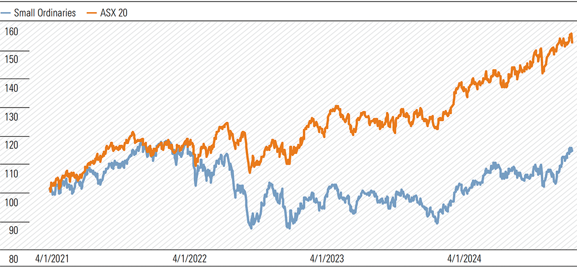
Source: Macrobond, Morningstar.
By contrast, the small caps—that is, companies outside the ASX 100 index—trade much closer to fair value. Almost 40% of the small caps we cover are four- or five-star rated, compared to 30% in the ASX 100. We’ve had interest in small caps from clients, and this week, will share our thoughts on investing in the space.
Why consider small caps?
Small caps won’t suit all investors. Small stocks are volatile, have historically underperformed large caps in aggregate, and are generally of lower quality. Of roughly 80 Australian small caps Morningstar covers, 30% earn a narrow or wide moat rating (and we prefer to cover higher quality names, so this probably overestimates the quality of the small caps market as a whole). Meanwhile, about half the companies we cover in the ASX 100 have moats, and the share rises to about two-thirds in the ASX 20. The divergence shouldn’t surprise; companies with durable competitive advantages should compound over time, winning their markets and outgrowing weaker peers.
Despite the drawbacks, the bright spot of small cap investing is informational inefficiency. According to PitchBook consensus, each stock in the benchmark ASX 100 is covered by 12 analysts, on average. But in the Small Ordinaries index, that figure drops to an average of eight analysts and reduces to six if we consider only companies outside the ASX 200. For investors who have the resources and risk appetite, the relative lack of information gives rise to the possibility of underappreciated diamonds in the small cap market.
Don’t dumpster dive
Investors considering small cap investing should tread carefully. One reason Australian small caps have consistently underperformed larger peers is the composition of the index. Compared to global small cap indices, our Small Ords contains an abnormally high share of unprofitable businesses. Compare Exhibits 2 and 3, showing the composition of the Small Ords and the ASX 100. What stands out is the larger weighting of basic materials in the Small Ords, many of which are junior miners still in the exploration phase. That’s not to say unprofitable small caps should automatically be dismissed, and Fineos (ASX:FCL), an example we’ll discuss below, looks like a much higher quality business. But the risk of failure and capital destruction is much higher during a company’s infancy.
Exhibit 2: ASX 100 cap-weighted sector allocation
Source: S&P, Morningstar.
Exhibit 3: Small Ordinaries cap-weighted sector allocation
Source: S&P, Morningstar.
Alongside infant businesses, the Small Ords is also replete with ‘fallen angels’. These stocks, cast into the ‘uninvestable’ basket by the market due to some combination of structural issues, scandals or management missteps, are 50-cents-on-the-dollar-type investments. Examples include Star Entertainment (ASX:SGR) (60% discount to fair value), Nine Entertainment (ASX:NEC) (55% discount) and Tabcorp (ASX:TAH) (48% discount). These names screen very cheap and may have a role to play in some portfolios. But they are no-moat, high uncertainty business, and we’d caution against too much exposure. Invoking Buffett, if you’re given a 20-slot punch card representing a lifetime of investing, you’d be unlikely to fill it with weak businesses that look dirt cheap because the market has thrown in the towel.
Our top picks of the small caps
Fundamentally, we think the same investing principles apply at both the small and large end of the market: own high quality, competitively advantaged companies, bought at reasonable prices.
We’ve compiled a list of small caps to serve as a starting point. Each sits outside the ASX 100 index and is either 4- or 5-star rated by our analysts. We’ve prioritized companies with moats, and where possible, lower uncertainty ratings. But in general, given the greater risks of small cap investing, we wouldn’t expect these companies to make up core positions in a portfolio. We’ll dive deeper into three of the more interesting names on the list—Bapcor (ASX:BAP), Siteminder (ASX:SDR), and Fineos—which also feature on our October 2024 Best Ideas list.
Bapcor
Negative sentiment amid short-term headwinds, management tumult, and structural changes facing the automotive industry has left the fundamental strength and resilience of Bapcor’s automotive-parts business underappreciated. A slowdown in discretionary spending weighs on retail in the near term, a new management team will need to prove itself, and the proliferation of electric vehicles is a long-term obstacle for the trade business. However, we think near-term pessimism overlooks fundamental resilience in automotive spare parts, and Bapcor is likely to successfully adapt to the gradual technological transition.—Angus Hewitt, Consumer Analyst
Siteminder
We view SiteMinder as a well-positioned industry leader with a large and highly winnable market opportunity. We expect the hotel industry will consolidate around scaled software providers, like SiteMinder, that can fractionalize large fixed technological and regulatory costs over a larger customer base. Economic downturns will only accelerate this process, in our view. We also expect SiteMinder’s new platform products will increase switching costs and help establish network effects, resulting in significantly higher terminal margins.—Roy Van Keulen, Technology Analyst
Fineos
We believe Fineos—one of few small caps under coverage to earn a wide moat—has investment merits not generally found in profitless technology companies. We think the market underestimates revenue upside from the adoption of cloud software by insurers and the increasing stickiness of Fineos’ insurer customers. Fineos is well-placed to win new business, supported by long-standing customer relationships and their referrals. The company is not yet profitable but reinvests to solidify switching costs with its sticky customer base, win new business, and maintain its lead over would-be competitors. We anticipate share gains from more products per client, new client additions, and expansions into new regions and adjacent businesses. There are also opportunities for cost efficiencies from client transitions to the cloud, automation of manual functions, and hiring in emerging economies. We expect Fineos to self-fund its future growth.—Shaun Ler, Diversified Financials Analyst
Exhibit 4: Small cap top picks
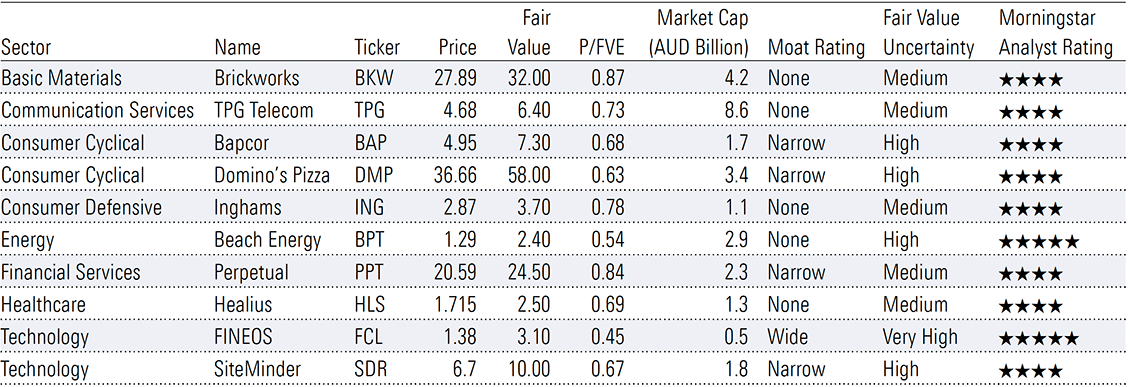
Note: Data as of 22 October 2024. Source: Morningstar.
We generally focus on equities in Your Money Weekly. This week, I’ll change tack slightly. But I feel our topic, the proposed cessation of bank hybrids, will be relevant for many readers.
In early September, the Australia Prudential Regulatory Authority (APRA) announced plans to gradually wind up the market for bank Additional Tier 1 capital, commonly known as bank hybrids. A final decision hasn’t been made, but under the current proposal, banks will not be able to issue hybrids with a call date past 2032, effectively shuttering the market over the next eight years.
Many investors will be disappointed. Hybrids offer a better yield than bank deposits, and distributions are franked. They’ve become a popular product for retail investors, who own around 20%–30% of hybrids listed on the ASX. But high levels of retail ownership make Australia’s hybrids market a global outlier. And while the point has been hotly contested, APRA considers this a problem.
Additional Tier 1 capital is designed to absorb losses in the event of a bank crisis, to provide some protection for senior bondholders and depositors. While never tested domestically, the bail-in of hybrids during the collapse of Credit Suisse is a real-world example.
APRA feels some retail investors don’t understand the risks. And if, amidst the unlikely event of a banking crisis, investors were blindsided by mandatory conversion of their hybrids into distressed bank equity, this could seriously undermine public trust in financial markets. There is also a risk a bail-in could further destabilise the financial system if some securityholders can’t withstand the loss.
Regardless of the merits of ARPA’s decision, time is running out for bank hybrids. And this means investors need to find a new home for their capital. As a starting point, we’ve compiled a list of potential alternatives. This list is not exhaustive, and unfortunately, there is no perfect substitute. Each option comes with different risks and potential returns, and investors should consider their personal circumstances.
Bank ordinary shares
Given hybrids already have some inherent exposure to the equity risk of the bank, rotating into bank shares doesn’t seem like a huge bridge to cross for investors. One attraction is that dividend payments, like hybrid distributions, are franked. And investors almost certainly have some familiarity with the risk and return characteristics of bank shares.
Common equity is, of course, riskier. In the event of a bank failure, common equity ranks beneath hybrids, and is the first asset class to bear losses [Exhibit 1]
Exhibit 1: Seniority of assets
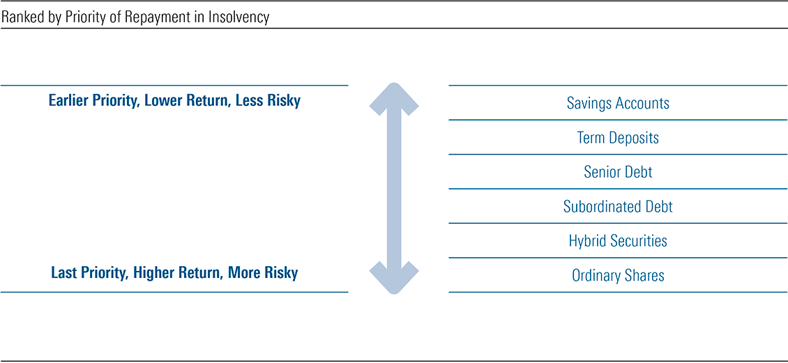
Source: ANZ, Morningstar
Another consideration is price volatility. Bank share prices reflect the outlook for earnings, which can change depending on the economic outlook. It incorporates a view on net interest margins, expenses, and bad debts. While this can materially impact bank share prices, only extreme moves in margins and bad debts can impact the banks’ ability to make good on hybrid distributions and repayment.
At present, bank shares are not cheap either. Excluding ANZ, shares in all major banks trade at a significant premium to our fair value estimate. CBA, the most overvalued of the bunch, is arguably the most expensive bank in the world based on metrics such as price-to-book. Of course, market prices change, and major bank shares may look attractive at some point before hybrids cease to exist. And we do see some value in the regional banks, namely My State and Bank of Queensland, but these businesses lack the competitive advantages of the four majors.
Tier 2 capital
To fill the hole left by hybrids, banks will issue more common equity and Tier 2 capital. [Exhibit 2] We’ve discussed common equity as an alternative to hybrids, but Tier 2 may also be an option. Tier 2 notes, which are fixed income securities with a maturity of at least five years, rank above both equity and hybrids in the event of a wind up. However, unlike shares and hybrids, banks do not have discretion over whether to pay a distribution. Tier 2 payments are an obligation, and missed payments accumulate. The upshot, of course, is that investors should expect a lower yield for bearing less risk. And Tier 2 payments are not franked. Most retail investors cannot directly access Tier 2 securities but can still get exposure indirectly through a fund.
Exhibit 2: AT1 (‘Hybrids’) to disappear under proposed reforms
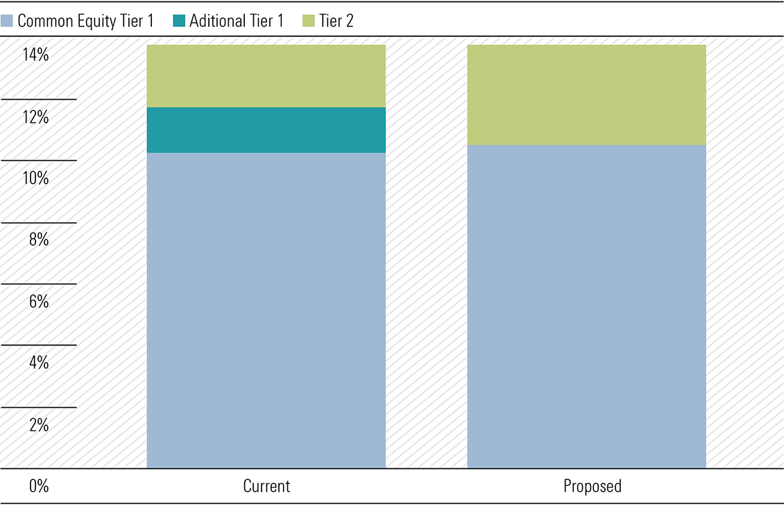
Note: Exhibit shows proposed changes to capital structure for ‘advanced’ banks: ANZ, CBA, ING Australia, Macquarie, NAB, and Westpac. Other domestic banks are subject to different, though conceptually similar, changes to capital requirements.
Source: APRA, Morningstar.
Credit funds
The Morningstar manager research team analyses thousands of funds. Our five-tier Medalist Rating, running from Gold to Negative, seeks to evaluate a fund’s strategy and associated vehicle in the context of an appropriate benchmark and peer group. Morningstar assigns Gold, Silver, and Bronze ratings to vehicles expected to provide better risk-adjusted returns than their relevant indexes, after accounting for fees.
For hybrid investors, one option that may look interesting is Yarra Enhanced Income. The fund runs an Australia-oriented credit strategy, with a skew towards Tier 2 notes, and earns a Bronze Medalist Rating from Morningstar. Including franking, total returns have exceeded the RBA cash rate by an average of roughly 3.5 percentage points over the past ten years (though assets in the fund are higher risk than cash assets). It has been a strong performer in its peer group, beating the index by an annualized 8.4 percentage points on a three-year basis. Its fees, which are one of the most predictive factors of future performance, place it in the second-cheapest quintile of its category.
Insurer hybrids
AT1 securities issued by other Australian firms, such as insurers, are another option. At this stage, APRA is not proposing any changes to insurer hybrids. However, Suncorp, IAG and Challenger combined have less than $3 billion of hybrids listed on the ASX, per data from BondAdvisor. This is minuscule compared to the $43 billion bank hybrids market. While investors in these hybrids will still get the benefits of franking, it’s not unreasonable to expect yields to compress as some capital currently sitting in bank hybrids migrates to this market.
FY24 was a tough year for income investors. For companies under Morningstar’s Australian coverage—the majority of the benchmark ASX 200 index—total dividend payments were essentially flat. [Exhibit 1] Granted, this was improvement on FY23, when dividends fell almost 10%. But against inflation of roughly 4%, real income went backwards.
Exhibit 1: Dividend growth improves, but only modestly
Growth of total dividends paid (Morningstar Australia coverage, %)
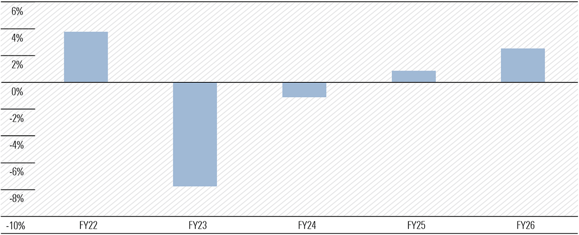
Source: Morningstar
Note: Total dividends paid is based on dividends declared for each financial year, including forecasts for companies yet to report in FY24 (such as the major banks).
In FY24, the pain was most acute in the energy and materials sectors, with softening commodity prices weighing on earnings and shareholder returns. Consumer-facing stocks also posted negligible dividend growth in aggregate, as companies battled a confluence of softer spending and elevated rent and wage inflation. And real estate trusts, which generally carry higher levels of debt, saw distributions dragged down by rising interest expense.
FY25 doesn’t look much better
On our forecasts, FY25 doesn’t look much better. The big laggard is the basic materials sector, which accounts for almost of third of dividend payments from companies we cover. As we have discussed previously, China’s subdued growth outlook poses a significant headwind for bulk commodity miners. The prospects of maintaining steel production and iron ore consumption at peak rates appear slim given the apparent investment excesses of the past two decades. We’re expecting mid-single digit declines in dividend payments for the basic materials sector— and further downgrades are possible given recent commodity price weakness.
In FY26, the picture improves modestly. We think the big winners will be the cyclical sectors—consumer, industrials, and financials– which should benefit from an upturn in economic activity as inflation cools and central banks ease monetary policy. But mining and energy still weigh, and given their outsized contribution to the index, we see total dividends only growing 2%—firmly below Treasury’s 3% inflation forecast.
Exhibit 2: Materials and Energy to weigh on dividend growth
Growth of total dividends paid by sector (Morningstar Australia coverage), %
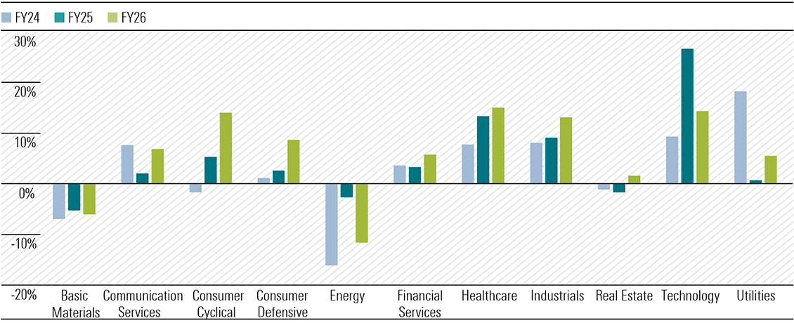
Source: Morningstar
Note: Total dividends paid is based on dividends declared for each financial year, including forecasts for companies yet to report in FY24 (such as the major banks).
A few income picks from our Best Ideas list
While the overall dividend outlook is less than impressive, some pockets of the market still screen favourably. But the best dividend stocks aren’t simply those with the highest yield. Focusing solely on this can lead investors straight into a ‘yield trap’, where the market has bid down a stock because earnings look unsustainable, and the dividend is likely to be cut. To avoid this, investors should consider the durability of dividends, and the price they’re asked to pay.
With this in mind, we’ve looked at the dividend outlook for our Best Ideas list. [Exhibit 3] Morningstar’s Best Ideas are selected on valuation and quality, and aren’t tailored to a specific investment style. However, several names on the list could appeal to income-oriented investors.
Exhibit 3: Highest-yielding stocks on the Best Ideas list
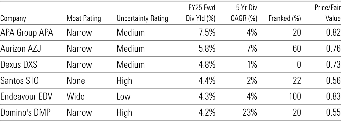
Source: Morningstar. Forward yields and dividend growth are Morningstar forecasts.
APA Group is the highest yielding stock on the list. The company has several attractive features, including a narrow moat arising from its unparalleled gas pipeline network. High capital costs and inelastic demand deter new entrants, resulting in a competitive advantage for incumbents like APA. The company also enjoys highly secure revenue, underpinned by regulation and long-term contracts, and we expect this to facilitate dividend growth of roughly 4% annually over the next five years.
Aurizon trades at an attractive 6% yield, mostly franked. We think some investors are losing patience with attempts to diversify away from coal via investment in non-coal bulk and containerized freight haulage. But Aurizon’s core rail-haulage and rail network businesses enjoy a narrow moat, holding significant cost advantages over road transport for bulk commodities. Earnings are defensive, and the outlook for dividend growth is strong, at a forecast 7% CAGR over the next five years.
While riskier than the two names above, Domino’s Pizza has the strongest dividend growth outlook on the list. We think the market underestimates the massive growth potential of Domino’s global network, which we expect to approach 6,000 stores in ten years, from less than 4,000 today. As the network expands at a rapid clip, so too should dividends. Trading conditions have recently proved challenging, but Domino’s is a globally recognized, moat-worthy brand, and we forecast a rebound. On valuation grounds, Domino’s is also one of the cheapest names on our Best Ideas list.
A quick note on the Fed
On Wednesday, the US Federal Open Market Committee cut the fed funds rate 0.5 percentage points. After two years of restrictive monetary policy, this pivot signals the Fed’s belief it has finally won the battle against inflation.
Through the end of 2025, our Chief US Economist sees a steady reduction in the fed funds rate to around 3%, broadly in line with market pricing. This should be enough to keep the economy out of a recession. As discussed last week, we think the uptick in unemployment is far from alarming. GDP growth remains robust, and as a result, we don’t expect a collapse in the labour market.
But we continue to differ from the market on the long-run outlook for interest rates. We think structural factors, including aging demographics, slowing productivity growth, and increasing inequality have pushed down real interest rates for decades. And we don’t think these forces have gone away. By 2026, we see a fed funds rate of around 2%, some 100 basis points below current market pricing.
This week, we close the book on the August 2024 reporting season. Our Australian equity research team covers nearly 200 Australian and New Zealand stocks, and the vast majority of the benchmark ASX 200 index. All up, we changed fair value estimates for roughly 40% of our coverage during August. The proportion is similar to this time last year, and the average upgrade of roughly 1% implies August 2024 was, perhaps surprisingly, a relatively benign reporting season. As with August 2023, upgrades accounted for around 70% of all changes.
Taking a look at the bigger picture, on an unweighted basis, the market seems fairly valued post reporting season. Shares we cover trade at a slim 1% premium to fair value, on average. But we see pockets of value across the market, and still a relatively elevated number of four- and five-star rated stocks. We direct readers to the Best Ideas list for our top picks, which we updated this week.
Exhibit 1: Reporting season fair-value estimate changes for August 2024 and 2023
Source: Morningstar
China weak, banks OK, retail recovering
With big share price swings on earnings ‘beats’ and ‘misses’, there is often an undue focus on the noisy near-term. This is our attempt to cut through the noise, to find the three themes we think are most important for investors.
China’s weak economy could mark a sea change for iron ore
Broadly speaking, commodity prices remained elevated during fiscal 2024, supporting strong profitability and shareholder returns for major miners. But concerns are mounting around the global growth outlook, and in particular, China’s demand for our resource exports.
The prospects of maintaining steel production and iron ore consumption at peak rates appear slim given the apparent investment excesses of the past two decades. Notably in real estate, and to a lesser extent, infrastructure. Shares in bulk commodity miners have already trended down in 2024 as the outlook sours. But we don’t think the story is finished yet, with near-term iron ore prices of around USD 90 per tonne materially above our midcycle forecast of USD 70 per tonne.
While BHP Group (ASX:BHP), Rio Tinto (ASX:RIO) and Fortescue (ASX:FMG) all screen as fairly valued following the recent selloff, we’re yet to update our near-term commodity price assumptions for recent volatility in prices. All three miners have substantial leverage to iron ore prices, but Fortescue is most vulnerable. With iron ore virtually the sole revenue source, it lacks the commodity diversification of BHP and Rio Tinto, and has an unfavourable position on the industry cost curve, at around the 75th percentile once discounts for lower grade ore are taken into account.
Borrowers resilient but banks expensive
The health of the Australian borrower was a positive surprise. While stress on bank loan books is rising, arrear rates remain around long-term averages, despite cost-of-living pressures and rapid rate rises since mid-2022. Quarterly updates from the major banks revealed extremely low bad debt expenses.
Nonetheless, most major banks look overpriced, with ANZ Bank (ASX:ANZ) the only one of the big four trading close to fair value. Commonwealth Bank (ASX:CBA) remains the most expensive of the bunch. Debate on what supports the bank’s share price rages on, including buyer support from passive funds, interest from global investors, to active managers reducing underweight positions.
But we think patient investors can await a better opportunity, and in the past few years there have been plenty of chances to buy our big four, wide moat-rated banks. We see some value in the regional banks, with Bank of Queensland (ASX:BOQ) and MyState (ASX:MYS) most attractive—but most certainly not of the same quality as the majors, given the regionals all lack cost advantages.
Green shoots in retail
Fiscal 2024 was tough for the consumer. The national accounts, released this week, cemented that point. In the June quarter 2024, real household consumption grew only 0.5% on June 2023, the slowest annual growth rate since lockdown-affected March 2021.
But much-anticipated trading updates for the first weeks of the new financial year—a more timely measure than GDP—show sales are beginning to pick up for major retailers. Super Retail (ASX:SUL), owner of Super Cheap Auto and Rebel Sports, saw like-for-like sales lift 3% in the first seven weeks of fiscal 2025 versus a year ago, and JB Hi-Fi (ASX:JBH) saw 5% sales growth in the month of July. At Kmart, sales are up 3% in the first eight weeks.
We expect a discretionary retail recovery in fiscal 2025. We forecast industry growth of 3%, following a year of zero growth in fiscal 2024. At 3.75%, the fiscal 2025 minimum wage increase is still higher than the pre-pandemic norm, but a smaller increase than fiscal 2024 at 5.75%. With labour one of the largest costs for retailers, wage disinflation should support margins in fiscal 2025. Undervalued Domino’s Pizza (ASX:DMP), on our Best Ideas list, stands to benefit.
The big winners of reporting season
Drilling down to individual names, we see some significant moves this reporting season. The biggest winner was wide-moat Brambles (ASX:BXB), with a rosier outlook for capital expenditure and margins resulting in a 16% fair value upgrade. The market liked the result too. We had forecast meaningful margin gains in fiscal 2024, but Brambles did better, making our prior medium-term margin assumptions look conservative. Brambles remains on our Best Ideas list, trading at discount of almost 20% to fair value.
We made big upgrades to technology names WiseTech (ASX:WTC) and Life360 (ASX:360). We still expect wide-moat WiseTech will dominate its winner-take-most market. But we’ve increased our assumption about the absolute size its market can grow to, and raised our fair value estimate 15%. Shares screen as slightly undervalued.
We also raised our fair value estimate for no-moat Life360 by 13%. The cost to acquire new monthly active users continues to fall, which is a key metric for efficiency and future growth. We think Life360 is in a strong position to grow rapidly and build its competitive advantage, but it’s priced accordingly and fairly valued. (Exhibit 2)
Exhibit 2: Reporting season fair-value estimate upgrades of 6% or more
Source: Pitchbook, Data reflects FVE changes between close 31 Jul, 2024 and close 1 Sep 2024.
The big downgrades
Corporate Travel Management (ASX:CTD) and Audinate (ASX:AD8) were the biggest disappointments, with both fair values cut 20%.
For Corporate Travel, part of the downgrade reflects our underestimation of how beneficial one-off humanitarian projects were to European earnings since fiscal 2019. Those gains are now rapidly unwinding. More important is lower confidence in maintainable earnings from North America, Australia and New Zealand.
Shares trade at a significant discount to our revised fair value, but it may take time for investors to look through the near-term earnings uncertainty. Given the group’s track record of earnings growth, efficiency improvements, account wins, and customer service delivery in the still-fragmented corporate travel management space, we think the long-term earnings outlook remains robust.
Narrow-moat Audinate’s revenue and profit both met our forecasts, but guidance signaled a dramatic, unexpected slowdown this year. We think this reflects a one-off transition in business model, which is not too dissimilar from what we have seen in many software-as-a-service businesses. Shares screen as materially undervalued, and it appears the market believes the company’s slowdown may signal a loss of competitive position or an exhaustion of its addressable market—a view we don’t share.
Megaport’s (ASX:MP1) guidance missed our expectations for revenue and EBITDA, and hints at worsening salesforce efficiency and product/market fit than we thought. The market reaction was severe, with shares falling some 30%.
We believe slower revenue growth is partly driven by cyclical factors rather than purely by competitive pressures. We’ve reduced our fair value estimate by 17%, but shares still look cheap, and we see a long, attractive growth runway ahead. We expect EBIT margins to expand materially to 39% by fiscal 2034, compared with 2% in 2024. The primary driver here is the feed-through of Megaport’s highly attractive lifetime value per customer, compared with its customer acquisition costs, as its customer base matures.
Exhibit 3: Reporting season fair-value estimate downgrades of 6% or more
Source: Pitchbook, Data reflects FVE changes between close 31 Jul, 2024 and close 1 Sep 2024.